Brand mistakes that cost small businesses customers
Most brand problems are confusion, not taste. Spot the twelve most common mistakes, fix them without a big budget and audit your brand in half an hour.
Most brand problems are not about taste. They are about confusion: customers cannot tell what you do, cannot read what you wrote or cannot recognize you from one place to the next. This lesson lists twelve brand mistakes that quietly cost small businesses customers, shows how to fix each one and gives you a thirty-minute audit you can do today.
Brand mistakes cost you customers quietly
People decide fast. A visitor to your website, a passer-by who reads your sign and a customer who finds you on Google Maps each get a few seconds to understand who you are. If the answer is unclear, they do not complain. They leave, and you never find out. The mistakes below are common, and almost all of them can be fixed without a big budget.
Twelve mistakes, and how to fix them
1. Nobody can tell what you do in five seconds
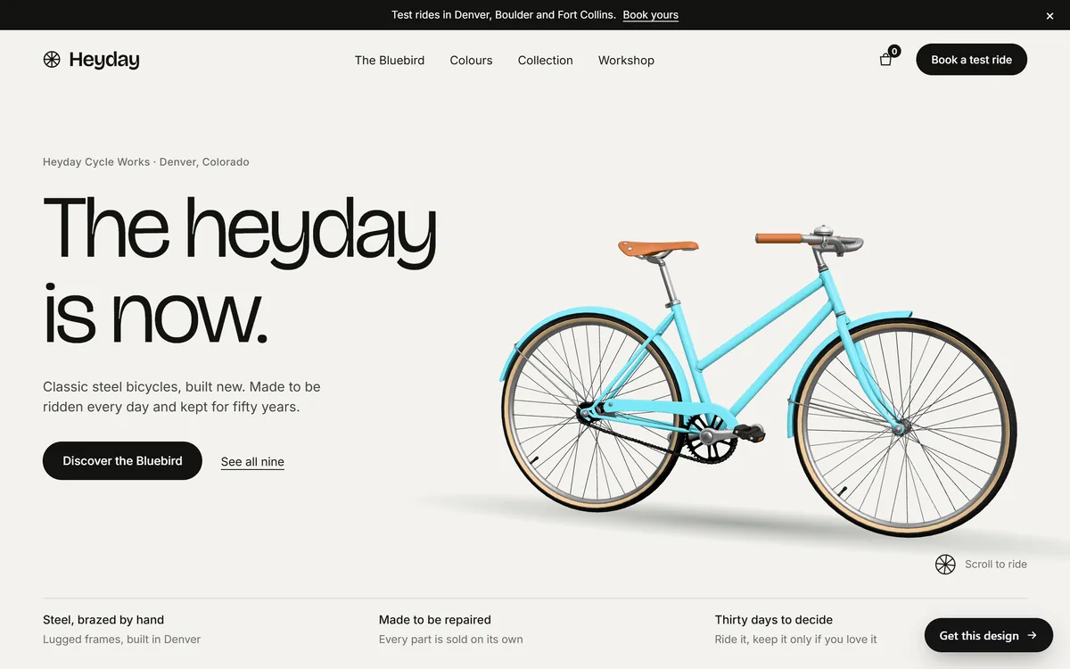
A clever line, a vague name and a photo of an office tell a visitor nothing. Fix it by saying plainly what you do, for whom and where, at the top of every important page. Heyday, our concept design for a bicycle maker, does it in one screen: the name, the place, a headline, a line that says "Classic steel bicycles, built new" and one main button. Show your page to a stranger for five seconds, hide it and ask what you sell.
2. A name that works against you
A name that is hard to spell, easy to confuse or impossible to get as a web address costs you every time someone tries to find you. The first two lessons in this series cover how to choose a name and check it. If you already have a weak name, you do not have to rename today. Fix what you can: add a clear descriptor beside it, buy the closest web address and use one spelling everywhere.
3. Skipping the legal basics
Many small businesses build a brand on borrowed material: a font without a license, a photo pulled from a search, a logo from a template that others use, a name that another company owns. These problems stay hidden until a letter arrives. Fix them early. Check the license of every font and image, get your logo rights in writing and search for conflicts before you print a sign.
4. A logo that only works in one place
A logo with fine detail, or one that needs its colors, falls apart on a phone, a stamp or a dark background. Fix it by building a small kit: a horizontal, a stacked and an icon version, each in full color, one color and white. If your current logo cannot be simplified, ask a designer for a lighter version.
5. Too many colors and fonts
Each new color or typeface makes your brand look less certain. Fix it by cutting down to three to five colors and two fonts, and write them in one place. When in doubt, remove one.
6. Text that is hard to read
Pale gray on white, small type, all capitals in a paragraph and text over a busy photo are all common. Fix it by checking contrast, keeping body text at about 16 pixels or larger and placing text on a plain or darkened area. If you have to squint at your own website on your phone, so do your customers.
7. A look that changes from place to place
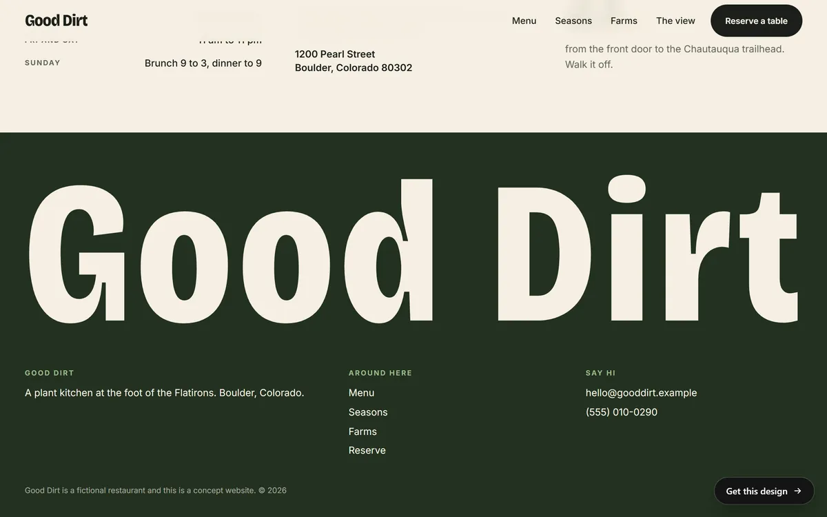
Your website is green, your Facebook page is blue, your invoices use another logo and your van has a fourth version. People start to wonder whether they are dealing with the same business. Fix it with one set of files and one guide. Good Dirt, our concept design for a plant-based restaurant, repeats the same heavy lettering and the same name in the header and in a large form in the footer. The colors flip, near-black on cream at the top and cream on forest green at the bottom, but the shape of the name never changes.
8. Different names in different places
"Mike's Plumbing", "Mikes Plumbing LLC", "MP Plumbing Services" and "Mike's Plumbing and Heating" may all be the same company, but customers and search engines may not know that. Google's own guidelines for business profiles ask you to use the name you use on your sign, your website and your stationery. Fix it by choosing one version for the public and using it everywhere, with the legal name kept for contracts and invoices.
9. Copying a competitor
It can seem smart to look like the leader in your field. In practice, it makes you the second choice and invites confusion, and sometimes a legal complaint. Fix it by studying your competitors to learn what everyone does, then choosing a different color, a different shape and a different way of speaking.
10. Generic words and generic photos
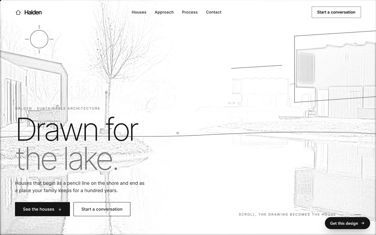
"Quality service you can trust" and a stock photo of two people shaking hands could belong to any business in the world. Fix it with specifics: a name, a number, a place, a detail only you would know and real photos of your work and your team. Halden, our concept design for an architecture studio, writes about "a pencil line on the shore" and "a place your family keeps for a hundred years". The line is concrete, so it cannot be mistaken for another studio.
11. A voice that changes, or the wrong language
Formal on the website, jokey on Instagram and robotic in emails makes a business feel like three. A website only in English, when many customers speak Spanish, or a Spanish page that reads like a machine translation, sends customers away. Fix it with a one-page voice sheet and a native speaker to review each language.
12. Never looking at it again, or changing everything too often
Old logos stay on vans, old phone numbers stay on flyers and old hours stay on profiles. The opposite mistake is to change the logo, the colors and the name every year, so nobody builds a memory of you. Fix it with one review a year: update what is out of date, and change the brand gradually so people still recognize you.
Signs your brand needs attention
You do not need a study to know that something is off. These signs show up early.
- Customers ask "what exactly do you do?" after visiting your website.
- People misspell your name or call you by a different one.
- Your logo looks blurry or stretched somewhere.
- Your website feels like a different business from your printed materials.
- A new employee or helper makes something that looks nothing like you.
- You cannot find your logo file when you need it.
- You avoid putting your logo on things because it does not look good.
- A competitor looks so similar to you that customers mix you up.
Two or three of these are normal. Five or more mean it is time for the audit below.
A thirty-minute brand audit
You can find most of these problems in half an hour. Do it with a coffee and a note on your phone.
- Search your name. Google it in three forms: the full name, the short name and a likely misspelling. Look at the first two pages and the map.
- Open every place you appear. Check your website's home and contact pages, your Google Business Profile, Facebook, Instagram, Yelp or other directories, your email signature, an invoice and a photo of your sign, van or uniform.
- Compare. For each place, check the name spelling, the logo version, the colors, the tagline or description, the phone number, the address, the hours and the link.
- Mark each item. Match, small difference or mismatch.
- Ask three customers. Two questions: what do we do, and what three words describe us?
- Pick the top three fixes. Do them this week. Keep the rest on a list.
What to fix first
If the audit gives you a long list, work in this order.
- The same name, address and phone number everywhere. It helps customers and local search.
- A clear first screen on your website.
- Logo files in the right versions.
- Readable text and enough contrast.
- One voice, in every language you use.
- Real photos in place of generic ones.
- Everything else.
What a change of brand really involves
Before you decide to change your name, your logo or your colors, list every place the brand appears. The list is usually longer than people expect, and it shows why a change should be planned and not rushed.
- Signs, vehicles, uniforms and packaging.
- Business cards, flyers, menus, brochures and invoices.
- Your website, your email signature and your contact forms.
- Your Google Business Profile, Facebook, Instagram, Yelp and every directory listing.
- Ads, stickers, merchandise and anything you gave to partners to display.
Each item needs a new file, a new order or a manual update. If only the colors change, most of the list is quick. If the name changes, every item changes, and customers must also learn the new name. That is why choosing the name and the logo carefully at the start is the cheaper path.
Brand mistakes and your website
A website is where most of these mistakes show up together or disappear together. It carries your name, your logo, your colors, your fonts and your words in one place, and people see all of it at once. When we build a site, we design it for your industry, write the texts for you and set it up with a mobile version, so the first screen says clearly who you are. You can see how that looks for different kinds of businesses in our designs.
Questions people ask
What are the most common branding mistakes?
Unclear messaging, a logo that does not work in every size, too many colors and fonts, text that is hard to read, a look that changes from place to place, different names in different places and generic words and photos.
How do I know if my branding is working?
Customers can tell you in a sentence what you do, they recognize your logo, your name is spelled the same everywhere and people find you without confusion. Ask five customers what three words describe you.
Can bad branding hurt my business?
Yes. Unclear or inconsistent branding makes you look less reliable and harder to remember, and many customers will choose a competitor who looks more certain. It rarely causes a visible problem. It just costs you quiet sales.
Is it bad to change my logo?
No, if you do it for a reason and keep what people recognize. Change it gradually, keep the name and the main color if you can and update every place at once so the old and new versions do not mix.
How often should I update my brand?
Review it once a year. Update details, such as photos, phone numbers and hours, as they change. Redesign the logo or the colors only when they no longer fit the business, not for fashion.
How much does a rebrand cost?
It depends on how much you change. A refresh of colors, fonts and files is far smaller than a new name, new signs and new vehicles. Make a list of every place the brand appears to see the real scale.
Do I need a professional designer?
Not always. A simple wordmark, two fonts and a clear palette can be done by an owner with free tools. A designer helps when the logo goes on vehicles or packaging, or when you want a mark you can register.
What is brand consistency, and why does it matter?
It means looking and sounding the same in every place. It matters because repetition builds memory and trust. A customer who sees the same name, colors and voice many times is more likely to remember you.
How do I fix inconsistent branding?
Do an audit, choose one version of each element, write it on a one-page guide and update every place that does not match. Start with the name, address and phone number, then the logo and the colors.
What should I do if my name is too similar to another business?
Stop and get legal advice before you spend more on signs and marketing. Changing the name early is cheaper than a dispute later. A trademark attorney can tell you how serious the overlap is.
Want a website that does all of this? Start your site