How to create your logo, even if you are not a designer
You need a clear idea, a simple shape and a few tests, not design skills. Go from a blank page to a finished set of logo files in one afternoon.
You do not need to be a designer to make a logo that works. You need a clear idea, a simple shape and a few tests. This lesson takes you from a blank page to a finished set of files in one afternoon, and explains when it makes more sense to hire someone instead.
What a logo has to do
A logo is your signature. It goes on your sign, your invoices, your website and your social profiles, so people recognize you at a glance. It has a short list of jobs.
- Tell you apart. It should not look like the businesses around you.
- Work small. On a phone screen, in a browser tab and on a pen.
- Work in one color. On a stamp, in a newspaper ad and on a black shirt.
- Work on any background. Light, dark or a photo.
- Fit the business. A law office and a bounce house should not look alike.
A logo does not have to explain what you do. Apple does not sell apples, and the Nike swoosh says nothing about shoes. Your name, your tagline and your website do that work. The logo's job is to be recognized and remembered. It is also only one part of your brand. Color, fonts and voice, covered in the next lessons, do just as much.
Three ways to get a logo
Make it yourself
A free design tool is enough for a clean wordmark or a simple symbol next to a name. Tools such as Canva, Figma and Inkscape offer free plans or are free. The cost is your time, and the risk is a look that is too busy or too close to a template. This path works best when your name is short and you like a simple style.
Hire a designer
A freelancer or a small studio gives you original work, a point of view and finished files. Look through their portfolio for logos that are simple and still look good small. This path works best when the logo will go on vehicles, packaging or a storefront, or when you want a mark you may register as a trademark.
Use a logo maker or an AI tool
Online logo makers and AI tools are fast and cheap, and they are fine for a first version. Know their limits. Templates and icon libraries are shared by many users, so another business may end up with something very close to yours. Read the terms about commercial use. And in the United States, copyright generally requires a human author, so a logo made only by an AI tool may have no copyright protection. Trademark rights depend on use and on how distinctive the mark is, not on who drew the image. Keep your sketches and notes as proof of your own creative choices.
Make your logo in six steps
Step 1: Write three words that describe the brand
Choose three adjectives for how you want customers to see you, such as calm, local and precise, or bold, playful and fast. Add one sentence about who you serve. These words are the filter for every choice that follows: a shape, a letter style, a color.
Step 2: Collect examples
Save ten logos you like, from any industry, and five from your competitors. Write one line about each: what works and what does not. You are not copying. You are learning what you like and what to avoid. Notice how many of the logos you like are simple.
Step 3: Pick a type
Decide whether your logo will be a name in a styled font, a symbol with a name or something else. The next lesson explains each type. If you are unsure, start with the name in a good font. It is the easiest type to do well.
Step 4: Sketch on paper
Set a timer for twenty minutes and draw twenty small versions. Draw bad ones too. Circle the three best, then redraw each one larger. Paper keeps you from getting lost in fonts and effects, and it is where the idea comes from.
Step 5: Build it on a screen
Open your tool and start in black and white. Type the name in a few fonts and compare them. Add the symbol if you have one: a simple shape you can build from a circle, a line or a triangle. Space the letters evenly. Then add color, one at a time. If it looks good in black and white, color will only help.
Step 6: Test it hard
Test before you print anything.
- Shrink it to the size of a browser tab and to the width of your thumb on a phone. Can you still read it?
- Make it one color, then white on black.
- Place it on a photo, on a light page and on a dark page.
- Squint at it. You should still see a clear shape.
- If your name has an accent or a special letter, such as é or ñ, check that the font draws it well.
- Show it for five seconds to a few people, then ask them to describe it. If they cannot, simplify.
- Ask five customers what kind of business they imagine.
What simple looks like
Four of our concept designs show how much a simple mark can do. Each one pairs a small shape with a name. None of them explains the business, and all of them still feel specific.
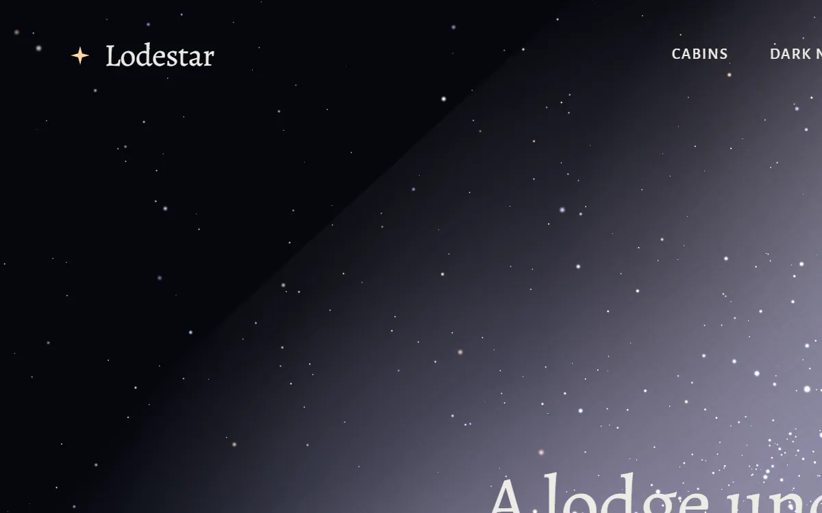
Lodestar, a lodge under a dark sky, uses a four-point star in a warm tone next to its name in a serif typeface. The star fits the name, since a lodestar is a guiding star, and it stays clear even when it is tiny.
Halden, an architecture studio, pairs a thin-line house with its name in a clean sans serif. The simple outline matches the pencil drawings that fill the page behind it.

Snowmelt Rafting Co. uses a peak over two wave lines, with the name in a heavy slab serif and the words Rafting Co. in small spaced capitals underneath. Stacking the name this way keeps the mark compact.

Solvia, a community solar company, uses a sun with rays, the name in lowercase and the words Community Solar in tiny orange capitals.
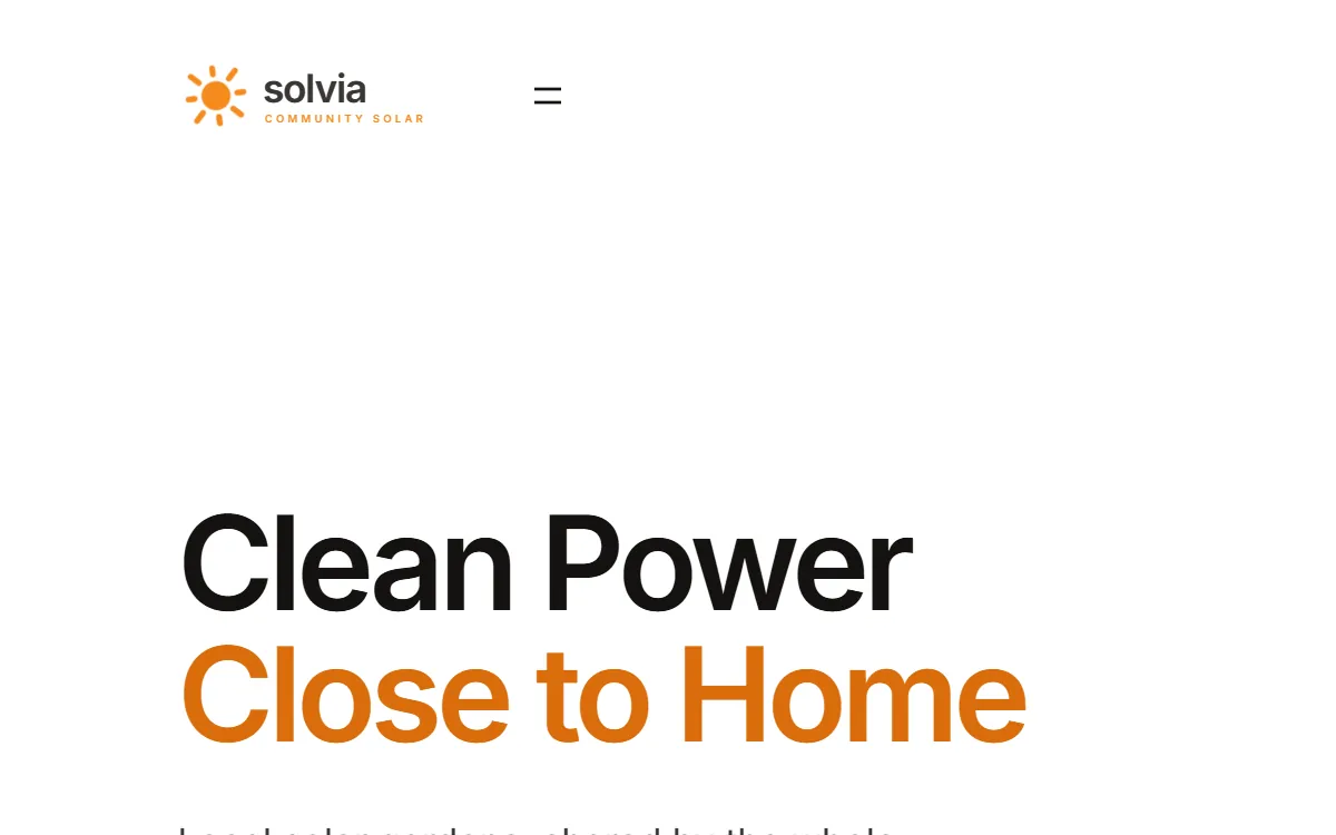
Notice what they share: one shape, one or two colors, no gradients and no effects.
Rules that keep a logo simple
- One font, two at most. More than that looks like a ransom note.
- One or two colors. The logo must still work in one.
- No effects. Gradients, shadows, bevels and glows print badly and date fast.
- No hairlines or tiny details. They disappear when the logo gets small.
- Space around it. Keep an empty margin on every side, about the height of one letter of your name.
- No clichés. Globes, handshakes, swooshes and light bulbs look like everyone else's logo and are harder to protect.
- No stock icons as your logo. Other businesses can download the same file.
- Three layouts. Make a horizontal version, a stacked version and an icon-only version, so the logo fits any space.
The files you need
A finished logo is not one file. It is a small kit.
- A vector master. SVG, plus PDF or EPS if a printer asks. Vector files can be made any size without going soft.
- PNG files with a transparent background. A few sizes, for websites, documents and social media.
- Three color versions. Full color, one color (black) and reversed (white, for dark backgrounds).
- Three layouts. Horizontal for headers and letterhead, stacked for square spaces and icon only for profile photos and the small icon in the browser tab, called a favicon.
- A note with the details. The font names and the exact color codes.
Keep everything in one folder with clear names, such as brand-logo-horizontal-color.svg, and save a backup in cloud storage. Never use a screenshot of your logo as the master. It will look blurry the first time someone enlarges it.
If you hire a designer or use a tool
- Brief them well. Send your three words, your examples and a list of where the logo will appear. Ask for sketches first, before any polish.
- Write down what you will receive. The files in the kit above, the number of rounds of changes and the delivery date.
- Get the rights in writing. In the United States, a freelancer generally keeps the copyright in the work unless the contract transfers it to you in writing. Ask for a written assignment of rights and for the source files.
- Ask what went into it. Was any stock art, template or AI tool used? Are the fonts and icons licensed for use in a logo? Get the answers in writing.
- Look at the price list, but judge by what you get. Prices run from nothing to a lot. What matters is the files, the versions and the rights.
- Check for look-alikes. Run a reverse image search on the finished logo and search the federal trademark database for similar marks in your field.
Logo mistakes to avoid
- Too much detail. If it needs a magnifying glass, it will not work on a phone.
- Depending on color. A logo that vanishes in black and white will fail on a fax, a stamp or a one-color print.
- Cramped or uneven letters. Uneven spacing looks careless, even when no one can say why.
- Chasing a trend. The effect that looks fresh this year will look old in three.
- A stretched, low-quality file. Always keep the vector master.
- Copying a famous or competing logo. It confuses customers and invites a legal letter.
- Putting the slogan inside the logo. At small sizes it turns into a gray smudge. Keep it as a separate line.
Your logo and your website
On a website, your logo works in more places than you might expect: the header, the footer, the small icon in the browser tab, the image that appears when someone shares a link and the emails sent from your contact forms. Each place needs a slightly different version, which is why the kit above matters. When we build a site, you can upload your logo in any format, and a vector file or a PNG with a transparent background gives the cleanest result. If your logo is still a work in progress, a clean wordmark is a fine start. You can see how logos sit in the header and the footer in our designs.
Questions people ask
Can I make my own logo for free?
Yes. Free tools can produce a clean wordmark or a simple symbol with a name. Start on paper, keep it simple and test it small and in one color. Check the tool's terms for commercial use before you print anything.
What makes a good logo?
It is simple, easy to recognize, readable at a small size, clear in one color and right for your kind of business. It should also stand apart from your competitors.
What size should my logo be?
Start with a vector file, which has no fixed size. For a website, export PNG versions at about twice the size they will appear, so they stay sharp on high-resolution screens. Keep the vector master for print.
What file format should my logo be?
Keep a vector master, such as SVG, PDF or EPS, and a few PNG files with a transparent background. Avoid JPG for logos, because it cannot be transparent and gets blurry when it is compressed.
Do I need a symbol, or can I use only text?
Text alone works well, especially for short names. Many strong logos are just a name in a well-chosen font. Add a symbol when you want an icon for small spaces, or when you want people to remember a shape.
How many colors should a logo have?
One or two. A logo with a single color is cheaper to print, easier to recognize and easier to place on photos and colored backgrounds. You can always add a second color for emphasis.
Should my logo include my slogan?
Usually not. A slogan makes the logo longer and turns unreadable when small. Make a separate version with the slogan for places where there is room, and keep the main logo clean.
How much does a logo cost?
It can cost nothing or a great deal, depending on who makes it and what you get. Compare offers by what is included: original work, the full file kit, rounds of changes and a written transfer of rights.
Can I use a logo I found online or a free template?
Be careful. Free templates and icons are shared with other users, and some licenses do not allow commercial use or trademark registration. Read the terms, and prefer a design that is truly yours.
Can I trademark my logo?
Often yes. A logo can be registered with the federal trademark office as a design mark. Many owners register the name first and the logo later. A trademark attorney can tell you what makes sense for your plans.
Want a website that does all of this? Start your site