Your one-page brand guide
A short document that says how your business looks and sounds saves you from deciding the same things twice. Here is the page to make and how to use it.
A brand guide is a short document that says how your business looks and sounds. It saves you from deciding the same things again every time you print a flyer, post online or brief a designer. This lesson gives you a one-page structure, a way to fill it in during one hour and a few habits that keep it useful.
Why one page is enough
Big companies have brand books with dozens of pages. A small business does not need that. It needs the decisions made once, written in one place and easy to find. A one-page guide that people read beats a sixty-page manual that nobody opens.
A guide helps in several ways.
- Consistency. Your sign, your website, your invoices and your posts look like one business.
- Speed. You stop asking "which blue was it?" every time you make something.
- Fewer mistakes. A printer, a sign maker or a helper cannot guess wrong when the answer is on the page.
- Easier delegation. A freelancer, an employee or a family member can make something on brand without calling you.
- Protection. When your look is written down, it is harder for it to drift or be copied.
The people who will use it are you, your staff, designers, printers, sign makers, social media helpers, web designers and anyone who writes about you.
What goes on the page
These ten boxes cover what a small business needs. Most boxes take one to three lines.
1. Name
Write the name exactly as it appears: spelling, capital letters, spaces. Add the legal name if it differs, a short form if you use one and a note on what not to do, such as "never abbreviate".
2. What you do and for whom
One sentence about your business and one about your customers. Add a promise, in a line, and three values written as plain words, such as "on time", "clear prices" and "no jargon".
3. Logo
Show every version: horizontal, stacked and icon only, in full color, one color and reversed. Add the smallest size you allow, the empty space to keep around it and three or four things never to do, such as stretching it, changing its colors or placing it on a busy photo.
4. Colors
List each color with its name and its hex, RGB and CMYK codes. Say what each one is for: main, support, accent, text, background. Add a note on how much of each to use.
5. Fonts
Name the headline font and the text font, with weights. Give sizes for headlines, paragraphs and small print. Add where to get the fonts and the backup fonts to use if the main ones are missing.
6. Voice
Your three traits, each with its "but not", a list of words to use and words to avoid, and one sample paragraph. The earlier lesson in this series explains how to build it.
7. Tagline and short description
The tagline, plus a description of your business in about twenty-five words that anyone can copy into a profile, a listing or a press note. This saves you from rewriting your own description every time.
8. Photos and images
Describe the look you want: real photos of your work and your team, natural light, close-ups, people who look like your customers. Add what to avoid, such as generic stock photos and heavy filters.
9. Buttons and web details
Give the button color and shape, the link color and the wording style for actions, such as "Book a visit" instead of "Submit". Add the icon style if you use icons.
10. Files and contact
Say where the logo files live, who approves new materials, the date of the guide and the version. Add the name of the person to ask when someone is unsure.
A sample page for a made-up bakery
Here is how a short page might read for an imaginary family bakery called Corner Loaf, using the palette from the color lesson.
- Name: Corner Loaf. Two words, capital C and L. Never "CL" or "Corner Loaf Bakery" in headlines.
- What we do: We bake bread and pastries every morning for families, cafés and offices in one city. Promise: fresh every day. Values: on time, honest ingredients, friendly.
- Logo: horizontal, stacked and a loaf icon, in brick red, in white and in charcoal. Minimum width 100 pixels on screen. Never on a busy photo.
- Colors: Brick #A63D2F (main), Wheat #E8D5A8 (support), Deep green #1F5C45 (buttons only), Flour #FBF7EF (background), Charcoal #2A2623 (text).
- Fonts: headlines in a bold serif, text in a clear sans serif, at 16 pixels or more.
- Voice: warm, but not sugary; direct, but not pushy; local, but not folksy.
- Tagline: Bread baked before sunrise.
- Photos: real bread and real bakers, natural light, close up.
- Buttons: deep green with white text, wording such as "Order bread".
- Contact: the owner approves all new materials. Files are in the shared folder called Brand.
What a guide controls on real sites
Three of our concept designs show what these boxes decide, even though you never see the guide itself.
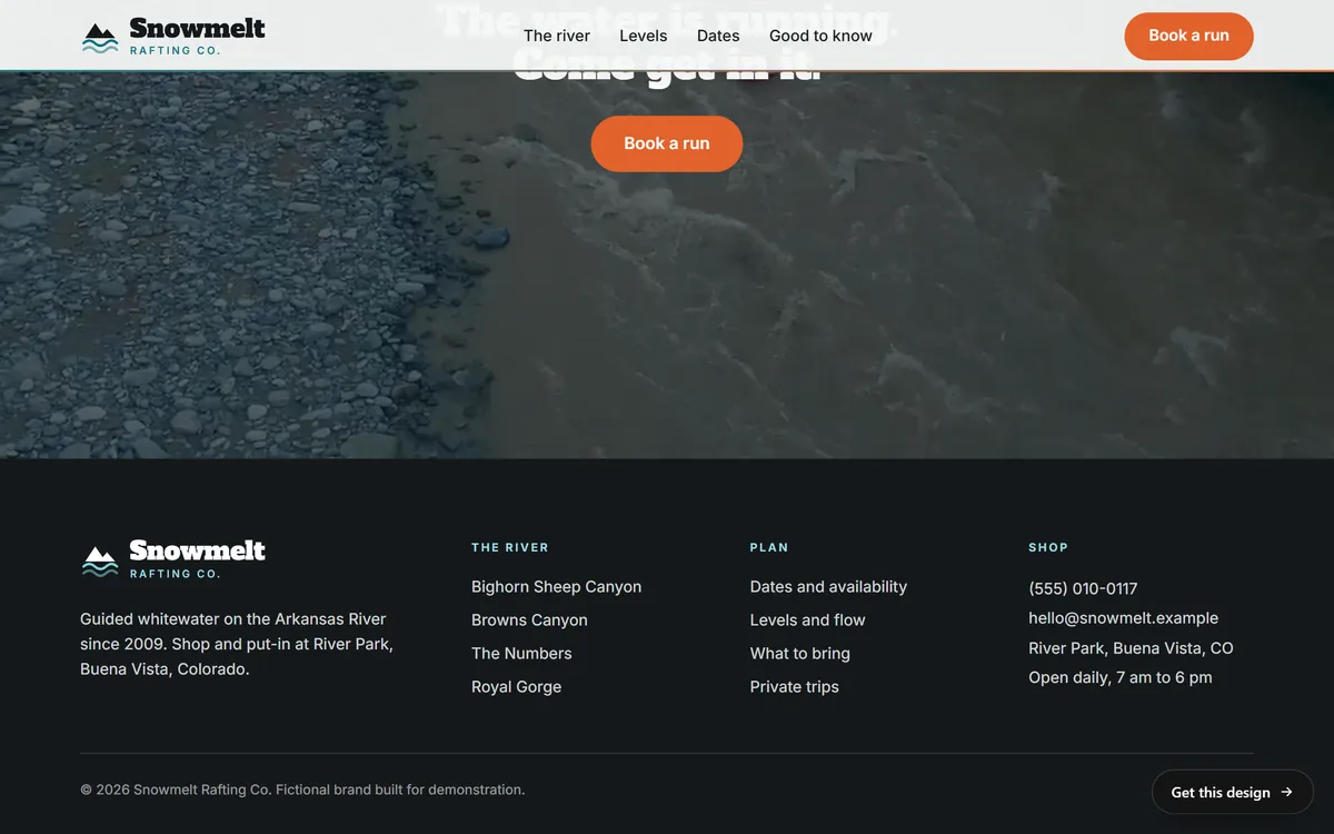
Snowmelt Rafting Co. keeps two versions of its logo. On the white bar at the top of the page, the name is dark with a teal descriptor. In the dark footer, the same logo appears in a light version. That is the logo box of a guide at work: one mark, two versions, each placed where it is readable.
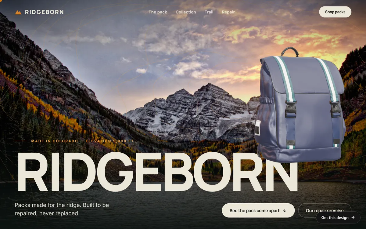
Ridgeborn, an outdoor gear brand, repeats one warm ochre in the peak of its logo and in the small line above its headline, while the large name and the line below it stay in cream. The color box tells everyone where the ochre goes and where it does not.
Aster, a solar company, pairs a clean sans serif for its headline with a monospaced font for small labels, and keeps its orange for the asterisk in the logo and a tiny dot before a label. The fonts box and the color box are visible in one glance.

Fill it in during one hour
- Minutes 0 to 10. Gather what you already use: logo files, a few things you have printed, a link to your website and a handful of posts and emails you are proud of.
- Minutes 10 to 20. Write the name, what you do, the promise and the three values.
- Minutes 20 to 30. Export the logo versions and place them on the page. Write the rules for space and size.
- Minutes 30 to 40. List the colors with codes and the fonts with sizes.
- Minutes 40 to 50. Write the voice traits, the word list and one sample paragraph.
- Minutes 50 to 60. Add the photo style, the button rules and the contact. Then do the stranger test: ask someone to make a flyer using only the page. Where they get stuck, add a line.
Make it easy to use
A guide that is hard to find does not get used. Make it a single page, in letter size, saved as a PDF. Write it in a tool you already know, such as Google Docs, Canva or a slide. Keep the logo kit in a shared folder, with the guide in the same place. Name the files clearly, with the year, such as brand-guide-2026.pdf. Put a link in your email signature or in a message to yourself so you can find it from your phone. When you work with a printer, a sign maker or a freelancer, send the guide and the folder before the job starts, and ask for a proof before anything is printed.
What to send with the guide for each job
The guide is the same for everyone, but each helper needs different pieces. Send the page and the right files.
- A printer: the vector logo, the CMYK color codes, the sizes and a request for a printed proof.
- A sign maker or a vehicle wrap shop: the vector logo, the one-color version and the color names, plus a request for a sample of the real material.
- A freelance designer: the full guide, the logo kit and two or three examples of materials you already like.
- The person who runs your social accounts: the voice page, the photo style, the profile images and the exact wording of your description and tagline.
- A web designer or studio: the logo files, the colors, the fonts and their licenses, and the voice page.
- A new employee: the whole page, a short walk-through and one finished example of each kind of material.
Mistakes that make a guide useless
- It is too long. If it needs a table of contents, nobody will read it.
- It is vague. "Be friendly" helps no one. "Friendly, but not silly, with a sample sentence" does.
- It has no examples. One real sample is worth ten rules.
- It has no files. A guide that says "use our logo" but does not link to the logo files will be ignored.
- It lives in one person's head. Write it down and share it.
- It is never updated. A guide with last year's colors does more harm than none.
Keep it alive
Review the guide once a year, and whenever you change a color, a font or a logo. Keep the old version with the date so you can see what changed. Before you publish anything new, run it through six questions.
- Is this the right version of the logo?
- Are the colors the exact codes?
- Are these the right fonts and sizes?
- Does it sound like us?
- Does the photo style match?
- Is the next step for the customer clear?
Your brand guide and your website
If you already have a brand guide, send it to us. We build your site with your logo, your colors and your fonts, and we keep your voice in the texts we write. If you do not have one, the page from this lesson is enough to start. It also helps with the monthly services you can add later, such as email marketing and Google Business management, because everyone writes and designs from the same page. When you are ready, you can start your site.
Questions people ask
What is a brand guide?
It is a document that records how your brand looks and sounds: the logo, colors, fonts, voice and rules for using them. People use it to make sure everything they create fits your brand.
What should a brand guide include?
At minimum: your name, the logo and its versions, colors with codes, fonts and the voice. Useful extras are the tagline, a short description, photo style, button rules and a contact for questions.
How long should a brand guide be?
For most small businesses, one page is a good start. Add pages only when you have decisions that cannot fit. A short guide that people use is better than a long one that nobody reads.
Does a small business need a brand guide?
Yes, a simple one. As soon as more than one person makes something for your business, or you work with a printer or a designer, a written guide saves time and mistakes.
How do I create a brand guide for free?
Use Google Docs, Canva or a slide in any presentation app. Follow the ten boxes in this lesson, fill them in during one hour and export a PDF. Save it next to your logo files.
What is the difference between a brand guide and a style guide?
The terms often overlap. Brand guidelines usually cover the identity: logo, colors, fonts and voice. A style guide can mean the rules for design or the rules for writing. Choose one name and use it consistently.
How do I find my brand colors if I have no codes?
Ask the person who designed your logo. If you only have an image, open it in a design app and use the color picker to read the codes, then save them in your guide.
How often should I update my brand guide?
Review it once a year and any time you change a logo, color or font. Keep the older versions with their dates.
Who should have a copy of my brand guide?
Anyone who makes or approves something for your business: staff, freelancers, printers, sign makers, the person who runs your social accounts and the people who build your website.
Where should I store my logo files?
In one shared folder in cloud storage, with clear file names and a copy of the guide. Keep a backup on your computer. Tell everyone where it is.
Want a website that does all of this? Start your site