Logo types explained: wordmark, symbol and emblem
Almost every logo belongs to one of a few types. Learn what each one does best, where it struggles and which one fits your name and your business.
Almost every logo you have ever seen belongs to one of a few types. Knowing them helps you pick one that fits your name, your business and the places it will appear. This lesson explains the three main types, wordmark, symbol and emblem, plus lettermarks, mascots and combination marks, with real examples and a simple way to choose.
The seven types of logo at a glance
Designers use slightly different names, but the list below covers almost every case.
- Wordmark. The business name set in type, with no picture. Also called a logotype.
- Lettermark. Initials only, also called a monogram.
- Symbol. A picture that stands for the business. A pictorial mark shows something you can recognize, like an apple. An abstract mark is a shape with no literal meaning.
- Mascot. A character, drawn as a person, an animal or an object.
- Combination mark. A symbol or mascot together with a wordmark.
- Emblem. The name placed inside a symbol, such as a badge, a seal or a crest.
The next sections take the three main types one at a time, then the rest.
Wordmarks: the name is the logo
A wordmark is the name, written in a typeface that has been chosen and adjusted with care. Google, Coca-Cola and Visa are all wordmarks. The name does all the work, so people learn it and the look at the same time.
Why choose a wordmark
- People remember the name and the look together.
- It is the easiest type to make well, even without drawing skills.
- There is no symbol to explain, so it suits a short or unusual name.
- It reads clearly on a sign, a van, an invoice and a website header.
Where wordmarks struggle
- A long name becomes tiny when it has to fit in a narrow space.
- A name alone does not shrink well into a round profile photo or a browser tab icon. You will need a short version, such as the first letter.
- A plain wordmark in a common font can look like everyone else's.
How to make a wordmark your own
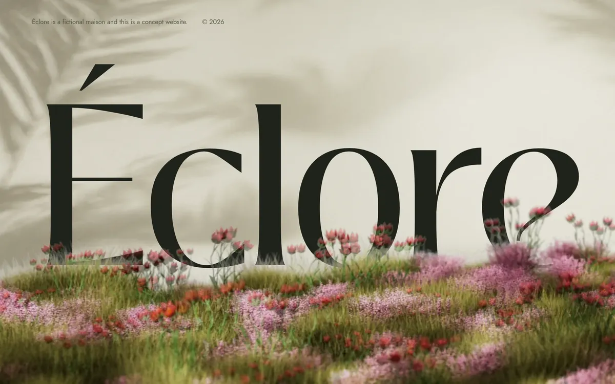
Choose a typeface with a clear personality, then adjust the spacing between the letters so the word looks even. Add one small change that nobody else has: a letter with a custom shape, an accent, a different weight for part of the name. The Éclore perfume house, one of our concept designs, sets its name in a high-contrast serif with sharp thick and thin strokes, and it makes the accent over the first letter part of the look.
Symbols: a shape that stands for you
A symbol is a picture that stands for the business without using words. Apple's apple is a pictorial mark, because you can recognize the object. Nike's swoosh is an abstract mark, a shape that means nothing literal until the brand gives it a meaning. Symbols are strong in small spaces: an app icon, a profile photo, a stamp, an embroidered cap.
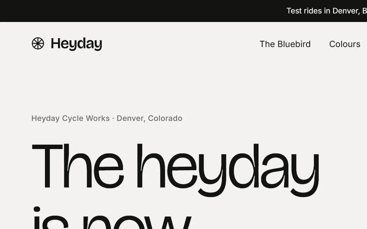
There is one catch. A symbol alone only works once people know who it belongs to, and that takes years and a lot of exposure. For a new small business, the practical route is to place the symbol next to the name. Heyday, our concept design for a bicycle maker, draws a wheel as a circle with spokes and sets it beside the name. A bike shop does not need a caption for that picture.
Why choose a symbol
- It is memorable and works without words.
- It fits small, square spaces such as a profile photo or the icon in a browser tab.
- It travels across languages, which matters if your customers speak English and Spanish.
Where symbols struggle
- It carries no meaning on day one. You build the meaning with use.
- Popular shapes, like globes, leaves and swooshes, look like thousands of other logos.
- A symbol that looks like another company's can bring a trademark dispute.
Emblems: the name inside a shape
An emblem puts the name and the picture together in one piece: a round badge, a shield, a seal or a crest. Harley-Davidson is a classic example. Emblems feel crafted and traditional, which is why you often see them on coffee, beer, barbershops, schools and workwear. They look good on packaging, stamps and signs, where there is room for detail.
The label on the Highway Roast can, one of our concept designs for a coffee brand, works the same way. The name sits under a mountain, a sun and a road, with a curve of small text above it, and everything reads as one stacked piece. A website could not put all of that into the header, so a brand like this also needs a simpler version.

Why choose an emblem
- It gives a feeling of craft, heritage and trust.
- It works well on physical things: packaging, stamps, signs and uniforms.
- The name and the picture are locked together, so they cannot be separated by mistake.
Where emblems struggle
- Details turn into a smudge when the emblem gets small.
- It is hard to fit in a wide, thin website header.
- It is the type most likely to need a simplified second version.
Lettermarks, mascots and combination marks
Lettermarks
A lettermark uses initials. IBM, HBO and CNN are well-known examples. It suits a long name that would be too small as a wordmark. The drawback is that initials say nothing until customers know them, so the full name should stay close by.
Mascots
A mascot is a character that speaks for the business. Mailchimp has its chimp and Michelin has its Michelin Man. Mascots suit friendly, family and food businesses, and they give you a face for social media and packaging. They need a good illustration, and they can look too playful for a serious service, like a law firm or a clinic.
Combination marks
A combination mark is a symbol or mascot with a wordmark. It is the most common choice for new small businesses, because it is flexible. You can use the full version in a header, the symbol alone for a profile photo and the name alone for a document. The logos in the previous lesson, from Lodestar, Halden, Snowmelt and Solvia, are all combination marks. The three pieces can be laid out side by side, stacked or tucked together.
How to choose your type
- Short, distinctive name: a wordmark.
- Long name: a lettermark for small spaces, with the full name in a wordmark for everything else.
- A craft or product that goes on packaging, signs or uniforms: an emblem, plus a simple version for the web.
- You need an icon for profile photos and the browser tab: a combination mark with a symbol that can stand alone.
- A friendly, family or kids brand: a mascot, if you can afford a good illustration.
- Not sure: start with a wordmark or a combination mark. They are the safest pair.
Also think about who will make the logo. A wordmark is within reach of most people. A symbol, an emblem or a mascot is usually a job for a designer or an illustrator.
Test your choice with five questions
Before you commit to a type, hold it up against these questions. Mock it up in a few minutes with any design tool, or even with paper and a marker.
- Can a stranger read it from across the street, on a sign or a van?
- Does it still work as a small, round profile photo?
- Does it look right on a dark background as well as a light one?
- Will it still fit if you add a service, a second location or a longer name?
- Can a printer, a sign maker or an embroiderer reproduce it correctly without guessing?
If the answer to two or more is no, try another type or simplify the one you have. A logo that fails these tests costs you more every time you use it.
Plan for small sizes
Whatever type you pick, plan a second, simpler version for tight spaces. On a phone, the logo in a website header is often about as wide as your thumb. A browser tab shows a square icon smaller than a coin. If the full logo does not survive at that size, make a short version: the symbol alone, a single letter, or a name without the descriptor. Keep both versions in the same folder, with clear names, so you and your printer always use the right one. The next lessons add color, fonts and voice around the logo, and these small versions will carry them all.
Logo types and trademarks
If you plan to register your name or your logo with the federal trademark office, the type you choose matters. A name filed in plain, standard characters protects the words themselves, in any style of lettering. A filing for the logo protects that particular design: the symbol, the layout and the lettering you drew. Many owners register the name first, because it covers every version of the logo, and add the design later if they need it. A wordmark made of ordinary words is harder to protect than a coined one, and a symbol that looks like someone else's can be refused or challenged. Search before you commit, and ask a trademark attorney if the logo is central to your business.
Logo types and your website
A website uses your logo in three sizes at once: a horizontal version in the header, a light version in the footer if the background is dark, and a small square icon in the browser tab. Before we start, it helps to know which type you have and to have a version for each place. You can see wordmarks, combination marks and badge-style marks in use in our designs, each one built around a different kind of business.
Questions people ask
What are the main types of logos?
The seven common types are the wordmark, the lettermark, the symbol (pictorial or abstract), the mascot, the combination mark and the emblem. Most small businesses use a wordmark or a combination mark.
What is the difference between a logo, a symbol and a brand mark?
Logo is the broad word for the whole identity mark, whatever its type. A symbol, also called a brand mark or logomark, is the picture part. A logotype, or wordmark, is the name set in type.
Which logo type is best for a small business?
There is no single best type. A wordmark is the simplest and works for short names. A combination mark is the most flexible, because you can split it into pieces. Choose the one that fits your name and the places you will use it.
What is a combination mark?
It is a logo that joins a symbol or mascot with the business name. The two can sit side by side, stacked or woven together, and you can usually use each part alone.
What is an emblem logo?
An emblem places the name inside a shape, such as a badge, a seal or a crest. It feels traditional and handmade, and it works best on packaging, signs and uniforms.
Is a wordmark enough?
Yes. Many successful brands use only their name. Add a symbol only if you need an icon for small spaces, or if a picture will help people remember you.
What is the difference between a logo and a brand?
The logo is the mark that identifies you. The brand is everything customers feel and expect from you: the logo, the colors, the fonts, the voice, the service and the reputation.
Should my logo include an icon?
Not always. An icon helps when you need a small square version, such as a profile photo or a favicon. If your name is short, a styled first letter can do the same job.
Can I change my logo type later?
Yes, and many businesses do as they grow. Change it gradually: keep the name, the main color and the feeling, so customers still recognize you. A sudden change can confuse them.
What is a lettermark?
A lettermark is a logo made of initials, such as IBM or HBO. It works for long names, but you still need the full name nearby, because initials alone say little.
Want a website that does all of this? Start your site