How to choose fonts for your brand
Two fonts are enough for a whole brand. Learn what each kind of type says, how to pair them and how to keep your text easy to read on any screen.
Fonts speak before the words do. A heavy, tall font shouts, a light serif whispers, and a handwritten one feels personal. You only need two fonts to cover a whole brand, plus a few rules to keep them readable. This lesson shows how to choose them, pair them and set them up for print and for the web.
Typeface and font, in plain words
A typeface is a design family, such as Inter or Georgia. A font is one version of it: a weight, a style and a size, like Inter Bold at 16 pixels. In daily talk, people say "font" for both, and that is fine. What matters is that a typeface usually comes in several weights, from light to bold, with italics, so one family can do many jobs. That is why two typefaces are enough for most brands.
Five kinds of type and what they say
Every typeface has a personality, and it shows before anyone reads a word. These are the main groups.
Serif: traditional, editorial, refined
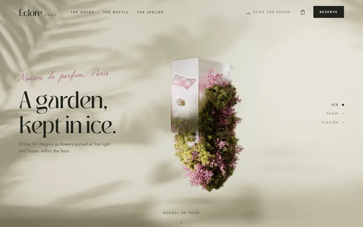
Serifs are the small feet at the ends of the letter strokes. They feel established and literary, which is why books, newspapers, law firms and perfume houses use them. A serif with sharp contrast between thick and thin strokes looks elegant. Éclore, one of our concept designs for a Paris perfume house, sets its headline in one and adds a handwritten script for the small line above it. The paragraph below uses a clean sans serif.
Sans serif: clean, modern, friendly
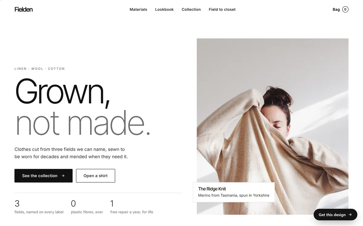
Sans serif means "without feet". These typefaces look simple and open, and they read well on screens, so they are the safe choice for most websites. A light weight in a large size feels calm and spacious. Fielden, our concept design for a clothing brand, sets its headline in a light sans serif at a very large size, with the second line in gray, and sets the paragraph in a sister design from the same family.
Slab serif: sturdy, outdoorsy, handmade
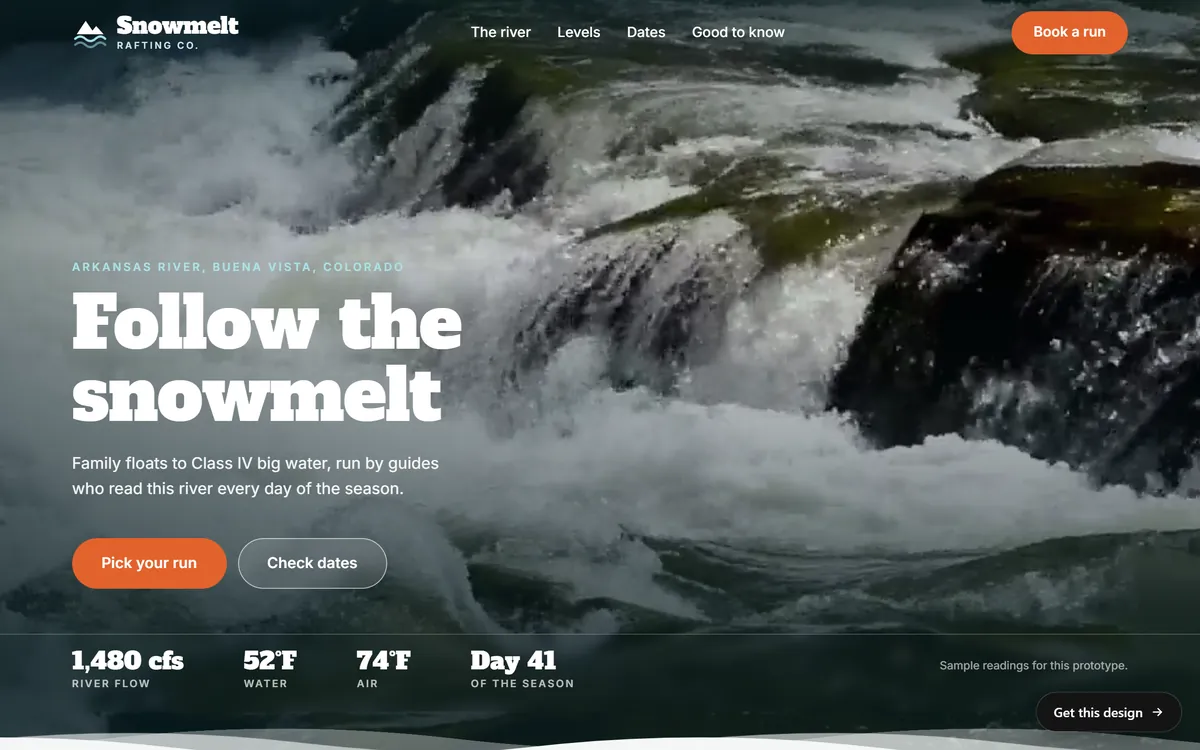
A slab serif has thick, block-like feet. It feels solid and a bit rugged, which suits outdoor, craft and workshop businesses. Snowmelt Rafting Co., our concept design for a river company, sets its headline in a heavy slab serif and its text in a plain sans serif. The contrast between the two keeps the page easy to read.
Script: personal, elegant, handwritten
Script typefaces imitate handwriting. They add warmth and a human touch, as the pink line on the Éclore page shows. Use them in small doses: a greeting, a signature, one short line. A whole paragraph in script is tiring to read.
Display: loud, built for big sizes
Display typefaces are designed to be seen large, with a strong personality. Highway Roast, our concept design for a canned coffee brand, uses a very heavy, tall and narrow typeface in capitals for its headline, which looks like a poster. It would be unreadable as body text, and it is not meant to be.

How to choose your fonts in five steps
Step 1: Start from the brand feeling
Take the three words that describe your brand and ask what kind of type fits them. Calm and precise points to a light sans serif. Warm and trusted may point to a friendly serif. Rugged and honest may point to a slab. Write the answer before you look at any font.
Step 2: Match your logo
Your fonts should feel related to your logo. If the logo has round, soft letters, choose round, soft fonts. If it uses sharp, narrow capitals, pair it with something that holds up next to that. You can use the same typeface as the logo for headlines, or a quieter one that shares its mood.
Step 3: Choose a headline font and a text font
The headline font can have character. The text font should be quiet and easy to read in long passages. If you want only one typeface, use a family with many weights and let the weight do the work.
Step 4: Pair with care
Two typefaces work together when they are clearly different or clearly related, and clash when they are almost the same. A heavy display font with a quiet sans serif is a safe pair. So is a serif with a sans serif. The easiest pair of all is a family designed together: Lodestar, our concept design for a lodge, pairs Alegreya, a serif, with Alegreya Sans, a sans serif drawn as its companion. Fielden uses Inter Tight for its headlines and Inter for its text, two sister designs. When you build hierarchy, use weight, size and color before you add a third font.
Step 5: Test with your own words
Type your business name, a headline, a paragraph, a price and a phone number in each candidate. Look at them on a phone and on a laptop. Then check the characters you need, which brings us to a detail that matters for many US businesses.
Check that the font speaks your language
Many display fonts are missing letters. If you write in Spanish, test á, é, í, ó, ú, ü, ñ, ¿ and ¡, in both lowercase and capitals. A font without them will either show a blank box or borrow letters from a different font, which looks wrong. The same goes for names with accents in any language. If you serve English and Spanish speakers, choose a font family whose character set covers both, and test it before you commit.
Make text easy to read
- Size. Body text on a screen should be about 16 pixels or larger. Small text is the most common complaint on phones.
- Line spacing. Leave about one and a half times the font size between lines. Tight lines are tiring.
- Line length. Aim for about 45 to 75 characters on a line. Longer lines make people lose their place.
- Contrast. Dark text on a light background, or the reverse, with enough difference to read in sunlight.
- Capitals. Use all capitals for a few words, such as a label. Do not use them for paragraphs.
- Weight. Avoid very thin weights for small text, and avoid placing them on photos.
- Alignment. Align paragraphs to the left. Centered text works for a headline or two lines, not for a long block.
A simple type scale to copy
A type scale is a short list of sizes for each kind of text. It keeps pages tidy and saves you from choosing a size every time. Here is a starting point for a website, which you can adjust.
- Main headline: 40 to 56 pixels, in a bold or medium weight.
- Section headline: 28 to 32 pixels.
- Subheading: 20 to 24 pixels.
- Paragraph text: 16 to 18 pixels, in a regular weight.
- Small print and captions: 14 pixels, and never smaller.
Write the scale on your brand page, next to the font names. On a phone, headlines shrink a little, so ask for sizes that adapt to the screen. The point is not these exact numbers. The point is a clear step between levels, applied the same way on every page.
Where to get fonts, and the license
You have three main sources. Google Fonts is a large open library, and its fonts are free for business use, including in logos, according to Google's own FAQ. The fonts that come with your computer, such as Arial and Georgia, are safe but common. Paid fonts, from type foundries or from a subscription service, offer more distinctive designs.
Whatever the source, read the license. Paid fonts often have separate licenses for print, for websites and for apps, and some charge by the number of page views. Check that the license covers logo use, since not every license does. Keep a copy of the license with your brand files, and do not use a font you have not paid for. Foundries do check, and using a font without the right license can lead to a claim.
Fonts on your website
Each weight of a font is a separate file that your visitor's phone has to download. Three weights load faster than ten. Ask for the compact web format, called WOFF2, or a variable font, which holds many weights in one file. Where you can, keep the font files on your own site, so visitors do not need a connection to another company's server, and choose a similar-looking backup font for the moment before yours loads. A slow font can leave blank space or make the page jump, and both feel unprofessional. The demo sites in this lesson all load their fonts from their own folders.
Font mistakes to avoid
- Too many fonts. Two is enough. Three is the limit.
- Two fonts that are almost the same. The difference looks like a mistake, not a choice.
- A script or display font for paragraphs. It is hard to read after one sentence.
- Thin, pale text on a photo. It disappears.
- A trendy novelty font. It dates your brand faster than any other choice.
- Ignoring accents and symbols. Test every language you write in.
- Using a font without a license. It can turn into a legal and financial problem.
- Using different fonts on every channel. A website, a menu and a flyer should look related.
Your fonts and your website
Fonts carry a lot of a website's personality, and they must work on every screen. When we design your site, we set the headline font and the text font once and keep them the same on every page, on phones and on desktops. If you already have brand fonts, tell us their names and send the license. If not, we will choose readable ones that fit your industry. You can see how different typefaces change the feel of a page in our designs.
Questions people ask
How many fonts should a brand use?
Two is enough for most brands: one for headlines and one for text. Use weight, size and color to create variety, rather than adding more fonts. Three is the practical limit.
What is the difference between serif and sans serif?
Serif fonts have small feet on the ends of the strokes and feel traditional or editorial. Sans serif fonts have none and feel modern and clean. Both can be readable, so choose by the feeling you want.
What are the best fonts for a small business website?
The best choice is a readable one that fits your brand. Popular and safe families include Inter, Open Sans, Lato, Lora and Playfair Display, all free on Google Fonts. Test them with your own words before you decide.
How do I pair fonts?
Choose two fonts that are clearly different, like a bold headline font with a quiet text font, or pick a family designed as a pair. Avoid two fonts that are nearly the same, and keep to two or three weights.
Can I use free fonts for my business?
Yes, if the license allows commercial use. Fonts from Google Fonts are free for business use. Be careful with free-font sites that do not state the license, and read the terms before using a font in a logo.
Do I need to buy a font?
No. Many brands work well with free families. A paid font can give you a more distinctive look, but it also brings license limits you must read and keep.
What size should my website text be?
About 16 pixels or larger for paragraphs, with about one and a half times that for the space between lines. Headlines are larger, and a clear step between sizes helps people scan.
What is a web font?
It is a font file your website sends to the visitor's device so the text looks the way you designed it. The common format is WOFF2. It needs a license that covers web use.
Should my logo font match my website font?
Not necessarily. The logo is usually drawn or adjusted for the name, so it can be unique. The website fonts should share its mood, and they can be the same family if you want a tight match.
What fonts work in Spanish?
Any font with a full Latin character set works, but check the accented vowels, the ñ, the ü and the opening marks ¿ and ¡, in capitals and lowercase. Test a few real sentences before you decide.
Want a website that does all of this? Start your site