How to choose your brand colors
You only need a handful of colors and a few rules. Choose them, test them for readability and write them down so everything you make matches.
Color is the fastest way people recognize you, and one of the easiest things to get wrong. The good news is that you only need a handful of colors and a few rules. This lesson shows how to choose them, test them and write them down, so everything you put out, from your website to your invoices, looks like it came from the same place.
Why color matters
People see color before they read a word. A steady set of colors makes your signs, your posts and your website feel like one business, and it makes you easier to remember. Color also sets a mood: calm, bold, warm, serious.
It is worth keeping this in proportion. Color does not sell by itself, and no color guarantees results. What helps is a palette that fits your business, can be read easily and is used the same way every time.
List every place your colors will appear: the sign, the van, the uniforms, the invoices, the website, the email signature, the social posts and the packaging. Each one needs the same colors, which is why you decide once and write the choice down.
The parts of a palette
A brand palette is not a pile of colors you like. Each color has a job.
- Main color. The one people connect with you. It appears in the logo and in the biggest areas.
- Support color. A second color that works beside the main one, for sections, icons and charts.
- Accent color. The color that means "click here": buttons, links and the one thing you want people to notice. Use it sparingly, so it stays loud.
- Neutrals. The quiet colors that carry most of the page: a dark shade for text, a light shade for backgrounds and a gray for lines.
Three to five colors in total is plenty. As a starting point, many designers use about 60 percent neutral or main color, 30 percent support color and 10 percent accent. It is a rule of thumb, not a law, but it keeps a page calm and keeps the accent noticeable.
What colors tend to say
Colors carry associations. In the United States, these are the common ones.
- Blue: trust, calm, order. Common in finance, health and technology.
- Green: nature, health, growth and, in the US, money.
- Red: energy, urgency, appetite. Common in food and sales.
- Orange: friendly, warm, active.
- Yellow: optimism and attention.
- Purple: creative, premium, thoughtful.
- Black: serious, modern, high end.
- White and cream: clean, simple, quiet.
- Brown and earth tones: natural, dependable, handmade.
Treat this list as a starting point, not a rulebook. Meanings change with culture, with industry and with the shade: a deep blue says something different from a bright one. If your customers come from several cultures, ask a few of them what a color suggests. Research links colors with personality traits, but the links are loose. Fit with your business and steady use matter more than any symbol.
How to choose your colors in seven steps
Step 1: Start from the feeling
Go back to the three words that describe your brand. Calm and precise points toward cool, quiet colors. Playful and fast points toward brighter, warmer ones. Pick a direction before you look at a single swatch.
Step 2: Look at your competitors
List the main colors of five businesses like yours. If everyone uses blue, a different main color can help you stand out. Do not go so far that you look wrong for your field: a neon pink funeral home would confuse people. The goal is to be recognizable and appropriate, not to be the loudest.
Step 3: Pick the main color
Use a color wheel or a free palette tool and choose a shade, not only a hue. Two blues can feel very different when one is deeper or lighter. Look at it large, since a color on a small swatch always looks different from the same color covering a wall.
Step 4: Build the rest of the palette
Add a support color, an accent and your neutrals. Colors that sit next to each other on the wheel feel harmonious. Colors on opposite sides create contrast, which suits an accent. A free palette tool can suggest matches. A near-black with a touch of your main color, instead of pure black, is usually easier on the eyes.
Step 5: Check the contrast
Contrast is how different two colors are in lightness. It decides whether people can read your text. The accessibility guidelines for websites (WCAG, level AA) ask for a contrast ratio of at least 4.5 to 1 for normal text, and 3 to 1 for large text, buttons and icons. Free contrast checkers, such as the one from WebAIM, calculate it in seconds. About 1 in 12 men and 1 in 200 women have some form of color vision deficiency, so never use color alone to carry meaning. Add a word or an icon beside it.
Step 6: Test in real places
Look at the palette on a phone in sunlight, on a laptop, on a printed card and as a small profile photo. Put it on a dark background and on a photo. If you will wrap a van or embroider a shirt, ask the shop for a sample, because screen colors rarely match them exactly.
Step 7: Write the codes down
A color you cannot name exactly will drift. Record a code for each color and give each one a name, such as Harbor Blue or Brick. Names make it easier to say what you mean when you talk to a designer or a printer.
Palettes on real sites
Four of our concept designs show how a few colors can do the work. Each one uses a dark or a quiet base, a small number of colors and one color that stands out.
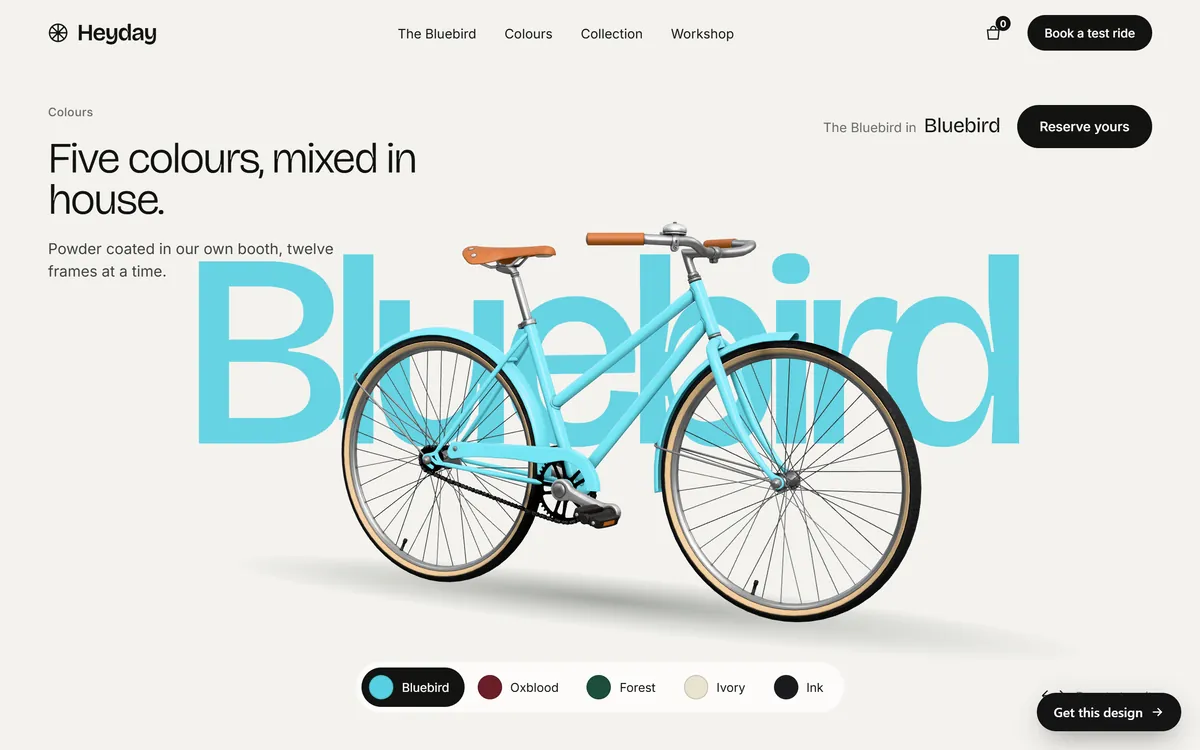
Heyday, a bicycle maker, goes a step further and names its paint colors. The page shows five swatches, Bluebird, Oxblood, Forest, Ivory and Ink, on a warm off-white page with black text. A named color is easy to remember and easy to ask for.
Good Dirt, a plant-based restaurant, uses a cream page and near-black lettering, with one rust orange kept for the Reserve tag and for a single note. The orange appears in so few places that the eye goes straight to it.

Norvane Energy, a maker of power systems, sets white text on a very dark indigo and keeps a violet for the words that matter, such as the second half of the headline. The header is white with a deep indigo button, so the same two or three hues appear from top to bottom.

Lodestar, a lodge under a dark sky, uses a night-sky page with cream text and a single warm, pale amber for its buttons. Against all that dark, the warm button is the first thing you see.

A palette in ten minutes
Here is how the steps come together for a made-up family bakery that wants to feel warm, local and honest.
- Main color: brick red, #A63D2F.
- Support color: wheat, #E8D5A8.
- Accent: deep green, #1F5C45, kept for buttons only.
- Neutrals: flour, #FBF7EF, for backgrounds, and charcoal, #2A2623, for text.
Charcoal text on the flour background has a contrast ratio of about 14 to 1, and white text on the green button is about 8 to 1. White text on the brick red is about 6 to 1. All three pass the accessibility test with room to spare. The bakery writes these five names and codes on one page and uses nothing else.
Hex codes, RGB and CMYK in plain words
You will hear three kinds of color codes, and you only need to know where each one goes.
- Hex. A six-character code starting with #, such as #FFFFFF for white and #000000 for black. It is the standard for websites. You copy and paste it, so you never need to work it out.
- RGB. Three numbers for red, green and blue light. Used by screens and by most design apps.
- CMYK. Four numbers for the inks cyan, magenta, yellow and black. Used for printing.
Ask your designer for all three for each color. If you only have a logo file, a free color picker tool in most design apps will read the codes from it.
Screen colors and printed colors
A screen makes color from light, and a printer makes it from ink. Very bright blues, greens and oranges that glow on a screen often look duller on paper. Paper also matters: the same ink looks different on glossy paper than on uncoated paper. Before you print a big batch of anything, ask for a printed proof and compare it with your screen. For signs, vehicle wraps and embroidery, ask the maker for a sample.
Color mistakes to avoid
- Too many colors. More than five or six turns a page into a patchwork.
- Light text on a light background. Pale gray on white is hard to read, especially outdoors on a phone.
- Red and green together. Many people with color vision deficiency cannot tell them apart.
- Copying a competitor's signature color. You invite confusion, and in some cases a legal complaint.
- Judging only on your own screen. Screens differ. Check the palette on at least two devices.
- Changing colors every season. Recognition comes from repetition.
- Forgetting dark backgrounds. Check that your logo and text work on dark as well as light.
- Using the accent everywhere. If every button and heading is bright, nothing stands out.
Your colors and your website
On a website, your colors do more than decorate. They tell people where to click, what is a heading and what is a quiet detail. When we build a site, we apply your colors to the buttons, the headings, the backgrounds and the links, and we keep one color for the actions you want people to take. If you already have color codes, send them. If you do not, the person who made your logo can read them from the original file. When you are ready, start your site and we will take it from there.
Questions people ask
How many colors should a brand have?
Three to five is enough for most small businesses: a main color, a support color, an accent and a couple of neutrals. More colors make it harder to stay consistent.
What are the best colors for a small business?
There is no single best color. The right ones fit your industry and your customers, are easy to read and stand apart from your closest competitors. Start with the feeling you want, then test the colors in real places.
How do I find the color codes in my logo?
Ask the person who designed it, since the original file lists them. If you only have an image, open it in a design app and use the color picker, sometimes called an eyedropper, to read the code.
What is a hex code?
It is a six-character code that names a color for screens, written with a # in front, such as #FFFFFF for white. Designers and website builders use it so the same color appears everywhere.
What is the 60-30-10 rule?
It is a guideline for balance: about 60 percent of a design in a dominant color, 30 percent in a second color and 10 percent in an accent. It is a starting point, and you can bend it.
Should I use black for text?
Black works, but a very dark gray or a near-black with a hint of your main color is easier to read for long text. Whatever you choose, check the contrast against the background.
What colors go well together?
Colors next to each other on the color wheel feel calm. Colors on opposite sides feel lively. A neutral base with one strong accent is the easiest combination to get right. A free palette tool can suggest matches.
Can I trademark a color?
In limited cases, yes. A color can be protected when customers link it to one company, which usually takes a long history of use. For a small business the practical point is simpler: do not copy a competitor's signature color.
Why do my colors look different in print?
Screens use light, and printers use ink, so the same color looks different. Bright, glowing colors suffer most. Ask for a printed proof, and give the printer CMYK values.
Do I need different colors for dark mode?
Not different brand colors, but you may need lighter versions of them. Check that your logo and text stay readable on a dark background, and keep a reversed logo ready.
Want a website that does all of this? Start your site