Writing for people who skim
Most people scan a web page instead of reading it. Here is how to write so that a scanner gets the point in ten seconds, and a reader finds the detail.
Most people do not read a web page. They scan it: the headings, the first words of a paragraph, the lists and the buttons. This lesson shows how to write so that a scanner gets the point in ten seconds, and a careful reader still finds the detail when they want it.
Most visitors scan, so write for scanners first
Researchers have been watching people use websites for more than twenty-five years, and the finding has hardly changed: people scan. In its early tests in the 1990s, the Nielsen Norman Group (NN/g), a well-known usability research firm, saw that most participants scanned a new page instead of reading it word by word. Later eye-tracking studies showed a pattern shaped like the letter F: people read the first lines across, then move down the left side, picking up the first words of each line. One NN/g analysis from 2008 estimated that visitors read roughly one fifth of the words on an average page. Treat that number as a benchmark and not a law, because pages and habits keep changing. The direction has held up.
There is good news too. NN/g also found that people do slow down and read when the layout and the copy help them find the part they care about. Scanning is how a visitor decides where to read. Your job is to make that decision easy and the reward worth it.
What a scanner looks at
A scanner's eyes jump between a few places. Put your most important words there.
- The headline and the headings. The first thing they read, and often the only thing.
- The first words of each paragraph and each list item. If those words are empty, the rest gets skipped.
- Bold words, numbers and names. They catch the eye.
- Lists and short blocks. They look easy, so people start reading them.
- Buttons and links. They show what the page lets you do.
- Captions under photos. They are short, so they are easy to take in.
Put the answer first
Journalists call it the inverted pyramid: give the main point first, then the reasons, then the details. Do the same in every section of your site. Start with the sentence that a skimmer needs, even if they read nothing else in that block.
Here is an example for an imaginary tax preparer.
- Buried: "For many years, our team has worked with people from all walks of life to help them navigate the often confusing process of filing their returns, and we are pleased to say that we can now also help you with the extension."
- Answer first: "We can file an extension for you. Bring last year's return and this year's income papers, and we handle the rest."
The second version says what the person gets in its first words, so a skimmer takes it in and a reader still gets the detail.
Write headings that carry the message
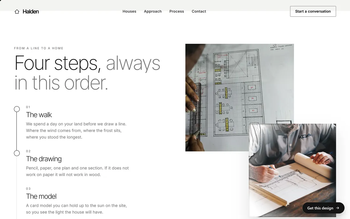
If a visitor read only your headings, would they understand your page? That is the best test of a heading. Halden, an architecture concept site, shows the idea. The section is headed "Four steps, always in this order." Under it, each step has a short name ("The walk", "The drawing", "The model") and one or two sentences. A visitor who reads only the names learns the process. A visitor who wants more reads the sentences.
Avoid headings that name a topic and say nothing, like "More information" or "Our approach". Prefer headings that make a point, as the lesson on headlines in this series explains.
Keep paragraphs short
A paragraph of one to three sentences is easy to scan. A paragraph of eight sentences looks like homework. Remember that a paragraph that looks short on a computer can take up most of a phone screen, so check your text on a phone. One idea per paragraph is a good rule. When you start a new idea, start a new paragraph.
Turn lists into lists
When you find yourself writing "first, second, third" or a string of items separated by commas, use a list. A list gives the eye places to land. Use bullets when the order does not matter and numbers when it does.
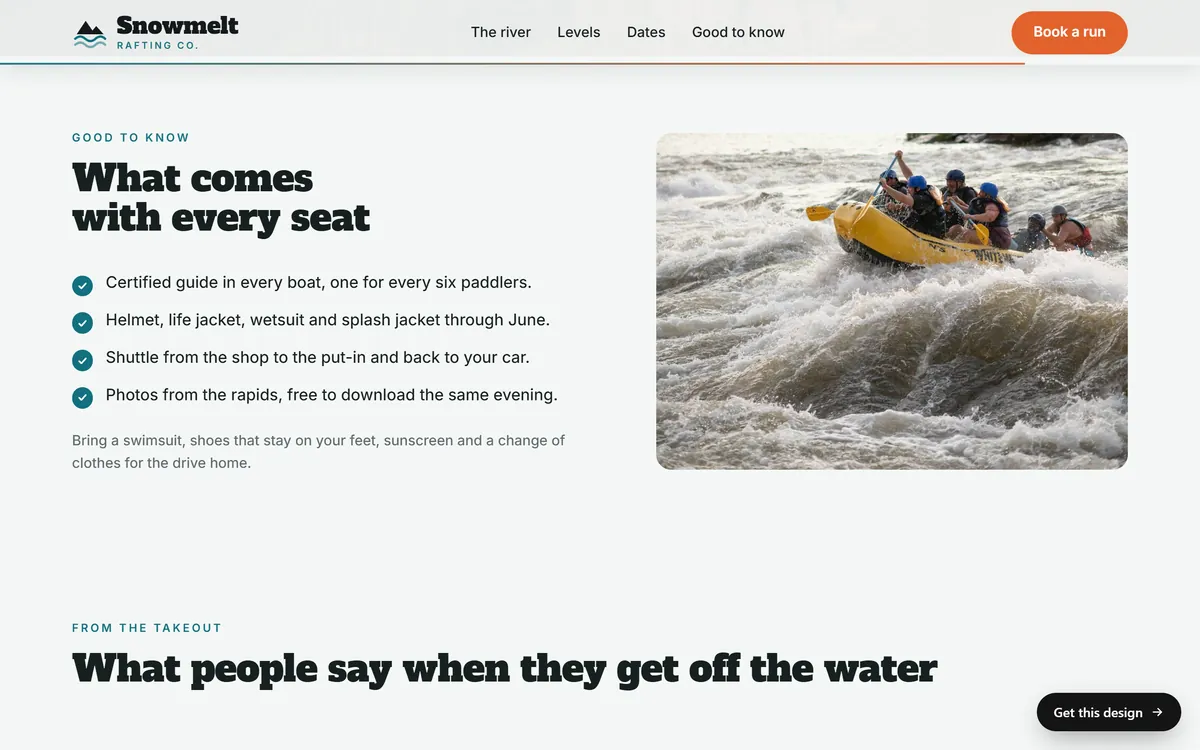
Snowmelt Rafting Co., a concept site, answers "what do I get?" with a short checked list under the heading "What comes with every seat". There are four items: a guide in every boat, safety gear, the shuttle and photos. Each item is one sentence, and each starts with the thing the customer receives. A note below adds what to bring.
A few rules make lists work better.
- Keep them between three and seven items. Longer lists need groups with their own headings.
- Make the items parallel. If one starts with a verb, they all should.
- Put the key word first. "Shuttle from the shop to the river" beats "A shuttle is provided from the shop".
Build cards the same way every time
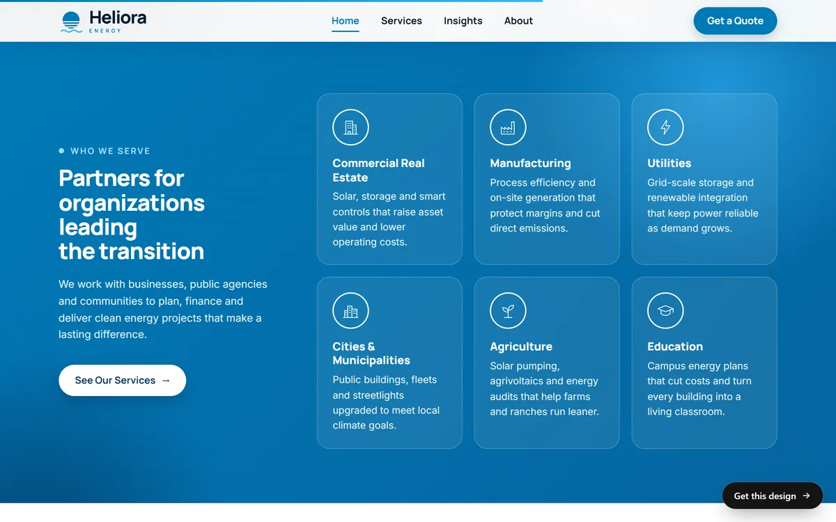
Cards, the small boxes with a title and a few words, are made for skimming when you keep them consistent. Heliora, an energy concept site, lists six kinds of customers in six cards. Every card has an icon, a plain name and one sentence about what the company does for that kind of customer. Because the structure never changes, a visitor learns it with the first card and then reads only the names until they find their own.
Keep the sentences in a set of cards about the same length, and start each with a title that stands on its own.
A before and after: one block, rewritten for skimmers
Here is a paragraph from an imaginary roofing company, followed by a rewrite.
- Before: "Our company has been serving the community for many years and we are proud to offer a complete range of roofing services, including repairs, replacements and inspections, and our team will work with you through every step of the process, from the first call until the final cleanup, to make sure you are completely satisfied."
- After, heading: "Roof repair, replacement and inspection".
- After, first line: "One crew takes care of it from the first call to the last cleanup."
- After, list: a written quote before work starts; the same crew from start to finish; cleanup every day.
- After, button: "Ask for a quote".
The rewrite has fewer words, and it says more. A skimmer who reads only the heading and the button knows what the page offers and what to do.
Use bold with care
Bold is a highlighter. If everything is highlighted, nothing is. Use it for a few key words per section: the word that carries the point, a name, a number. Never bold whole sentences. Do not underline, because people take an underline for a link. Avoid all capital letters, which are slower to read.
Choose plain words
Short, familiar words are quicker to read than long ones. They also sound like you. Here are a few swaps.
- "Use" instead of "utilize".
- "To" instead of "in order to".
- "Start" instead of "commence".
- "Help" instead of "assistance".
- "Buy" instead of "purchase".
- "Because" instead of "due to the fact that".
Prefer active sentences ("We repair the roof") to passive ones ("The roof will be repaired by our team"). Keep sentences to one idea. When a sentence needs three commas, think about splitting it.
Use facts the eye can catch
Numbers and concrete details stand out in a block of text. "Open seven days", "Two crews" or "Since 2016" catch a scanner's eye in a way that "experienced and reliable" never will. Use them only when they are true and you can back them up, and keep them close to the claim they support.
Use a table only when you compare
A table is the right tool when visitors compare things across the same points, such as packages or sizes. Keep it small, with three or four columns at most, because wide tables are hard to use on a phone. For anything else, a list or a set of cards is easier to scan.
Give the summary first and the detail after
Skimmable does not mean shallow. It means layered. Give the headline first, then a sentence or two that summarize, then the detail for people who want it. A visitor who is just checking gets the point. A visitor who is serious can keep reading. For long information, such as the details of a service, use short sections with headings, and let a reader choose what to open.
Make links and buttons make sense out of context
People scan links too, and screen readers read them as a list. "Click here" and "Read more" mean nothing when they stand alone. Write links that say where they lead: "See the four steps", "Get a quote", "Read our repair promise". Buttons follow the same rule. Say what happens.
Real headings help everyone
When your site is built, make sure headings are real headings, not just bigger bold text. A real heading has a level: the main title is the top level, and the sections below it are the next level. Screen reader users jump from heading to heading to find the part they need, and search tools use headings to understand the page. Keep the order logical, and do not skip levels to get a different size.
Test your page in five ways
- The headings test. Read only the headings, in order. Do they tell the story?
- The squint test. Blur your eyes. What stands out? It should be the main headline, the key words and the button.
- The five-second test. Show the page to someone for five seconds and ask what it is about.
- The read-aloud test. Read the text out loud. Wherever you stumble, rewrite.
- The phone test. Read the page on your phone, with one hand, as a customer would.
Mistakes to avoid
- Walls of text. A long block with no breaks gets skipped.
- Important words inside images. Text in a picture cannot be read by screen readers, and it often looks tiny on a phone.
- Light gray text on a light background. It looks elegant and is hard to read.
- Centered paragraphs. Centered text is hard to scan. Keep body text aligned to the left.
- Long lists without groups. Fifteen items need headings.
- Everything in bold. The reader cannot tell what matters.
- Key information in a PDF. Visitors on phones avoid it. Put it on the page.
Pages built for skimmers
Our designs are built from short sections with clear headings, lists, cards and buttons, so that a quick visitor finds the point at a glance. We write your texts in short blocks to match, from the answers you give us on day 1, and every site has a mobile version. Each stage has one round of changes, which is a good moment to read your page the way a visitor would, and tell us what to shorten. You can see how the sections of different designs are organized in our designs.
Questions people ask
Why do people skim websites?
They have little time and many choices, and a page is not a book. They scan to decide whether a page is worth reading. Good structure helps them decide quickly.
How long should a paragraph be on a website?
One to three sentences. Remember that a paragraph that looks short on a computer can fill a phone screen, so check your text on your phone.
What is the F-pattern?
It is a reading pattern that eye-tracking research from the Nielsen Norman Group found on text-heavy pages. People read across the top, then down the left side, picking up the first words of each line. It is why headings and the first words of each line matter.
Is it okay to use bold text?
Yes, for a few key words in each section. Do not bold whole sentences, and do not use underlines, which look like links.
Should I use bullet points?
Yes, when you list things. Keep lists between three and seven items, make them parallel and start each with the key word.
How do I write for people on their phones?
Use short paragraphs, clear headings, large buttons and plain words. Read your page on your phone before you approve it.
What reading level should I write at?
Write the way you would explain things to a customer in person: short sentences and common words. Simpler is almost always better, even for expert readers.
Does skimmable writing hurt my Google results?
No. Clear headings and short, helpful sections make a page easier for people to use, and Google's advice is to write for people first.
How can I tell if my page is easy to scan?
Try the five tests in this lesson: headings only, squint, five seconds, read aloud and phone. If a stranger can tell what the page is about in five seconds, it is working.
Should I put important information in an image?
No. Screen readers cannot read text inside an image, and it often shrinks on a phone. Write important information as real text.
Want a website that does all of this? Start your site