How to write your home page
A home page has a few seconds to say what you do, who it is for and what to do next. Here is how to write each part, with examples from real designs.
Your home page has a few seconds to answer three questions: what do you do, is it for me, and what do I do next. This lesson shows how to write each part, from the headline to the last button, with home pages we designed for businesses like yours.
A home page answers three questions
Think about who lands on your home page. Someone found you on Google, on a map, on a business card, or a friend sent them the link. They know very little about you, and they are comparing you with the other tabs they have open. They will not read your page from top to bottom. They will glance at it and decide.
In that glance, they look for three answers.
- What do you do, and where? A stranger should be able to say it back in one sentence.
- Is it for me? They look for their own situation: their kind of home, their kind of business, their city, their problem.
- What should I do next? One clear step: call, book, ask for a quote, order.
A fourth question hides behind the three: can I trust you? Proof answers it, and we cover it below. Everything on the page serves one of these questions. If a sentence does not help answer them, move it lower on the page or to another page.
Write the headline first
The headline is the biggest text on the page, so it does most of the work. The safest headline says what you do, for whom and, if it matters, where. "Family dentist in Tampa" is plain, and it works because the right person knows at once that the page is for them.
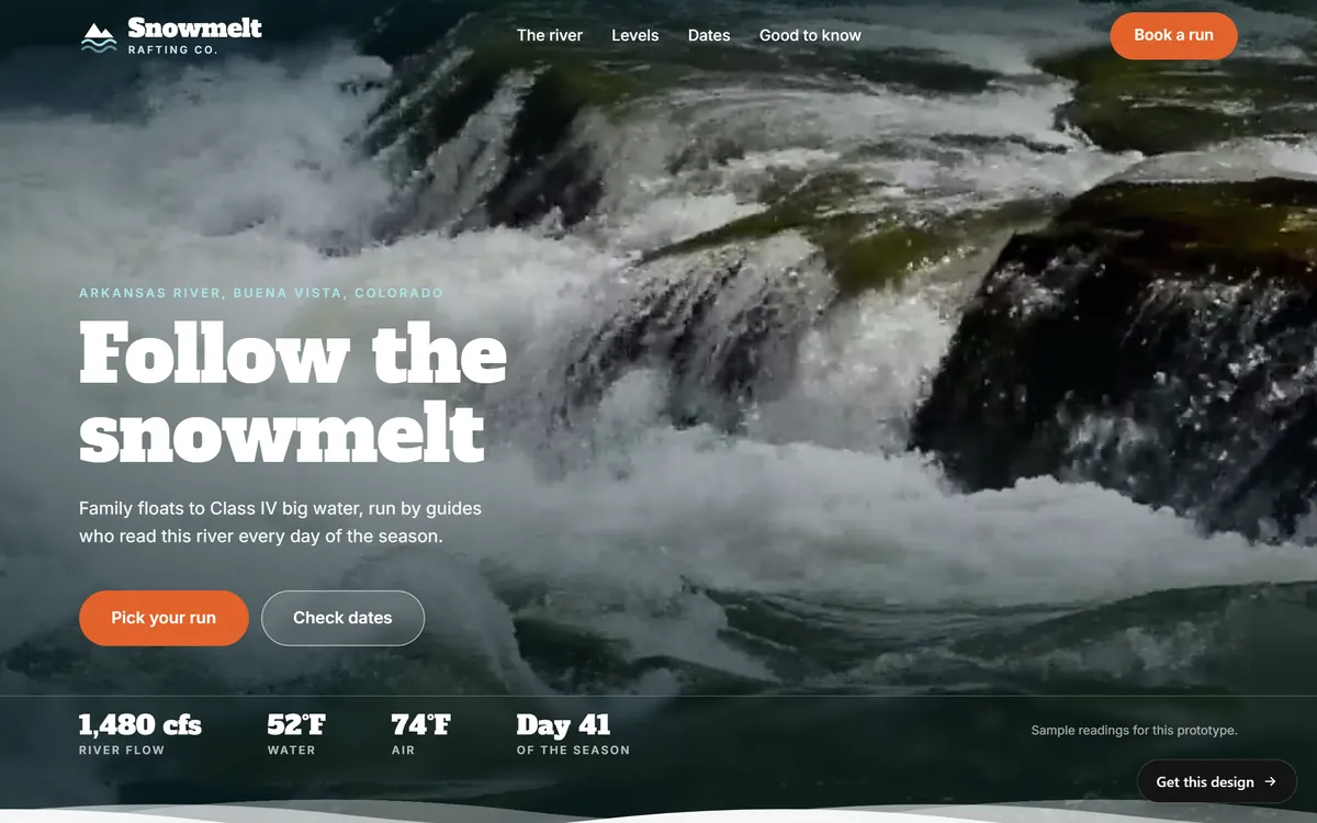
Some brands want a headline with more feeling. That can work, but only when something close by says plainly what the business does. Snowmelt Rafting Co., one of our concept sites, opens with "Follow the snowmelt". On its own, that is a small poem. The page puts the river and the town above it (Arkansas River, Buena Vista, Colorado), and it says below it who the trips are for: family floats to Class IV big water, run by guides who read the river every day of the season. The poem catches the eye, and the lines around it do the explaining.
A simple formula to start from: what you do + who it is for + the place or the benefit. Write five versions and pick the clearest one. A later lesson in this series goes deep on headlines, so do not get stuck here.
Add one or two sentences under it
The line under the headline is where you explain. Use it to name what you sell, who it is for and one reason to choose you. Keep it to two sentences at most.
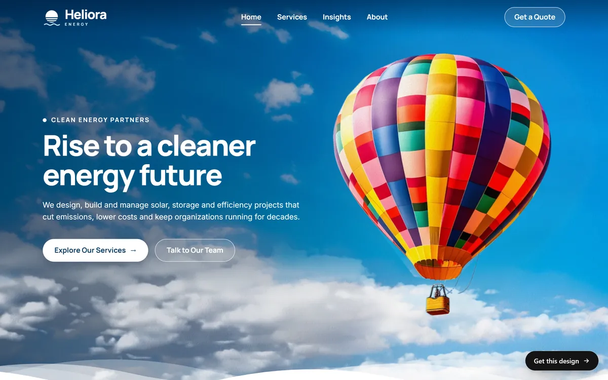
Heliora Energy, another concept site, opens with the headline "Rise to a cleaner energy future". The sentence under it does the explaining: the company designs, builds and manages solar, storage and efficiency projects, and the goal is lower costs and fewer emissions for organizations. Read the two together and you know the offer.
Write this sentence with nouns and verbs a customer would use. "We design, build and manage" is clear. "We leverage synergies to deliver outcomes" tells nobody anything. If you catch yourself using a word you would never say to a customer, replace it.
Give visitors one main button
After the headline and the sentence, the visitor needs something to do. Choose one main action and make it the most visible button on the first screen. The words on it should say what happens when someone clicks.
- Clear: Pick your run, Book a visit, Get a quote, Call us, Order now.
- Weak: Submit, Click here, Learn more, Go.
You can add a second, quieter button for people who are not ready. Snowmelt pairs "Pick your run" with "Check dates", and Heliora pairs "Explore Our Services" with "Talk to Our Team". One suits a visitor who wants to look around, the other a visitor who wants to talk. Past two buttons, the choices start to compete with each other.
If most of your customers phone you, show your phone number at the top too, written as text so a phone can dial it with one tap.
The order of sections after the first screen
Once the first screen works, the rest of the page follows the questions a visitor asks next. This order suits most small businesses.
- What you offer. Three to six short blocks, each with a plain name and one sentence, each leading to its own page.
- How it works. Three or four steps, so people know what happens after they contact you.
- Proof. Reviews, real photos, numbers you can back up, certifications, places you serve.
- A short piece about you. Two or three sentences and a photo, with a path to your About page.
- Questions people ask. The three or four that block most sales. A longer list belongs on its own page.
- A final call to action. The same main action, repeated, for the person who scrolled all the way down.
Not every business needs all six. A one-person business may combine two of them. What matters is that the order follows the visitor's thinking, not your own filing system.
Show how it works in three steps
People hesitate when they cannot picture what happens next. A short step-by-step removes that worry. Solvia, a community solar concept site, explains its service in three blocks: "See if you qualify", "Pick your garden" and "Save every month". Each title starts with a verb, and each block adds a sentence about what the customer does and what Solvia handles.
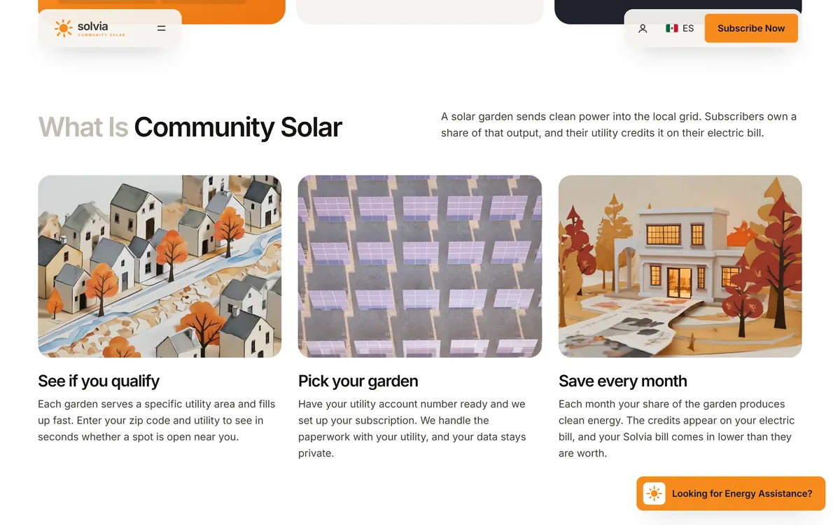
Write your own steps the same way. Name each step with a short action, add one sentence, and say who does what. If the first step is easy, say so, because people judge a service by how easy it is to start.
Prove it near the top
Anyone can write "we are the best". Proof is what makes it believable. Put some proof on your home page, close to the claims it supports.
- Real customer quotes with a first name and a town. The reviews lesson in this series shows how to collect and show them.
- Numbers you can show, such as years in business or jobs completed, only if they are true and you can back them up.
- Licenses, insurance, certifications and memberships, named exactly.
- Photos of your own work, your own place and your own people.
- Names of the places and partners you really work with.
Never invent proof, and never round up. If you have been in business for eight years, write eight, not "over a decade".
Write to "you" more than to "we"
Count the words "we", "our" and "us" in your draft, then count "you" and "your". Most first drafts are about the business, and visitors care about themselves. Turn statements about you into statements about them. For an imaginary cleaning company, here is how that looks.
- Instead of "We offer a wide range of cleaning services", write "Your office, cleaned after hours, so it is ready when your team walks in."
- Instead of "Our staff are highly trained", write "The same two people clean your space every week, so you never explain it twice."
You do not have to remove every "we". A line like "We answer every message the same day" is fine when it is true and it helps the visitor. The point is the balance.
End with a call to action
People who read to the bottom are the most interested people you have. Do not make them scroll back up to find the button. Snowmelt ends its page with "The water is running. Come get in it." and the same "Book a run" button that opened the page.
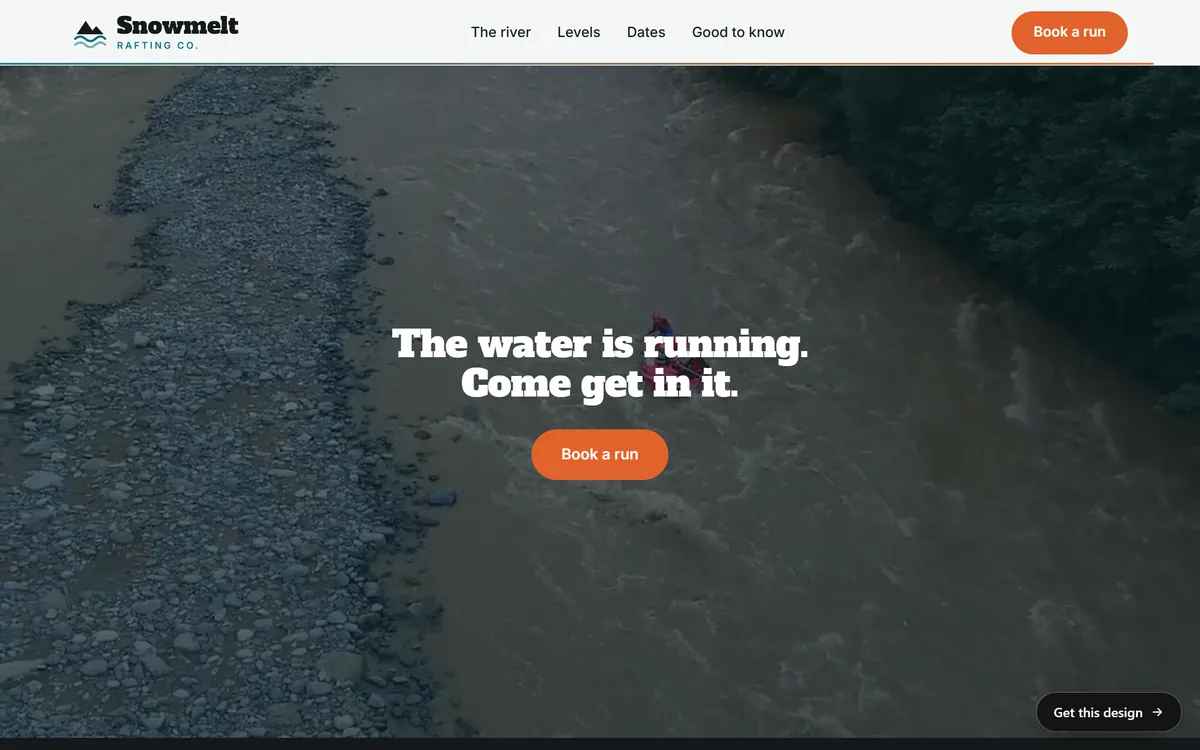
A good closing section has one sentence that gives a reason to act and one button. It can also repeat your phone number. It does not need a new pitch.
Use the swap test
Read a sentence from your draft and imagine your biggest competitor's name in place of yours. If the sentence still works, it is too generic. "Quality service at fair prices" passes the swap test for every business on earth. "A written quote before we start, and Saturday appointments" does not, because it says what one business actually does. (That line comes from an imaginary plumber, so do not copy it. Write what is true for you.)
How long should a home page be
There is no magic number. Google's own advice on writing helpful content says it has no preferred word count, so you do not need to stretch a page to reach a length. Write as much as it takes to answer the visitor's questions, and no more. For most small businesses that means a few hundred words, split into short blocks under clear headings, with the most important blocks first. A long page is fine when every block earns its place, and a short page is fine when it answers everything.
Home page mistakes to avoid
- "Welcome to our website." It spends the best spot on the page to say nothing.
- A mission statement first. Visitors want to know what you do before they care why.
- A slogan with no meaning. If the line could sit on any company's page, it is not working.
- Too many choices. Seven buttons and four menus make people leave.
- Hidden contact details. Your phone number, city and hours should take one second to find.
- Writing for yourself. Industry words, inside jokes and your whole history belong on other pages.
- Everything on the home page. Give the details to your service pages and let the home page act as a map.
Write your home page in one afternoon
Here is a method that works even if you do not think of yourself as a writer.
- Answer the three questions in three sentences. What do you do, and where? Who is it for? What should they do next?
- Write five headlines. Use the formula above, then pick the clearest.
- List your main services and write one sentence for each, starting with the result for the customer.
- Write your three steps. What happens from the first contact to the finished job?
- Collect your proof. Quotes, photos, licenses, numbers you can verify.
- Write the final call to action, with one sentence that says why to act now.
- Read it out loud. Cut anything you would not say to a customer standing in front of you.
- Wait a day, then cut a little more. Most first drafts are longer than they need to be.
Show the finished page to a stranger
Last, show your home page to someone who does not know your business. Give them five seconds, then take it away and ask three questions. What does this business do? Who is it for? What would you do next? If any answer is wrong, fix that spot. You rarely need to rewrite the whole page.
Your home page and Good Sites Only
When we build a site, the home page texts are written for you. You answer a few questions from your phone on day 1, and your texts are written on days 1 and 2, so you never start from a blank page. Each stage has one round of changes, which is your chance to fix anything that does not sound like you. You can see how real home pages read in our designs.
Questions people ask
What should be on the home page of a small business website?
A headline that says what you do, a sentence that explains it, one main button, your main services, how it works, some proof, a short piece about you and a final call to action. Your phone number and city should be easy to find.
How long should a home page be?
As long as it takes to answer the visitor's questions. Google says it has no preferred word count. For most small businesses, a few hundred words in short blocks is enough.
What makes a good home page headline?
It is clear before it is clever. It tells the right person what you do and, if it matters, where. If your headline is more poetic, add a plain line right under it.
Should I start my home page with "Welcome to our website"?
No. Visitors know they are on your website. Use the top of the page to say what you do and who you help.
Should I list all my services on the home page?
List your main ones in short blocks, with a plain name and one sentence each, and let each block lead to its own page. Put the details on the service pages.
Should my home page show prices?
It depends on how you sell. If your price is fixed, a starting price helps people decide. If every job is different, explain what affects the price. A later lesson in this series covers offers and prices pages in detail.
How many buttons should a home page have?
One main action, shown clearly, plus one quieter option at most. You can repeat the main button in other sections, but keep it the same action.
Should I put a video on my home page?
A video helps when it shows something words cannot, like your workplace or your work. Do not rely on it for your message. Many visitors will not press play, so say the key points in text too.
How often should I change my home page?
Check it whenever something real changes: your hours, your services, your offer or your contact details. Read it through every few months, and fix whatever no longer matches the business.
What is the difference between a home page and a landing page?
A home page is the front door for everyone, so it points to many places. A landing page is built for one action, such as a special offer, and it leaves out everything that distracts from it.
Want a website that does all of this? Start your site