Website designs for small businesses, explained one by one
A design is a set of decisions about what visitors see first and what they are invited to do. Here are eight of ours, with who each one is for.
A website design is more than colors and fonts. It is a set of decisions about what a visitor sees first, what they read next and what they are invited to do. A bakery, a lodge and an architecture studio need different answers. In this lesson we walk through eight of our designs one by one. For each, you will see what kind of business it fits, and what a visitor sees: the layout, the type, the colors and the sections as you scroll. All of them are concept websites that we designed, so the names, prices and facts on them are examples.
How to read a design
When you look at any website, five things explain most of its personality. Train your eye to notice them, and choosing a design becomes much easier.
- Layout. How the page is arranged: one big image, many small ones, columns, a long story that you scroll through.
- Type. The style of the letters. Heavy and condensed feels loud, thin and wide feels calm, a serif with curves feels classic.
- Color. A pale page feels open and a dark one feels dramatic. One bright accent tells the eye where to click.
- Pictures. Photos of products, places, people or drawings. They set the mood faster than any words.
- The main action. The one thing the page asks you to do: reserve, book, buy, ask for a visit.
Eight designs, one by one
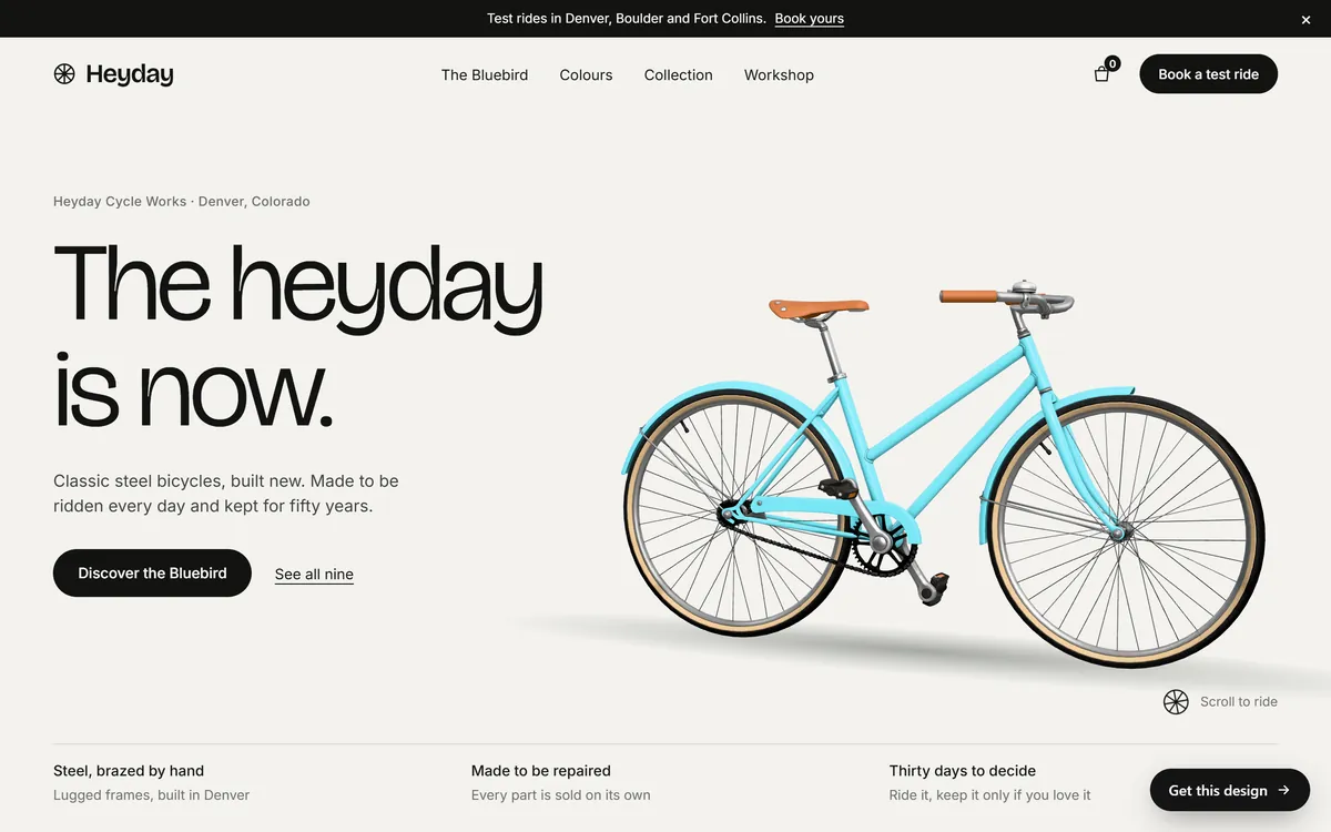
Heyday: for a maker with one star product
Fits. A business that makes or sells one main product in a small range of models, such as a bicycle workshop, a furniture maker or a small-batch brand. The visitor needs to fall for one thing, learn what makes it different and take a first step.
What a visitor sees. A warm off-white page, a thin black headline in a light sans-serif and a single turquoise bicycle with a soft shadow. A black bar at the top announces test rides, the header has a bag icon and a black Book a test ride button, and a row of three short facts sits along the bottom. As you scroll, the page moves through the main model, its parts, five colors, the full collection, notes from riders, how to care for the bike, a look at the workshop and a form to ask for a test ride.
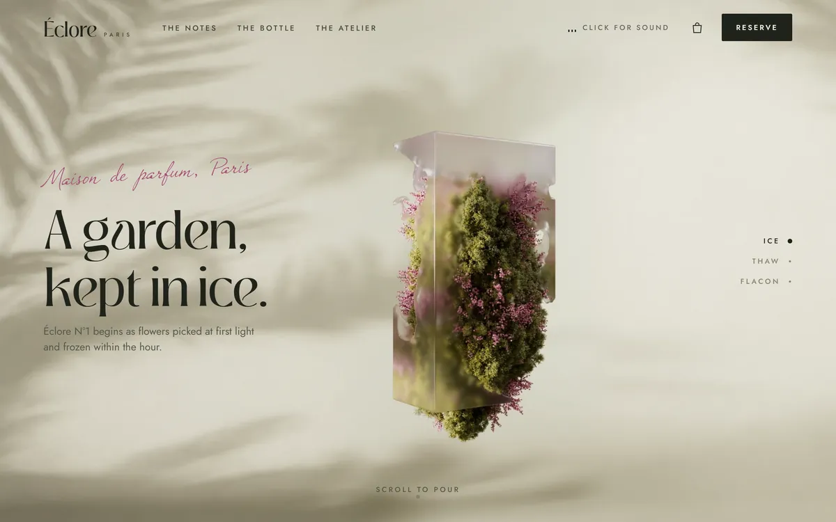
Eclore: for a premium product with a story
Fits. A premium product that sells through feeling: perfume, candles, skin care, jewelry or fine chocolate. It suits brands that want to be admired before they are compared.
What a visitor sees. A sand-colored page with the soft shadow of palm leaves, a note in pink script above a large, elegant serif headline and a block of ice holding flowers in the middle. The header is quiet: small spaced capitals, a bag icon, a Click for sound button and a dark Reserve button. Further down are a short manifesto, three scent notes, the bottle with size options and an Add to bag button, a section about the studio with a form to book a visit, short quotes from customers and an invitation to a newsletter.
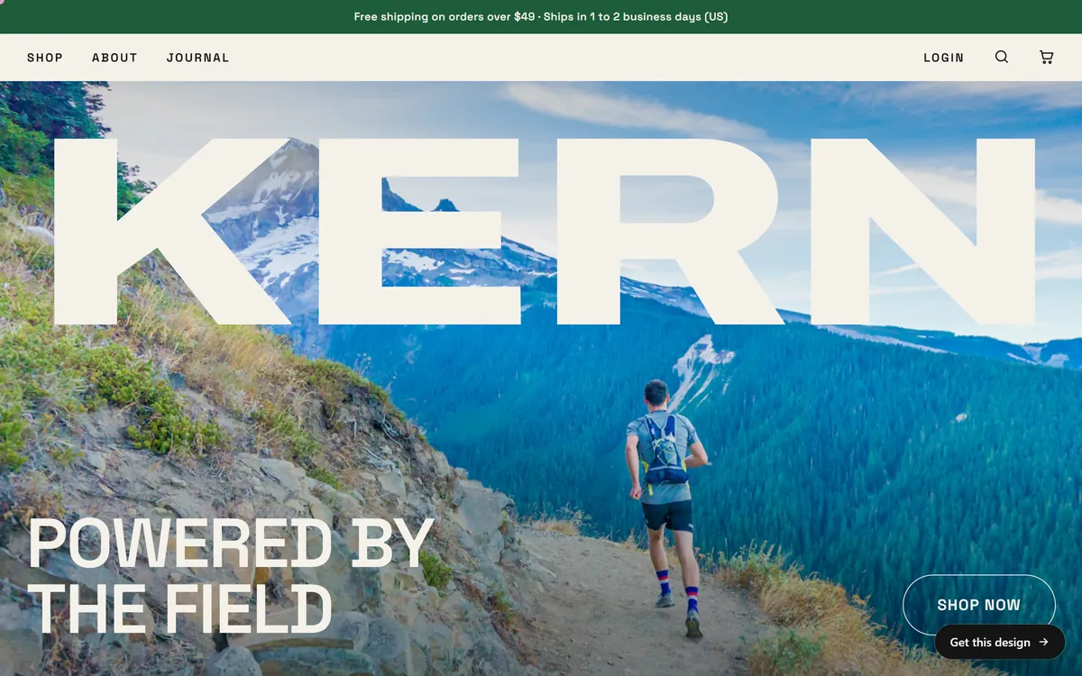
Kern: for a store with many products
Fits. An online store with several product lines, such as food and drink, supplements or gear, where customers browse, compare and add items to a cart.
What a visitor sees. A strip at the top with the shipping terms, a tidy header with Shop, About and Journal on the left and login, search and cart icons on the right, and a full-screen photo of a trail runner in the mountains. A giant cream KERN stretches across the top of the photo, the line Powered by the field sits at the bottom left and an outlined Shop now button sits at the bottom right. Below, the page shows rows of products with Add to cart buttons, a statement, flavors, the story of the bars, products grouped by goals such as muscle, strength, endurance and balance, formulas, a journal and a newsletter form.
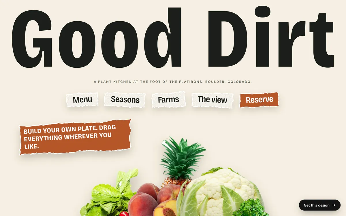
Good Dirt: for a restaurant or cafe
Fits. Restaurants, cafes, bars and bakeries. The page has to make people hungry, show the menu, say when you are open and let them reserve.
What a visitor sees. A cream page topped by the name in huge, extra-heavy letters, a small line that says where the kitchen is and five menu links shaped like paper stickers, with Reserve in burnt orange. A rust-colored note invites people to drag the vegetables around, which makes the first screen feel playful. The rest of the page includes a menu with food photos, prices and filters for dietary needs, a seasonal calendar, a section about the farms, a seating plan for reservations, a clear block with hours and address and a footer that repeats the name in large cream letters on dark green.
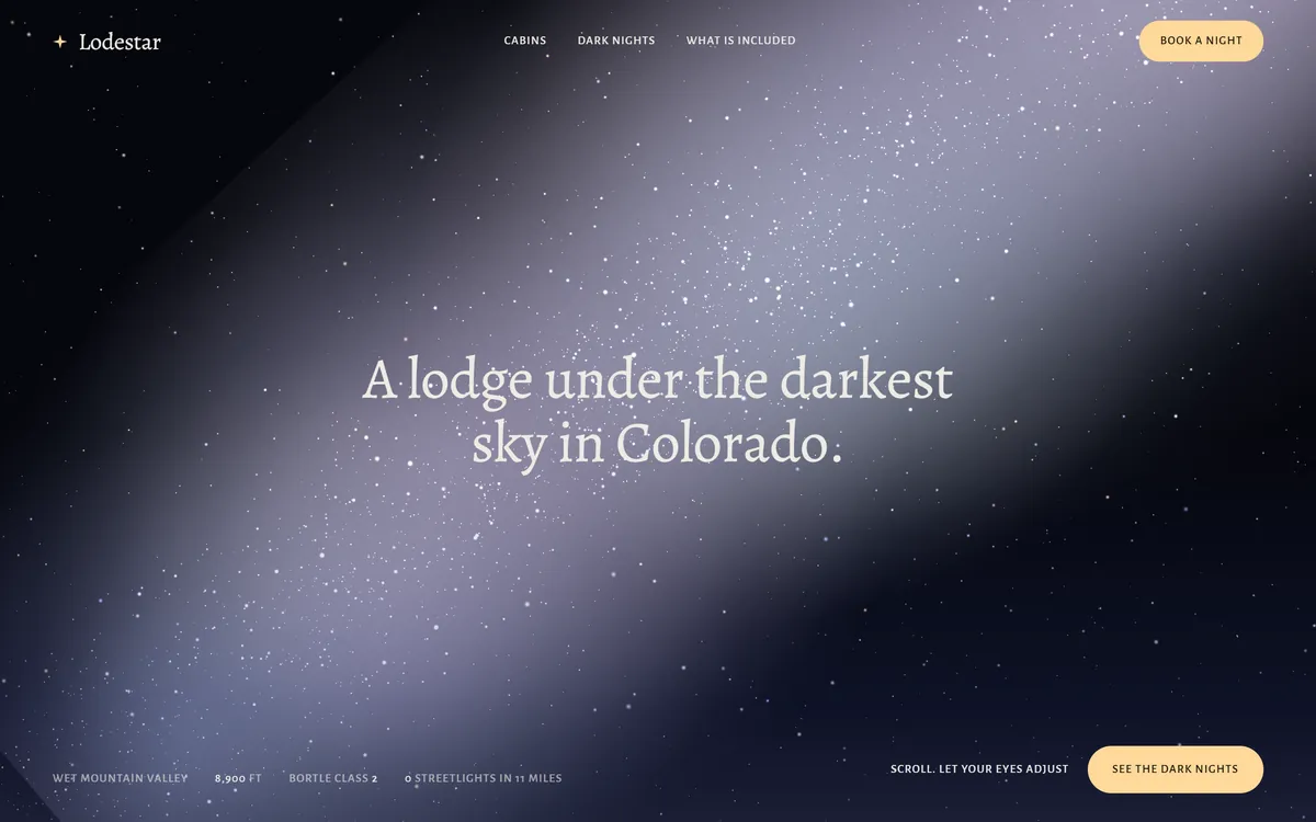
Lodestar: for a lodge or a stay
Fits. Lodges, cabins, bed and breakfasts, retreats and vacation rentals, where the place and the mood are the product, and the main action is to book nights.
What a visitor sees. A deep blue-black night sky with a pale band of stars and a headline in a soft serif: A lodge under the darkest sky in Colorado. The menu is small and spaced, with a peach Book a night button at the top right. Along the bottom, short facts about the place, such as the altitude and the number of streetlights nearby, sit next to a second peach button. The page goes on to a glass roof over the bed, six cabins in three sizes, a moon calendar for choosing nights, what is included and a short form to ask for dates.
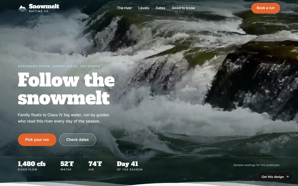
Snowmelt: for tours and outdoor activities
Fits. Tour operators, guides, outfitters, schools and any activity that people book by date.
What a visitor sees. Full-screen footage of rushing water, the name of the river and the town in small capitals, and a headline in a heavy slab serif, Follow the snowmelt. An orange pill button, Pick your run, and an outlined one, Check dates, stand out against the dark water, and a strip with river readings sits along the bottom. Below there is a map of the rapids, the levels of difficulty, a booking calendar that shows a trip summary as you pick, a quote over a full-width canyon scene, a list of what comes with every seat, short reviews and a closing invitation to book.
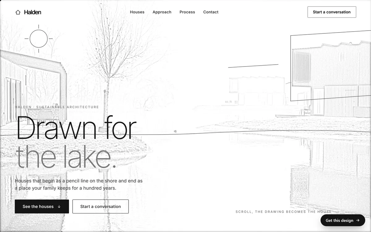
Halden: for a studio that sells its work
Fits. Architects, interior designers, builders, photographers and consultants, where the quality of the work speaks and the main action is to start a conversation.
What a visitor sees. A white page with a pencil drawing of a house by a lake, and a very large, very light headline in two tones: Drawn for the lake. A sentence explains the idea, a solid black button invites you to see the houses and an outlined button starts a conversation. The menu is short, and the whole page is quiet. As you scroll, the drawing turns into the house, and the page moves through a series of projects, photos of rooms that look out, the studio's approach, a four-step process and a final invitation to write.
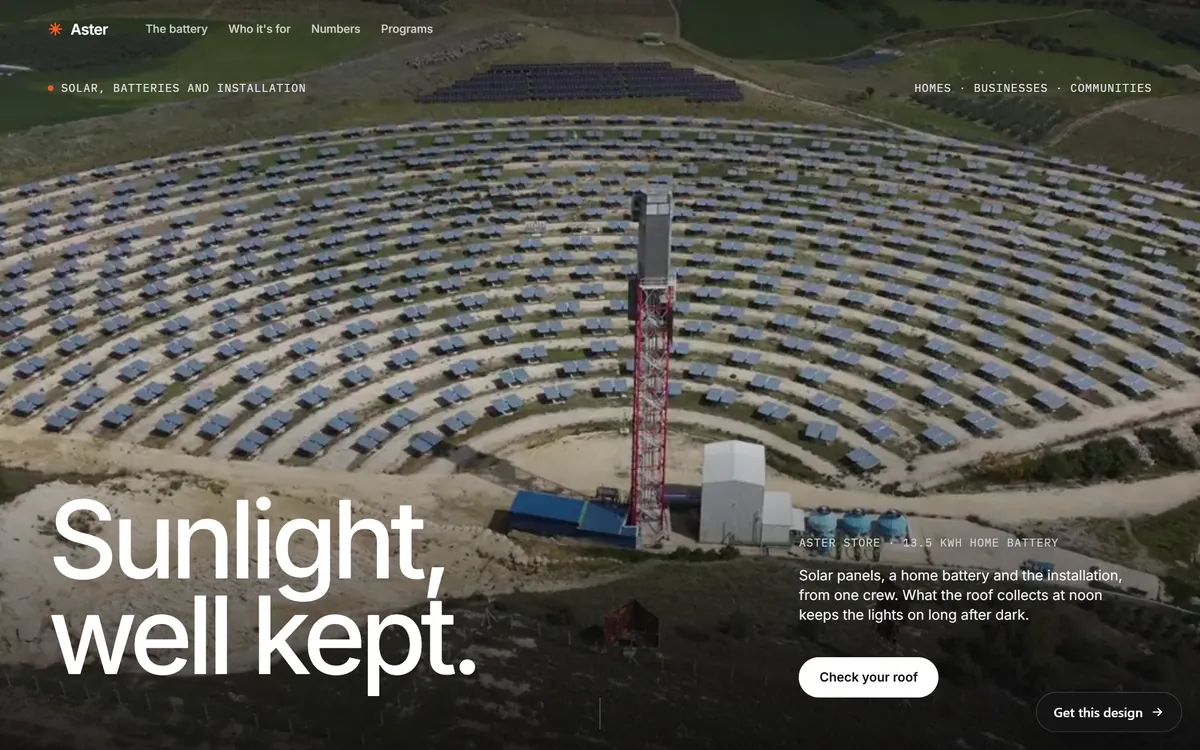
Aster: for a home-service company that gives quotes
Fits. Solar installers, roofers, electricians, heating and cooling companies and other trades where the customer wants an estimate before a visit.
What a visitor sees. A full-screen aerial photo of rows of solar panels around a tower, a very large white headline, Sunlight, well kept, and a small block with a plain sentence and a white Check your roof button. Small monospaced labels give the page a technical feel. Below, black sections with white type explain how the system is built, show a video of the panels and give the numbers, and a savings calculator invites the visitor to try three answers. The page ends in a bright orange section with a short form to book a roof visit.
More designs for more kinds of business
These eight are only part of the range. Our designs page also includes Fielden, for a clothing brand, Ridgeborn, for outdoor gear, Highway Roast, for coffee, and several energy companies: Heliora, Solvia, Aeolis and Norvane. Each is drawn for its industry, with its own layout, type and mood.
How to choose between them
Do not pick a design because it is the prettiest. Pick it because it fits the way your customers decide. These questions help.
- What do your customers do on your site? Book, buy, ask for a quote or look at your work? Choose a design whose first screen puts that action first.
- How do they decide? By feeling, by price, by proof or by seeing the work? A restaurant sells with photos and hours, a studio with projects and a trade with a quick estimate.
- What mood should they feel? Calm, loud, premium, friendly, technical? The type and color of a design carry most of it.
- What pictures do you have? A design built around big landscapes needs great landscapes. One built around drawings or products needs those.
- Would your best customer trust it? Show the first screen to someone who looks like your ideal customer.
A quick guide: if you take bookings, look at Good Dirt, Lodestar and Snowmelt. If you sell products, look at Heyday, Eclore and Kern. If your work is your pitch, look at Halden. If you give quotes, look at Aster.
Make a design your own
A design is a starting point. Your name, logo, colors, photos and texts change it into your site. The structure, the order of sections and the way the page guides a visitor come from what works for your kind of business. If a design has one feature you love and one you do not, say so when you review the mockup. Remember that everything you see in this lesson is a concept: the businesses, prices and facts are examples, and yours will be your own.
How Good Sites Only works with designs
Every site we build starts from a design made for your industry. We write your texts, include hosting, a mobile version, search engine setup and contact forms, and you see the mockup on days 3 and 4, with one round of changes. The site is built and checked on days 5 and 6 and goes online on day 7. Packages depend on the number of pages: Basic up to 15, Pro from 15 to 30 and Large for more than 30. Explore all of our designs and note the two that feel closest to your business.
Questions people ask
How do I choose a website design for my business?
Start with what your customers do on the site, and pick the design whose first screen puts that action first. Then think about mood, pictures and how your customers decide. Look at designs for your own industry before others.
Which design is best for a restaurant?
Good Dirt is built for restaurants and cafes: food photos, a menu with filters, a seating plan for reservations and a clear block with hours and address. Any design for a food business should put the menu and the booking button within reach.
Which design is best for a service business that gives quotes?
Aster is built around an estimate and a visit request, with a calculator and a short form. Halden suits a studio that wants conversations about projects. Choose the one that matches how your customers ask for help.
Which design suits an online store?
Kern suits a store with many products, Heyday suits a maker with one main product and Eclore suits a premium product with a story. Pick by how many products you sell and how customers choose.
Can I change the colors, fonts and photos of a design?
A design is a starting point. Your logo, colors, photos and texts make it yours. If you want to adjust something, tell us in the mockup review on days 3 and 4, where you have one round of changes.
Are the businesses in these designs real?
No. They are concept websites that we designed. The names, prices, hours and facts on them are examples, and your own site will show your real information.
How many pages can my site have?
It depends on the package. Basic includes up to 15 pages, Pro from 15 to 30 and Large more than 30. Most small businesses start with a few pages and grow.
How long does it take to build a site from a design?
A site goes online on day 7 of the project. You answer a few questions on day 1, your texts are written on days 1 and 2, you see the mockup on days 3 and 4, and the site is built and checked on days 5 and 6.
Does the design affect my Google ranking?
A design alone does not decide your ranking. Content, speed, a good mobile version and clear structure matter more. Search engine setup is included in every site we build, and the design should help visitors find what they need quickly.
What if none of the designs fits my business exactly?
Designs are made for kinds of business, not for each business. Choose the one closest in mood and layout, and tell us what you would change. Your colors, pictures and words will make it feel different from any other site.
Want a website that does all of this? Start your site