Your home page: what goes on the first screen
Visitors decide in seconds whether to stay. The first screen has to say what you do, who it is for, why to trust you and what to click.
Most visitors decide within seconds whether your site is worth their time. The first screen, the part you see before you scroll, has to answer four questions fast: what is this, is it for me, can I trust it and what do I do next. This lesson shows what goes on that screen and in what order, with four real examples from our designs, and ends with a simple five-second test you can run on your own home page.
What the first screen has to do
A visitor who lands on your home page is quietly asking four things. If the first screen answers them, they keep going. If it does not, they go back to the search results and open the next business.
- What is this. The headline and the picture should show what you do, in words a customer would use.
- Is it for me. The page should make it clear who you serve and where, so the right person feels welcome.
- Can I trust it. A fact, a number, a real photo or a rating shows that the business exists and does good work.
- What do I do next. One clear button shows the next step: call, book, ask for a quote or see the work.
Think of the first screen as a promise. The rest of the page exists to keep it. If the promise is vague, even a great page below it will not be seen.
What above the fold means
The phrase comes from newspapers, where the top half of the front page was visible when the paper was folded on a newsstand. On a website, above the fold means the part you see without scrolling. The difference is that the fold is not fixed. A phone shows far less than a large monitor, so your first screen has to work on both.
Usability research has found that people give the first screen the most attention, and also that they do scroll when the first screen gives them a reason. So the goal is not to cram everything above the fold. The goal is to make the first screen clear and to make people curious about what comes next. A small trick helps: let a sliver of the next section show at the bottom, so the page does not look finished before it is.
Design the key message so that it fits on a phone screen. On larger screens, the extra room can carry a bigger picture, never extra clutter.
The seven parts of a strong first screen
1. A headline that says what you do
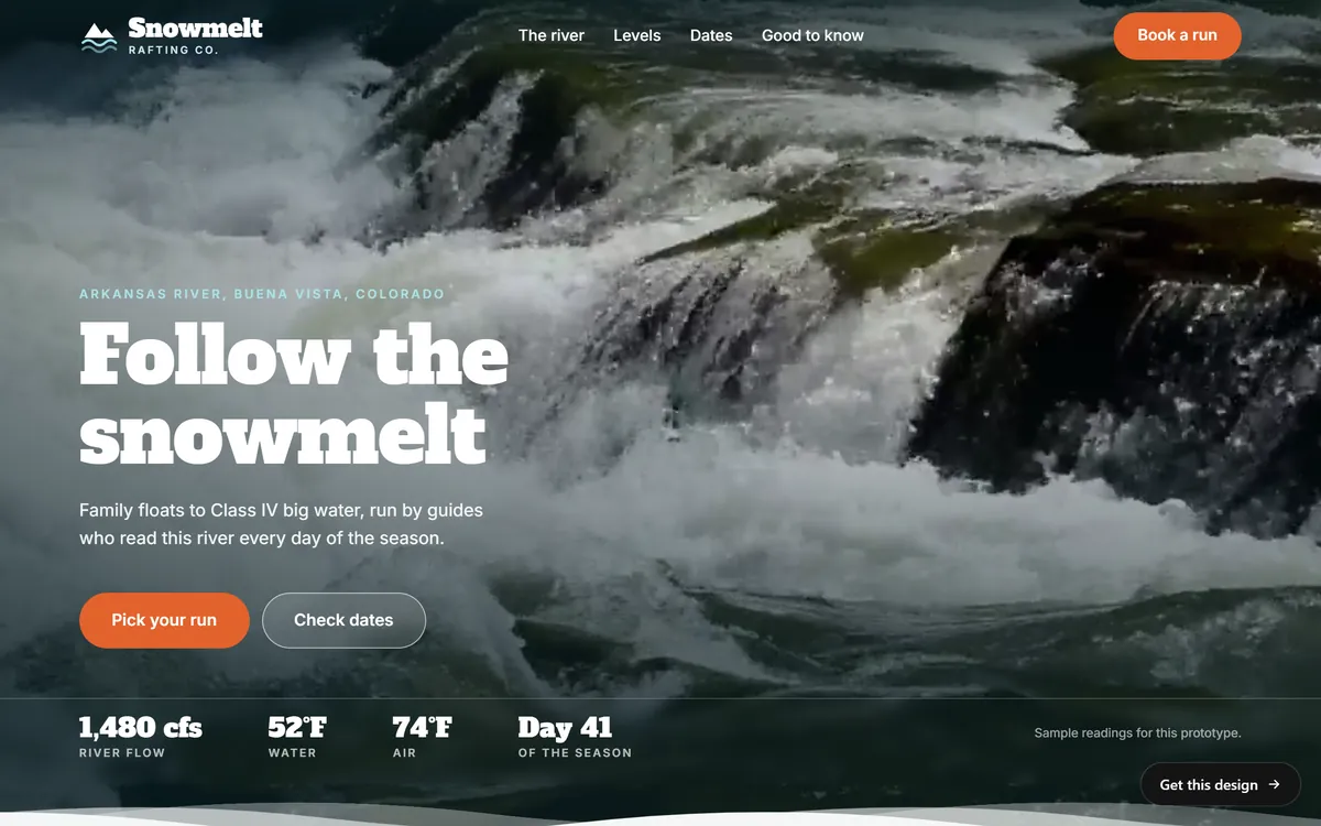
The best headline tells a stranger what you do, who it is for and where, in a few words. It can also have a little personality. The Snowmelt Rafting Co. screen below opens with a small line that names the river and the town, then a headline, then one sentence that explains what the trips are. A visitor knows the activity, the place and the kind of experience within a few seconds.
2. A plain line next to a clever headline
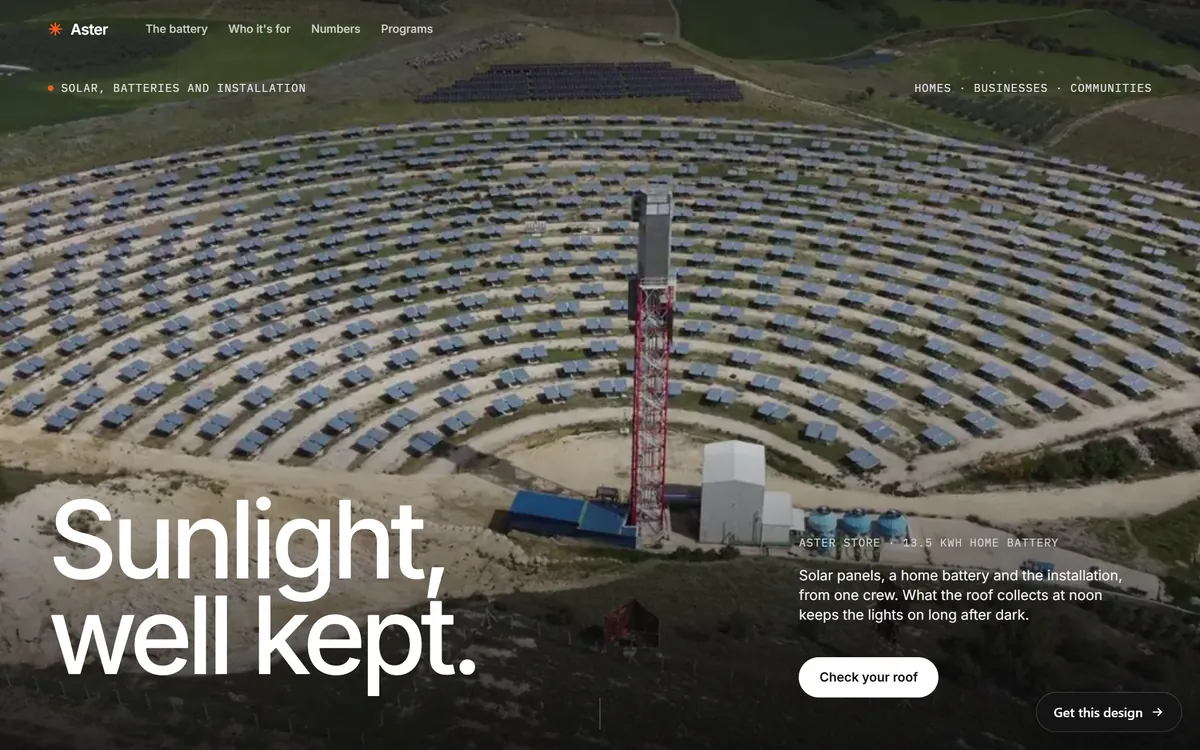
Short, poetic headlines are memorable, but they can hide what you sell. The solution is to put a plain sentence right next to them. On the Aster screen, the headline is Sunlight, well kept. It is a pleasant phrase, but the sentence beside it names the products: solar panels, a home battery and the installation, from one crew. If you like a poetic headline, add a plain line. If your headline is already plain, use the second line for proof or a detail.
3. One main button
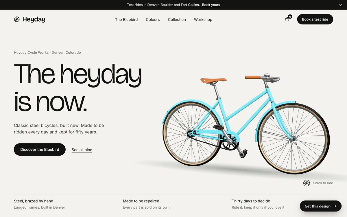
Choose the single thing you most want a visitor to do and make it the most visible button on the screen. The Heyday screen offers one solid black button, Discover the Bluebird, and a quieter text link next to it. The header repeats a second action, Book a test ride, which is the same family of action. Everything else on the screen stays out of the way. When a screen has five buttons of the same weight, visitors do not click any of them.
4. A real picture or video
Show the thing itself: the bicycle, the river, the dish, the team, the finished work. A picture that shows what you do answers the first question faster than any sentence. Avoid generic pictures that could belong to any business, and avoid pictures that cover the words. The next lessons explain how to choose photos and when video helps.
5. A quick proof
Add one fact that makes the promise believable. It can be a number, a rating, the years you have been in business, a license, a guarantee or a short list of what makes you different. Heyday shows three short statements along the bottom of its first screen, such as how the frames are made and how long a customer has to decide. Snowmelt shows a strip of river readings under its buttons: flow, water and air temperature, and the day of the season. Use only proof that is true and that you can show.
6. Simple navigation
The menu helps people who know what they want. Keep it to about four to six items, name them with plain words such as Services, About and Contact, and make the logo a link back home. If your main action matters, put it in the header too, as a button. On a phone, the menu collapses into an icon, which the next lesson covers.
7. Something to do right away
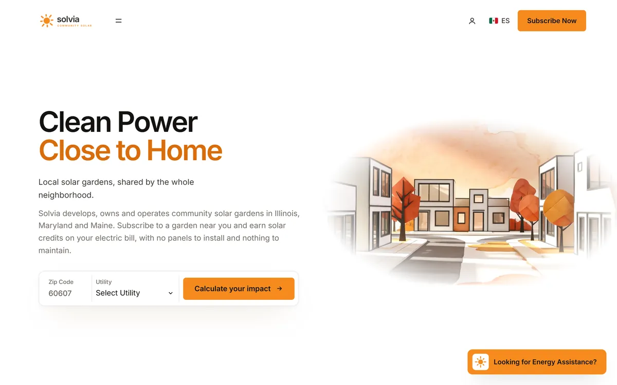
For some businesses, the best first screen is a small tool instead of a button. The Solvia screen asks for a zip code and a utility and offers a button that says Calculate your impact. The visitor starts doing something in the first five seconds, and the result gives them a reason to continue. Calculators, quote forms and booking pickers suit businesses where the next step is a concrete choice.
What to put first, by type of business
These are starting points, not rules. Check them against what your own customers ask.
- Restaurant or cafe. A photo of a dish, your hours, and the buttons Reserve a table and See the menu.
- Plumber, electrician or other trade. A phone number that can be tapped, the area you serve, a button to request a quote and a line about your license.
- Dentist or clinic. A friendly photo, a button to book a visit, the area you serve and any insurance you accept.
- Photographer or designer. Your best image, one line about your style, and the buttons See my work and Check my dates.
- Store. Your best-selling product, a shipping line and a Shop now button.
- Consultant or coach. Who you help, the result you deliver and a button to book a call.
- Lodge or tour operator. The place, the season and a button to check dates.
What to leave off the first screen
- Rotating sliders. They hide most of their messages and are easy to miss. Choose one message.
- Welcome to our website. It says nothing. Start with what you do.
- Vague slogans. Phrases like Quality and excellence could belong to anyone.
- Many buttons. One main action, one quieter second option at most.
- Pop-ups on arrival. Let people see the page before you ask for anything.
- Sound that starts by itself. It surprises people, and many leave.
- Text over a busy picture. If words are hard to read, darken the picture behind them or move them.
- An oversized logo. A huge header pushes your message below the fold.
Write your first screen in four lines
Before you think about design, write these four lines on paper.
- The headline. What you do, for whom and where.
- The supporting line. One detail or one proof that makes the headline concrete.
- The button. The main action, written as a verb: Request a quote, Book a table, Check dates.
- The proof. A real fact: your Google rating and number of reviews, your years in business or a guarantee you really offer.
Here is an invented example. A family plumber in Tampa might write: headline, Family plumbing repairs in Tampa, same day. Supporting line, Licensed and insured, with the price explained before we start. Button, Request a quote. Proof, your real star rating and review count from Google. Four lines, and a stranger knows what you do, where, why to trust you and what to do next. You can polish the words later, and a later lesson covers writing the home page in detail.
The five-second test
You are too close to your own site to judge it, so borrow someone else's eyes.
- Pick a person who does not know your business well.
- Show them your first screen for five seconds, then hide it or turn the screen away.
- Ask three questions: what does this business do, who is it for and what would you click.
- Write down their words exactly, and try three or four people.
- If most of them cannot answer, change the headline or the picture first, since those do most of the work.
Run the test again on a phone, because the first screen there contains less.
How Good Sites Only builds the first screen
Each design we make opens with a first screen drawn for a kind of business, so the layout, the type and the picture already suit your field. Your texts are written for you on days 1 and 2, including the headline and the supporting line, and you see the mockup on days 3 and 4 with one round of changes. A mobile version, contact forms, search engine setup and hosting are included. When you are ready, start your site.
Questions people ask
What should be on the first screen of a home page?
A headline that says what you do, a supporting line, one main button, a real picture, a quick proof and a simple menu. Together they answer what this is, who it is for, why to trust it and what to do next.
What does above the fold mean on a website?
It means the part of a page you can see without scrolling. Because screens come in many sizes, the fold changes from device to device. Make sure your key message fits on a phone screen.
Do people scroll on websites?
Yes, when the first screen gives them a reason. Research on how people read pages shows that the first screen gets the most attention, and that people keep scrolling if what they see is clear and useful. Put the message first and the details below.
How long should a home page be?
Long enough to answer the main questions of your customers, and no longer. A typical stack is a first screen, proof, a short look at your services, how it works, a few words about you and a final call to action.
How many buttons should the first screen have?
One main button and, if needed, one quieter secondary option. Repeating the same action in the header is fine. More choices make people less likely to click any of them.
Should I use a slider or carousel on my home page?
Usually not. Sliders show one message at a time, many visitors never see the later ones, and they can slow the page. One strong message works better, and you can place the others further down.
Should my home page have a video?
Only if it helps, and only if it is light and silent when it starts. A background video can set the mood, but it must not hide the headline or slow the page. The video lesson in this series covers when it helps and when it hurts.
What is the best headline for a home page?
One that tells a stranger what you do, for whom and where, in words they would use. Cleverness is optional. If you use a poetic headline, put a plain sentence next to it.
Should the phone number be on the first screen?
If most of your customers call, yes. Put it in the header, as a number that can be tapped on a phone. If your main action is booking or a quote, make that the main button and put the phone number nearby.
How do I know if my first screen works?
Run the five-second test with a few people. If they can tell you what you do, who it is for and what to click, it works. Later, your analytics will show how many visitors take the main action.
Want a website that does all of this? Start your site