How to design for phones first
Start with the smallest screen, decide what matters most, then add room for bigger ones. The result is a simpler, faster site on every device.
Many business owners build their site on a big screen and hope it works on a phone. Designing for phones first turns that around. You start with the smallest screen, decide what really matters, and then add room for bigger screens. The result is a site that is simpler, faster and easier to use everywhere. This lesson explains why phones come first, what changes on a small screen and how to test your own site on a real phone.
Why phones come first
There are four good reasons to start with the phone, and none of them depends on a trend.
- Google looks at the phone version. Google mostly uses the phone version of your pages when it decides how to list and rank them. This is called mobile-first indexing. If your phone version is weak, your site has a weak version in Google's eyes.
- A large share of visits come from phones. Public traffic figures for the United States differ from one source to another, and the mix is different for every business, so check your own numbers once your site has some visitors.
- Phone visits happen in real life. People search while they walk, wait or drive someone to practice. They hold the phone in one hand, often on a slow connection, and they want an answer now.
- A small screen forces good decisions. When you have room for only one headline and one button, you have to choose the most important ones. Those choices improve the big-screen version too.
What phone-first design means
Phone-first does not mean phone-only. It means the order of your work. You plan the content and the layout for a narrow screen first, in a single column, and then you let the design spread out when more room is available. Bigger screens get larger pictures, side-by-side columns and more breathing space, but not more things to read.
A simple way to work this way:
- List your content in order of importance. What does a visitor need first, second and third?
- Sketch one screen at a time. Draw a tall rectangle on paper and fit the first item, then the next, all in one column.
- Make the main action easy to reach. Put it where a thumb can tap it.
- Test on a real phone. Before you polish anything.
- Then widen. Decide what the large version adds: bigger pictures, columns, extra white space.
For a typical small business, the page that comes out of this process is a simple stack of sections: a first screen with your promise and your main button, a short proof, your main services, how it works, a few words about you and a closing action with your contact details. The same stack works on a computer, where pictures sit beside the text instead of above it. People who start on a phone and continue on a laptop find the same order in both places.
What changes on a small screen
Navigation: a short menu and one action
A desktop header can hold five links and a button. On a phone, the same links usually collapse into a menu icon, and only the most important action stays visible. In the Heyday design below, the phone header keeps only the logo, a shopping bag and one black button, Book a test ride, and the four links of the computer version are left out. Visitors never have to open a menu to find the main thing you want them to do.
Keep the menu short, use plain words, and make the icon big enough to tap. Avoid menus that open only when the mouse hovers, because a finger cannot hover.

Text: large enough to read without zooming
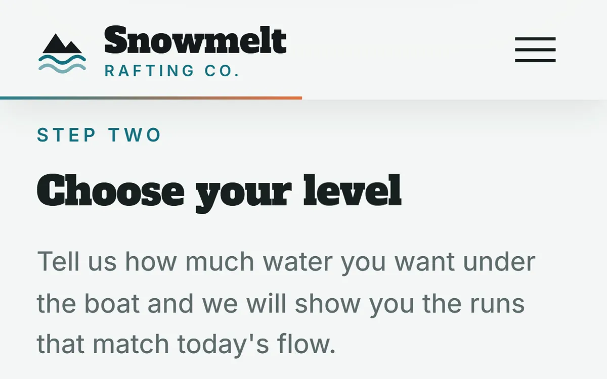
If visitors have to pinch and zoom, they will leave. Use body text of at least 16 pixels, short paragraphs, generous line spacing and headings that are clearly larger than the text. On a phone, lines are naturally short, which helps reading, but long blocks of text become very tall, so break them up with headings and lists.
Think about the places where people use phones. Outdoors in bright light, gray text on a white background nearly disappears. Choose strong contrast, which also helps people with weaker eyesight.
Buttons and links: big, spaced and in reach
A thumb is much bigger than a mouse pointer. Buttons need room, and so do the links around them. The accessibility guidelines called WCAG set a minimum of 24 by 24 pixels for tap targets, with some exceptions. Phone makers recommend larger sizes for the main buttons, around 44 to 48 pixels tall, and that is a good target. Leave space between buttons so a tap does not hit the wrong one.
On large phones, the lower part of the screen is the easiest to reach with a thumb, and the top corners are the hardest. Put your most important action where it is easy to reach, and consider a fixed button at the bottom with the words Call or Book. Do not cover the content with it.
Forms: short, big and with the right keyboard
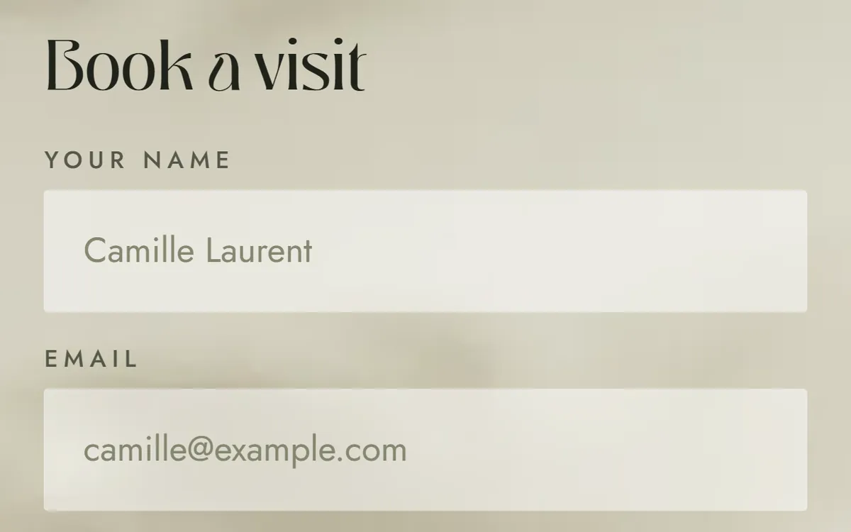
Typing on a phone is slow and mistakes are easy. Ask only for what you need, make every field tall enough to tap, and place the label above the field so it is still visible when the keyboard opens. The right keyboard makes a big difference: an email field should open the keyboard with the at sign, and a phone field should open the number pad. Browsers can fill in names, emails and addresses automatically when the form is built for it. Use text of at least 16 pixels inside fields, because some phones zoom in on smaller text when you tap a field, and the page jumps.
Phone numbers, maps and messages
A phone is also a phone. Make your number a link, so one tap starts the call. Make your address a link that opens directions. If your customers like to message, offer that option too. These small links save the visitor several steps and often turn a visit into a customer.
Images and video: right size, no waiting
A photo built for a wide monitor wastes data on a phone. Each image should come in sizes that fit the screen, so a phone loads a smaller file. Large autoplaying videos eat mobile data and slow the page. Keep pictures sharp but light, and let video wait until a visitor asks for it. Later lessons cover photos, video and speed.
No hover, no tiny targets, no surprises
Anything that appears only when the pointer hovers over it is invisible on a phone. Information in tooltips, menus that open on hover and buttons that show text on hover must have a touch version. Avoid pop-ups that cover the screen and are hard to close, and be careful with chat widgets or banners that sit on top of your main button.
Common phone mistakes
- Sideways scrolling. Wide tables or pictures that push the page past the screen edge.
- Tiny text. Small gray type, especially in menus and footers.
- Menus as PDF files. A restaurant menu as a PDF is hard to read and slow to open on a phone. Put it on the page as text.
- Links too close together. A tap hits the wrong one.
- Long forms. Ten fields on a phone is a reason to give up.
- Sound or video that starts by itself. It surprises people and uses their data.
- Heavy pages. A site that is fast on office Wi-Fi may crawl on a weak signal.
- Cookie banners and chat bubbles that cover the content. On a small screen they can hide the very button the visitor needs.
How to test on a real phone
A browser can pretend to be a phone, and that is a good first check, but nothing beats the real thing.
- Use the browser's phone view. In Chrome on a computer, right-click the page, choose Inspect and turn on the device toolbar. It shows how your page behaves at phone sizes. It is a quick check, not a replacement for a real phone.
- Open your site on your own phone. Use mobile data instead of Wi-Fi to feel how it loads on a normal connection.
- Use one hand. Can you reach the main button and fill in the form with your thumb?
- Go outside. Read the page in daylight and see whether the text is still clear.
- Try a bigger text setting. Many people set their phones to larger text. Check that nothing breaks.
- Turn the phone sideways. Make sure the page still works.
- Borrow another phone. Ask a friend with a different brand or an older model to open your site.
- Do the real task. Call from the page, send the form, find your hours. Everything a customer would do.
A phone-first checklist
- The first screen shows what you do and one main button without zooming
- Body text is at least 16 pixels and easy to read
- The menu is short, with one important action visible
- Buttons are large, spaced apart and easy to reach with a thumb
- Forms are short, with labels above and the right keyboard
- Phone number, address and email work with one tap
- Nothing needs hover to work
- Pictures are sized for phones and video does not start by itself
- No pop-up covers the main content
- You tested it on a real phone, on mobile data
How Good Sites Only handles phones
Every site we build includes a mobile version, so your site is designed for small screens as well as big ones. On days 3 and 4 you review the mockup, and you can open it on your own phone to see how it feels in your hand. On days 5 and 6 the site is built and checked, and it goes online on day 7. Your contact forms are included too. When you want to begin, start your site.
Questions people ask
What does mobile-first design mean?
It means you design the small-screen version first and then expand it for larger screens, instead of shrinking a desktop design. It forces you to decide what matters most, and it usually gives a simpler site on every device.
Is mobile-friendly the same as responsive?
Almost. A responsive site changes its layout to fit the screen, and that is the usual way to be mobile-friendly. Being mobile-friendly also means the text is readable, the buttons are easy to tap and the page loads quickly on a phone.
How do I know if my site is mobile-friendly?
Open it on a real phone and try to do what a customer does: read, call, find your hours and send a message. Then check it in your browser's phone view. If anything is hard, small or slow, it needs work.
What percentage of website traffic is mobile?
It depends on the country, the business and who measures it: public figures for the United States differ from one source to another. The number that matters is your own, and your website analytics show it.
Does Google rank mobile sites differently?
Google mostly uses the phone version of your pages to index and rank them, which is called mobile-first indexing. That is why the phone version has to contain your important content and work well.
How big should buttons be on a phone?
The accessibility guidelines set a minimum of 24 by 24 pixels with some exceptions. For the main buttons, aim bigger, around 44 to 48 pixels tall, and leave space around them so a thumb does not hit the neighbor.
What font size is best for a phone?
Use at least 16 pixels for body text. Headings should be clearly larger, and text in form fields should also be 16 pixels or more, so phones do not zoom in when someone taps a field.
Do I need a separate mobile site or an app?
No. One responsive site that adapts to every screen is the usual and best choice. A separate mobile site doubles the work and can show different content to Google and to visitors. An app is only worth it for special cases.
Should I use a hamburger menu?
On a phone, a menu icon is understood by most people, so it is fine when you have several pages. Keep the list short, and keep your main action visible outside the menu.
How do I test my site on iPhone and Android?
Open it on both if you can, or ask friends and family to test it. Check the first screen, the menu, a form and a phone call link on each. The differences are usually small, but that is where unexpected problems show up.
Want a website that does all of this? Start your site