Contact forms people actually fill in
Every extra field is a reason to stop. Here is how to build a form that people finish, and how to check that the messages really arrive.
A contact form is the last step between a visitor and a customer. Someone has decided to write to you, and the form either welcomes them or sends them away. Long forms, unclear fields, silent errors and spam filters that block real people all lose customers without a sound. This lesson shows how to build a form that people complete: what to ask, how to label it, how to make it work on a phone, how to handle spam and errors, and how to be sure the messages really reach you.
Every field is a reason to stop
Think about what a form asks of a person. They must stop browsing, type with their thumbs, trust you with personal details and hope for an answer. Each extra field adds effort and doubt. Forms that ask for a lot lose people before the last field, and you never see them leave.
The rule is simple: ask for what you need to reply, and leave the rest for the conversation that follows. You can always ask more once someone has written to you.
Ask only what you need to reply
The minimum
For most small businesses, three things are enough: a name, one way to reach the person, and a message or a choice that says what they want. Let people choose between email and phone instead of demanding both. If you need more, mark the extras as optional.
What to ask by type of business
- Restaurant. Name, phone or email, date, time and number of guests.
- Trade or home service. Name, phone, zip code or city and a line about the problem.
- Photographer or event service. Name, email, date and type of event.
- Clinic or salon. Name, phone or email, the service wanted and a preferred day.
- Store or workshop. Name, email and the product of interest.
- Consultant. Name, email and a short description of the need.
Here is an invented example for a house-cleaning company. Name, required. Phone or email, required, and the visitor needs to give only one of them. Zip code, required, because it tells you at once whether you serve that area. Type of place, a menu with apartment, house and office. Message, optional. The button says Get my cleaning quote, and a line under it says when you will reply. Five fields, each with a reason, and nothing you could ask later in the phone call.
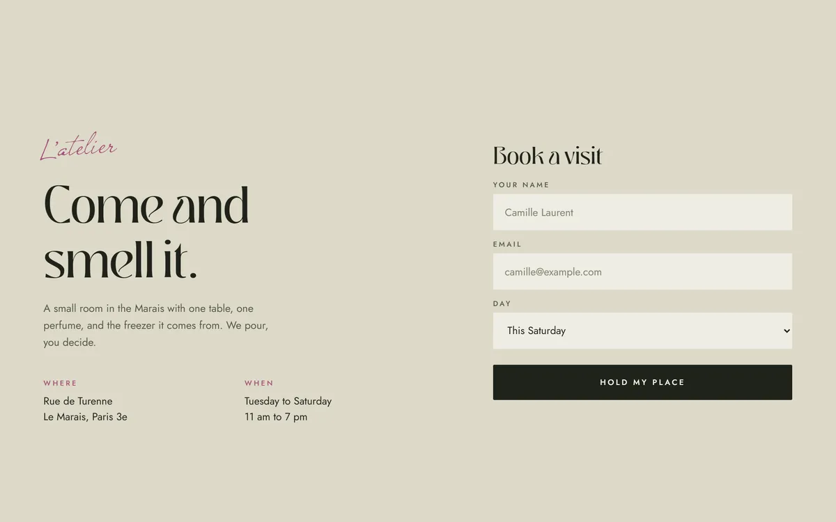
The Eclore design below asks for a name, an email and a day for a visit. That is all the studio needs to hold a place and send a confirmation. Notice the button, Hold my place. It says what will happen, in the voice of the business.
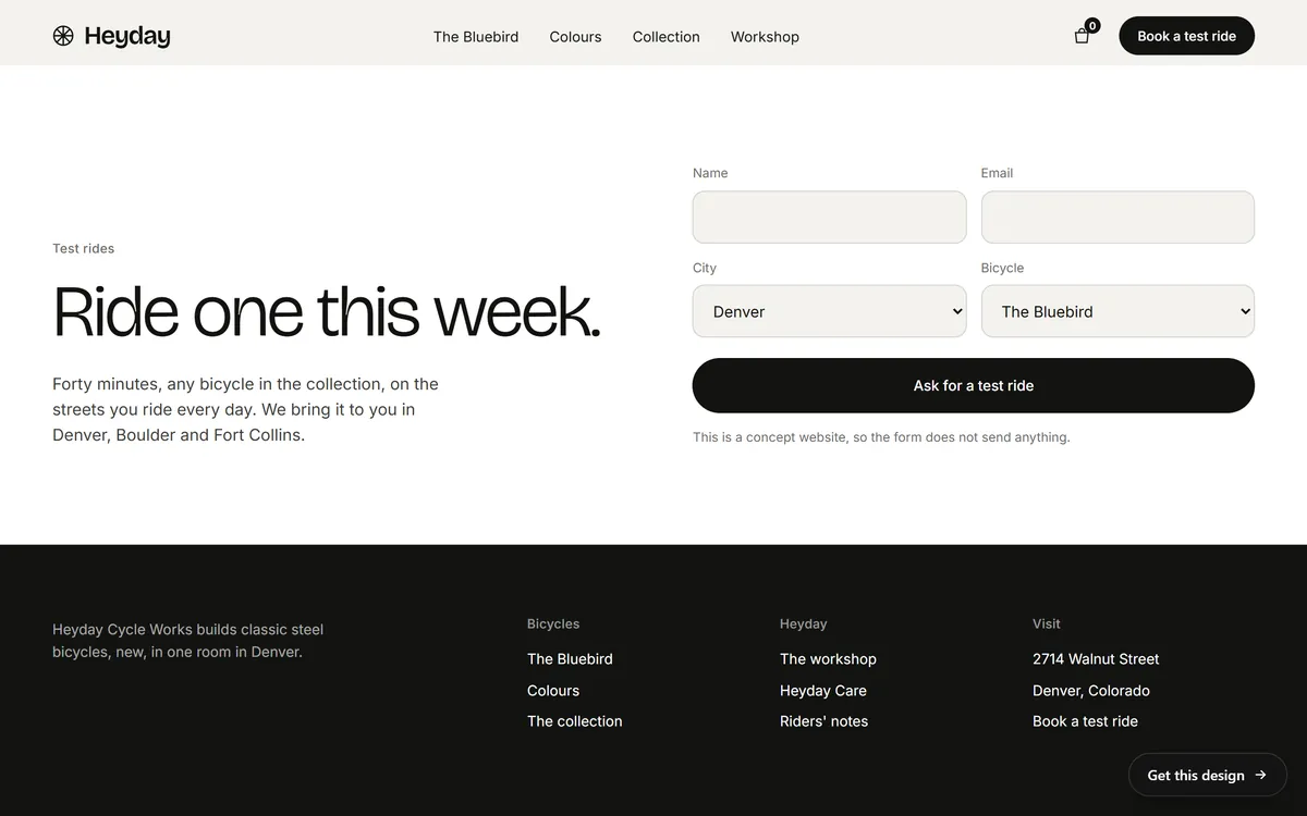
The Heyday form below asks for four things: name, email, city and bicycle. The city and the bicycle are menus, so the visitor chooses instead of typing. Together they tell the workshop where to bring the bicycle and which one to bring. A small line under the button explains that it is a concept website and sends nothing, which is a good reminder that a form should tell people honestly what it does.
Show choices instead of making people type
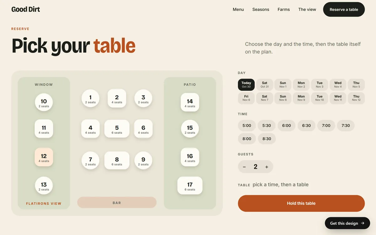
When the answer is one of a few options, show the options. Buttons, menus and calendars are faster than typing, avoid mistakes and make the form feel smaller. A booking is the best example. In the Good Dirt design, the visitor chooses a day, a time and a number of guests with a tap, and then points to a table on a plan. There is almost nothing to type, and the button at the end says Hold this table.
Keep the lists short, and put the most common choice first. For a long list, such as states or countries, a search box in the menu saves scrolling.
Labels, placeholders and hints
- Put a label on every field. The label says what to type. Place it above the field and keep it visible all the time.
- Do not use a placeholder as the label. Text inside the field disappears as soon as someone starts to type, and people forget what was asked. It is also usually pale and hard to read. Use placeholder text only for an example, such as the format of a date.
- Mark required fields. Say clearly which ones must be filled in, and which are optional.
- Add short hints. If a phone number or date needs a certain format, show it before the person types, not after an error.
- Keep the order natural. Name, contact, then the message, in the order a person would say it.
Labels and clearly marked required fields are among the basic checks that accessibility groups recommend, because people who use screen readers hear the label when they reach a field.
Make it easy on a phone
- Use the right keyboard. An email field should bring up the keyboard with the at sign, and a phone field the number pad.
- Allow autofill. Browsers can fill in names, emails, phone numbers and addresses when the form is built for it.
- Make fields tall and wide. Use text of at least 16 pixels inside them, and leave space between fields.
- Use a full-width button that is easy to reach with a thumb.
- Prefer taps to menus. A row of buttons is often easier on a phone than a long drop-down.
Write the button and the next step
Replace the button label Submit with a few words that say what happens: Ask for a test ride, Hold my place, Request a quote, Send my message. After the click, show a clear confirmation on the page, such as Thank you, we received your message. Say what happens next, and when, but only promise what you can do. If you can send a confirmation email as well, do it, because it tells the person that the message arrived and gives them a copy.
Handle errors kindly
Mistakes will happen. The way you handle them decides whether the person tries again or leaves.
- Show the message next to the field that has the problem, in plain words: Please enter an email address like name@example.com.
- Do not use only color to show an error. Add words and, if you like, an icon.
- Keep everything the person already typed. Never empty the form after an error.
- Check as the person goes, or when they leave a field, not only at the very end.
- Do not blame the person. Say what to fix.
Stop spam without annoying people
Every public form attracts bots. You have several ways to defend it, and the best ones are invisible to real people.
- A honeypot. A hidden field that people cannot see and never fill in, but bots do. If the field has content, the message is discarded.
- Limits. The site stops accepting many messages from the same source in a short time.
- Server checks. The site verifies every message on its own server, not only in the visitor's browser.
- A puzzle, as a last resort. The tests that ask people to click traffic lights or retype twisted letters block bots, but they also annoy real customers and can shut out people with disabilities. Use them only if the quieter methods are not enough.
Check your spam folder from time to time, because a good message can end up there.
Privacy, consent and what not to ask
A basic contact form does not need sensitive information. Do not ask for Social Security numbers, card numbers, passwords or private health details. If someone must send those, use a secure method designed for it. Tell people, in a short line near the form, how you will use their information. If you plan to send them marketing emails or text messages, ask for their permission clearly and separately. Rules apply to this in the United States, and legal questions belong to a professional who knows your situation.
Offer other ways to reach you
Some people never fill in forms. Show your phone number, an email address, your address and your hours next to the form or near it. If your customers like messaging apps, offer that option too. A form should be one door among several, never the only one.
Make sure the messages arrive
The most expensive form problem is the one nobody notices: a form that sends messages to an old address or to the spam folder. Protect yourself with a routine.
- Test it at launch. Send a message from a computer and from a phone, and see where it lands.
- Send to an address you read daily. Preferably an email on your own domain, and to more than one person if you have a team.
- Test it every month. Spam filters and email settings change, and forms break quietly.
- Answer fast. A reply on the same day often decides who gets the job.
- Keep a copy. If your tool stores messages, check there as well.
A contact form checklist
- Three to five fields, and only what you need to reply
- A visible label on every field, and required fields marked
- Choices shown as buttons or menus when there are only a few options
- The right keyboard on a phone, with autofill allowed
- A button that says what happens
- Errors in plain words, next to the field, with the typed text kept
- Spam protection that real people do not notice
- A confirmation on the page, and a confirmation email if possible
- Your phone, email, address and hours nearby
- A test message every month
How Good Sites Only handles forms
Contact forms are included in every site we build. The fields are part of the design that you review in the mockup on days 3 and 4, and the site, forms included, is built and checked on days 5 and 6 before it goes online on day 7. Your mobile version and hosting are included too. If you want to reach customers when you are not at the desk, ask us about our monthly chat assistant, which answers questions at any hour. When you are ready, start your site.
Questions people ask
How many fields should a contact form have?
As few as you can manage, usually three to five. A name, a way to reach the person and a message are enough for most businesses. Each extra field lowers the number of people who finish.
What should a contact form include?
Labeled fields for the essentials, a clear button, a short line about how you will use the information, and a confirmation after sending. Add fields that match your business, such as a date for a booking or a zip code for a home service.
Should I use a CAPTCHA?
Try quieter methods first: a honeypot field, limits on repeated messages and checks on the server. Puzzles annoy real customers and can block people with disabilities, so keep them as a last resort.
Should the phone number be required?
Only if you really need to call. Many people prefer email and may leave if forced to give a phone number. A good option is to ask for one or the other, or to make the phone number optional.
Why am I not receiving my form submissions?
Common causes are an old or wrong destination address, messages caught by a spam filter, or a form that does not send at all. Test the form, check the spam folder and confirm the destination address with whoever manages your site.
What should happen after someone submits a form?
They should see a clear confirmation on the page, ideally receive a confirmation email and know what happens next. Never leave them on a blank page, because they will not know whether the message arrived.
Do I need a contact form if I have an email address?
A form is still useful. It lets people write without opening an email program, helps you collect the same details each time and keeps your address away from bots. Show your email as well, for people who prefer it.
Where should I put my contact form?
On your contact page and, for the most important action, near the end of the home page or beside a service description. Do not hide it. A link to the contact page in the menu is also needed.
What is a honeypot?
It is a hidden field added to a form to catch bots. People never see it, so they leave it empty. Bots fill in every field they find, and the site discards any message that has content in the hidden one.
How do I make a form accessible?
Give every field a visible label, mark required fields, show errors in words next to the field, make sure the form can be used with a keyboard, and keep text large and clear. Test it with a keyboard and, if you can, with a screen reader.
Want a website that does all of this? Start your site