What makes a website look professional
A professional look does not come from effects. It comes from clarity, consistency and care. Here are ten signs you can check on your own site in ten minutes.
People form an opinion about your business before they read a single sentence. They look at the page, sense whether it is careful or careless, and decide whether to stay. A professional website is not the fanciest one. It is the one that is clear, consistent and finished. This lesson names ten signs that make a site look professional, shows them on real designs we made, and gives you a ten-minute check to run on your own site.
Why the look of your site matters
A website is often the first place a customer meets your business. They cannot see your shop, smell your kitchen or shake your hand, so the page has to do that job for you. If it looks neglected, with crowded text, blurry photos and buttons that do not match, people assume the work behind it is neglected too. That is not always fair, but it is how people judge a business they have not met yet.
The opposite is also true. A calm, tidy page tells visitors that someone pays attention to detail. It eases the worry that comes before every purchase or booking: is this business real, is it good, will they answer me?
Professional does not mean expensive, and it does not mean complicated. The sites that look best usually do fewer things, and do them well. They give one clear message at a time, use a small set of colors and one or two typefaces, show photos in the same style and leave plenty of space.
The ten signs of a professional website
1. One clear message on each screen
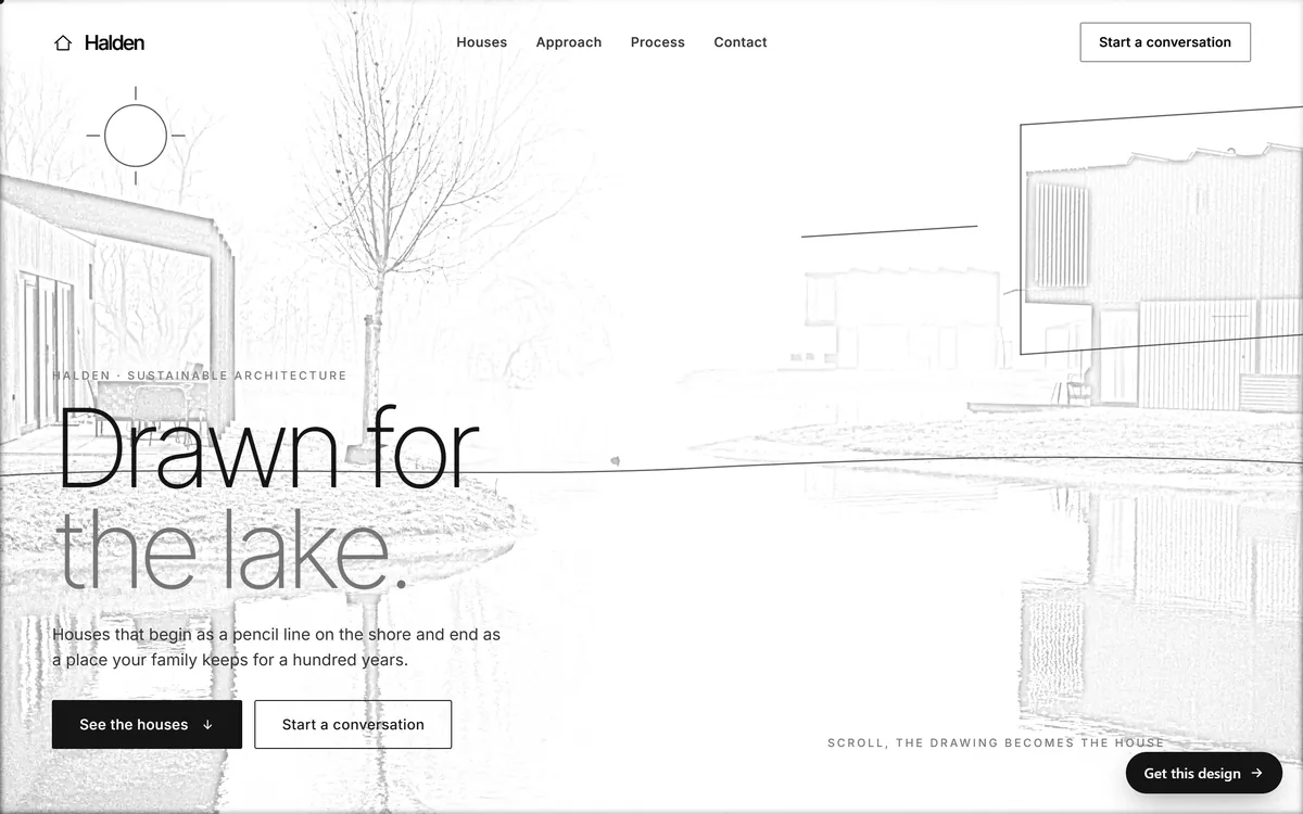
Look at the first screen of the Halden design below. It has one headline, one sentence and two buttons. Your eye goes to the headline first, then to the sentence, then to the buttons, because the design tells it where to go. This order of attention is called visual hierarchy.
To build it, make the most important thing the biggest, keep the second most important smaller, and give everything else less weight. Then take away whatever competes. If two things shout at the same volume, the visitor does not know where to look.
2. Space around everything
White space, also called negative space, is the empty area around text, pictures and buttons. It is not wasted. It lets the eye rest and shows what belongs together. Crowded pages look cheap and tiring, while airy pages look confident.
Leave generous room around headlines, between sections and around buttons. Do not fill every corner just because there is room. If you are not sure whether a section needs more space, add some and see if it improves.
3. Type that is easy to read
Text is the main thing people use on your site, so it must be comfortable. These habits make a page look professional and read well.
- Size. Body text of 16 pixels or larger is a common minimum on screens. Small gray text looks elegant to the designer and tiring to everyone else.
- Line length. Lines of about 50 to 75 characters are easiest to follow. Text that runs the full width of a wide screen is hard to read.
- Line spacing. Give paragraphs some air between lines, around one and a half times the size of the text.
- Two typefaces at most. One for headings and one for text, or a single family in two weights. A third one almost never helps.
- Clear headings. Headings should be clearly larger than text, and the same level should look the same on every page.
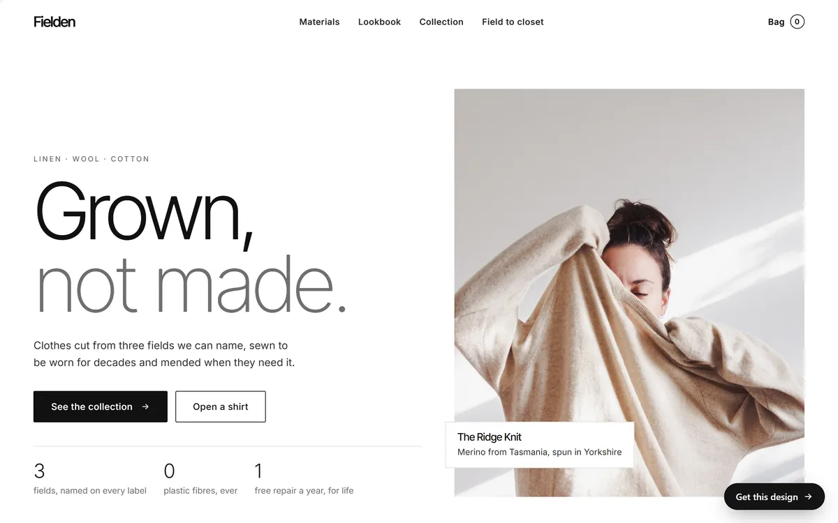
The Fielden design shows how little you need. It uses one typeface in two weights: the first word of the headline is dark and the rest is lighter, which gives rhythm without adding a second font.
4. A small, steady color palette
Choose one main color, one accent color for buttons and links, and neutrals such as white, black and gray for the rest. Use the accent only for actions. Visitors quickly learn that the colored thing is the thing you can click, and the page becomes easier to use. If your logo has several colors, pick the one or two that work best on screen and let the others stay in the logo.
5. Buttons and styles that match
Consistency is the quiet sign of a careful designer. Every button should have the same shape, corners and type. Every link should look like a link. Spaces between sections should be about the same, and icons should come from one family. In the Fielden screen above, the solid button is the main action and the outlined button is the quiet second choice, but both share the same size and shape, so they clearly belong together.
6. Photos in one style
Photos tell visitors what you are like. Sharp, well-lit pictures of your real work, your place and your people build trust. Pictures from different sources, with different light and different colors, make a page look pieced together. If some of your photos are weak, it is better to use fewer of them. The next lessons cover photos and video in detail.
7. Alignment on a grid
Professional pages line up. Text starts at the same left edge, columns have equal widths, cards have equal heights and margins repeat. You do not have to know the word grid to see the effect: when things line up, the page feels calm, and when they almost line up, it feels wrong without anyone knowing why.
8. Real details that build trust
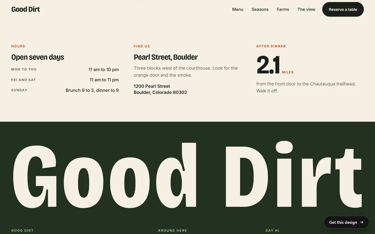
Vague pages feel risky. Real facts feel safe. Put the practical details where people can find them: your address, a phone number that can be tapped on a phone, opening hours, the area you serve, your license or insurance if your trade requires one, real names and faces, and real reviews. In the Good Dirt design, the hours, the street address and the distance to a nearby trailhead are written as plain text in one clear block.
9. Pages that load fast and stay put
A page that takes a long time to appear, or that jumps around while it loads, looks broken even when it is not. Speed is part of the look. Lesson 8 of this series shows how to check it.
10. No loose ends
Small mistakes add up. Broken links, typos, placeholder text, last year's date in the footer, an offer that ended months ago, missing images, social icons that go nowhere and a business name spelled two different ways all tell the visitor that nobody is looking after the site. Fixing them costs little and changes the impression a lot.
Signs that make a site look amateur
Use this list as a warning. If you see several of these on a site, it will look improvised, whatever the quality of the business.
- Three or more typefaces, or text in many sizes and colors
- Many bright colors that compete with each other
- Stretched, pixelated or very dark photos
- Stock pictures of handshakes and people pointing at a screen
- Text placed over a busy picture with nothing behind it to keep it readable
- Pop-ups the moment the page opens
- Music or video that starts on its own
- A long block of text with no headings
- Placeholder text such as Lorem ipsum, or a page that says under construction
- Links that open nothing, or a phone number that cannot be tapped
- A logo in different versions on different pages
- Too many animations that slow the page and distract from the message
A ten-minute check for your own site
Open your site on a computer and run through these steps. Write down every problem and fix the three biggest first.
- Squint. Blur your eyes or step back from the screen. What stands out first? It should be your main message or your main button.
- Five seconds. Show the first screen to someone for five seconds, then hide it. Ask what the business does and what they would click. If they cannot say, the first screen needs work.
- Phone. Open the same page on your phone. Is the text readable without zooming? Can you tap each button?
- Click everything. Click every menu item, button and link. Submit the contact form and make sure the message reaches you.
- Read aloud. Read the main pages out loud. Your ear catches typos and clumsy sentences that your eye skips.
- Footer. Check the year, the address, the phone number and the email.
- Count. Count the typefaces and colors. More than two typefaces or more than three main colors is a warning.
- Compare. Put your first screen next to two competitors. Does yours look as careful as theirs?
- Ask. Ask someone who does not know your business what they think it sells and whether they would trust it.
- Fix. Pick the three biggest problems and fix them this week. Then repeat the check in a month.
A professional look depends on your industry
A law firm and a skate shop should not look alike. A restaurant needs appetizing photos, hours and a way to book. An architecture studio needs quiet pages and large pictures of its work. A store needs clean product photos and an easy way to buy. A professional look means the right look for the people you want to reach.
That is why it is worth looking at examples from your own field before you decide. Notice what they keep simple, what they make big, and what they leave out. Then ask whether your site shows the same care.
How Good Sites Only builds a professional look
Every site we build starts with a design made for your kind of business. Your texts are written for you, the site has a mobile version, search engine setup and contact forms are included, and hosting is included too. You see a mockup on days 3 and 4, with one round of changes, and the finished site is built and checked on days 5 and 6 and goes online on day 7. To see how different industries look when they are finished, browse our designs.
Questions people ask
What makes a website look professional?
A clear message on each screen, plenty of space, readable type, a small set of colors, matching buttons, photos in one style, real contact details and no loose ends such as broken links or typos. Most of it comes from restraint and consistency, not from effects.
How can I make my website look more professional?
Start with the ten-minute check in this lesson. Fix the biggest problems first: unreadable text, mismatched buttons, weak photos and anything broken. Then simplify. Remove what competes with your main message and add space around what is left.
How many fonts should a website use?
Two at most. A common setup is one typeface for headings and another for text, or a single family used in two weights. More than that makes a page look unplanned.
What colors look professional on a website?
There is no single professional color. What matters is a small palette used consistently: one main color, one accent for actions and neutrals for the rest. Choose colors that suit your industry and your brand, and make sure text has enough contrast against its background.
What is white space and why does it matter?
White space is the empty area around text, images and buttons. It does not have to be white. It matters because it separates ideas, guides the eye and makes a page easier and calmer to read.
Does a professional website have to be expensive?
No. Professional comes from decisions, not from budget: a clear message, consistent style, good photos and careful details. A simple site done well looks better than a complex site done in a hurry.
How do I know if my website looks outdated?
Warning signs include tiny text, crowded layouts, a site that does not adapt to phones, old dates and offers, blurry or dark photos, and a design that looks very different from competitors. Compare your first screen with two or three current sites in your industry.
Do I need a professional logo for a professional-looking site?
A clear logo helps, but it does not have to be complicated. A clean wordmark in a good typeface works well. What matters is that the logo is sharp, used in one version and placed in the same spot on every page.
Are stock photos bad for a professional look?
Not by themselves. Generic stock photos can feel impersonal, especially pictures of handshakes and people in perfect offices. Real photos of your work and your people usually build more trust. Lesson 4 of this series explains where to find photos and how to use them.
How often should I update the look of my website?
You do not need a redesign every year. Keep the content current, replace weak photos and fix small problems as you see them. Plan a larger refresh when the design stops matching your business or your customers' expectations, which often takes several years.
Want a website that does all of this? Start your site