Buttons and calls to action that get clicked
A site can be beautiful and still bring no customers if nobody knows what to do next. Here is how to design, write and place the buttons that matter.
A website can be beautiful and still bring no customers if nobody knows what to do next. A call to action, often shortened to CTA, is the step you ask a visitor to take: call, book, ask for a quote, buy, visit. It usually takes the form of a button. This lesson shows how to choose the one action that matters on each page, how to write button text that gets clicks, how to design and place buttons, and how to ease the small worries that stop people at the last second.
What a call to action is
A call to action is an invitation with a clear next step. It can be a button such as Book a table, a link such as See our prices, a phone number, an email address or a short form. It matters because visitors rarely guess. If the path is not obvious, most of them leave without taking it, even when they liked what they saw.
Every page of your site should lead somewhere. A home page might lead to a service page, a service page to a quote request, and a contact page to a phone call. Think of your site as a set of short paths that all end in a way to reach you or buy from you.
Choose one main action for each page
The more choices a page offers, the fewer clicks any single choice gets. Decide the one thing you most want a visitor to do on each page and make it the star. You can allow one quieter, secondary option, but no more.
- Restaurant. Main: Reserve a table. Secondary: See the menu.
- Plumber or electrician. Main: Request a quote. Secondary: Call now.
- Shop. Main: Shop now. Secondary: See the new arrivals.
- Consultant. Main: Book a call. Secondary: Read how I work.
- Tour or lodge. Main: Check dates. Secondary: See what is included.
- Architect or photographer. Main: Start a conversation. Secondary: See the work.
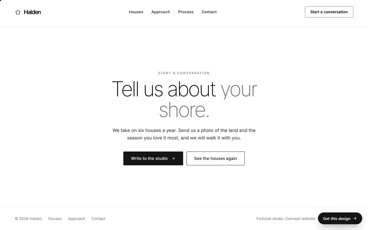
The Halden screen below follows this rule. It offers two buttons, but they are not equals. The solid black button, Write to the studio, is the main action. The outlined button, See the houses again, is the quieter second choice for visitors who want to look once more before writing.
Write button text that says what happens
A good button label answers the question: what will happen when I click. The best ones start with a verb and say the result in a few words.
- Clear. Book a run, Reserve a table, Request a quote, Call us now, Get directions, See the menu.
- Vague. Submit, Click here, Learn more, Enter, Go. They say nothing about the result, and Submit sounds like a chore.
Use the words your customers use, keep the label between two and five words, and match it to the promise on the page. If the heading talks about booking, the button should not say Contact us. Many businesses find that wording in the first person, such as Book my visit, feels natural, while others prefer the second person. Either can work, so choose one style and use it everywhere.
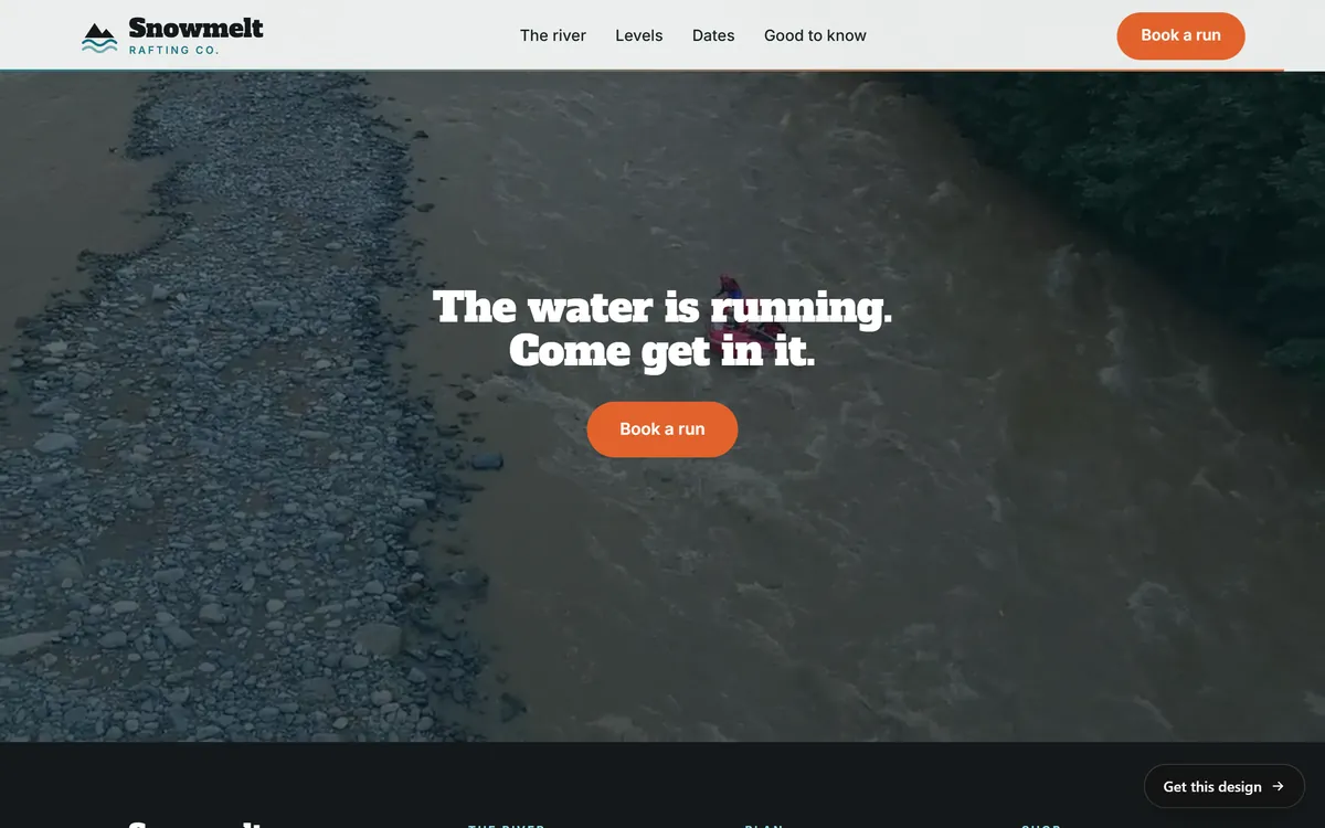
Look at the Snowmelt Rafting Co. closing section below. After a short line, The water is running. Come get in it, the button says Book a run. No decoding needed: the label says the action and its object. The same button also sits in the header, so a visitor who is ready to book does not have to scroll back.
Write the line before the button
A button works better when the sentence above it gives a reason to click. Think of it as one small pitch: the benefit, then the action. Instead of a bare Contact us, a plumber might write, Water on the floor? Tell us what is happening and we will tell you how soon we can come, followed by a button that says Request a visit. The sentence names the problem, and the button names the solution.
Links inside paragraphs can also work as calls to action. Make their text descriptive, such as See our repair prices, and never Click here. A link should still make sense when it is read alone, which also helps people who use screen readers.
Make buttons look like buttons
People should recognize a button in less than a second. A few design choices make that happen.
- Fill and contrast. A solid color that stands out from the background works best. The text inside must be easy to read. The accessibility guidelines called WCAG ask for a contrast ratio of at least 4.5 to 1 for ordinary text.
- One color for actions. Reserve your accent color for buttons and links. When color means click, visitors learn it in seconds. The exact color matters less than how different it is from the rest of the page.
- Size and space. Make the main button big enough to tap on a phone and leave empty space around it.
- Primary and secondary. Give the main action a solid look and the second choice an outline or a plain link.
- The same shape everywhere. Corners, height and type should match on every page.
- Real buttons. Build buttons as real buttons or links, not as pictures of buttons, so they work with a keyboard and with screen readers.
Put buttons where decisions happen
A button should appear at the moment a visitor is ready, and that moment is different for every person. So you offer the action several times, in a calm way.
- On the first screen. For the visitor who already knows what they want.
- In the header. One button that stays visible, as in the Snowmelt example above.
- After your proof. Right after reviews, results or a list of what is included, when trust is highest.
- After each important section. A short line, then the action.
- At the end of the page. A closing invitation for visitors who read everything.
- On a phone. A button within reach of the thumb, such as a fixed Call or Book bar at the bottom, as long as it does not cover content.
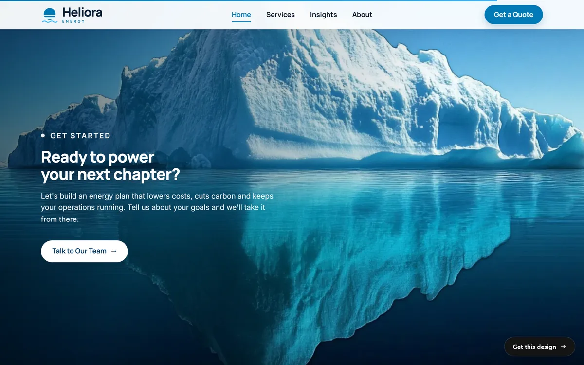
Repeat the same main action, not different ones. Ten different buttons on a page are just noise. The Heliora closing section below shows a simple ending: a small label, a question to the reader, a short paragraph and one button, Talk to Our Team, on a quiet picture.
Ease worry next to the button
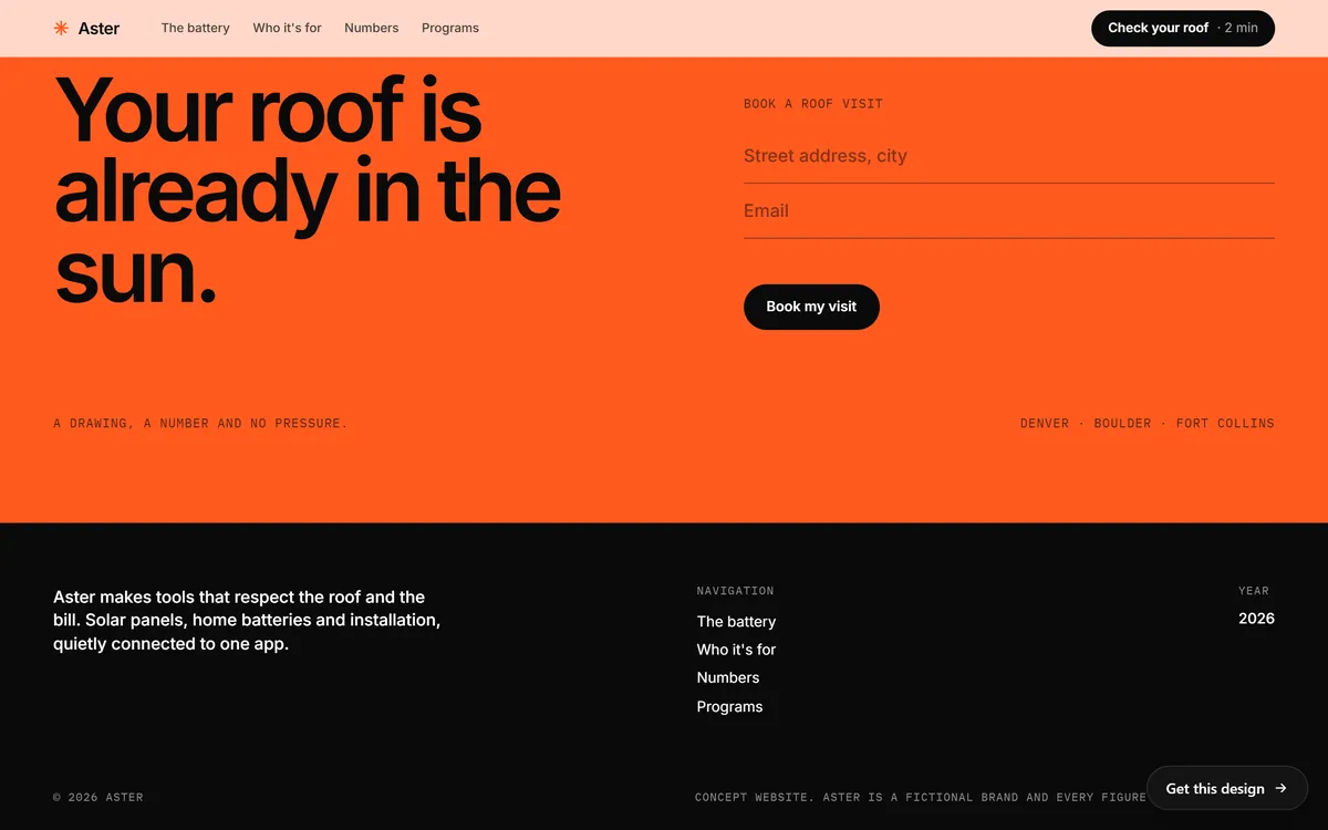
Just before the click, small doubts appear. Will I be pushed to buy? Will they spam me? Is this the right place? A short line of text next to the button can answer them. In the Aster closing section below, the button says Book my visit and, at the bottom of the section, a line says A drawing, a number and no pressure. The line tells visitors what they will receive and that nobody will push them.
Good reassurance is specific and true. These are some examples.
- No obligation, you will get a quote first
- We will never share your email
- Free cancellation up to 24 hours before
- We answer by the end of the next business day
Only promise what you will really do. A reassurance that is false is worse than none.
Calls, directions and messages
Many customers prefer to talk, to get directions or to send a quick message instead of filling in a form. Offer these as clear actions.
- Call. Make the phone number a link, so a tap on a phone starts the call.
- Directions. Make the address a link that opens a map.
- Email. A link that opens a message to your business address.
- Messaging. If your customers like to write on a messaging app, a button for it can bring in people who would never call.
Show your hours near the call button, so nobody calls at a time you cannot answer.
Test and improve, one change at a time
You do not need special tools to start. Look at how many calls, form messages or bookings your site brings each month. Then change one thing, such as the text of the main button or its position, and wait a few weeks. If the numbers improve, keep the change. If not, go back. Change only one thing at a time, otherwise you will not know what worked, and be patient, because a few days of data say very little. A later series in Start From Zero shows how to read these numbers.
Mistakes that cost clicks
- Too many calls to action. Five buttons of the same weight, and no one clicks.
- Vague labels. Submit and Learn more tell the visitor nothing.
- Buttons that hide. A pale gray button on a white page.
- Only a footer link. A Contact us link buried at the bottom.
- Asking too much too soon. Buy now on a first visit to a service that needs trust.
- A mismatch. The page promises a free quote and the button says Subscribe.
- No next step after the click. A form that ends with a blank page leaves the visitor in doubt.
- Pop-ups that cover the button. A banner that blocks the main action on a phone.
A ten-minute button audit
Open your site and write down every button and call to action you find on the home page. Then go through this list for each one.
- Does the label say what happens when I click it?
- Is it clearly the main action, or does it compete with another button?
- Can I see it in a second, from an arm's length away?
- Is the text easy to read against the button color?
- Is it big enough to tap with a thumb, with space around it?
- Does the page around it give a reason to click?
- Is there a short line that lowers the worry, and is it true?
- Does it lead to the right place, and does that place make the next step easy?
Fix the worst problems first, usually vague labels and buttons that blend into the page. Then ask a friend to find the way to book or call without help. Where they hesitate, your buttons need work.
How Good Sites Only handles calls to action
Contact forms are included in every site we build, along with hosting and a mobile version. Your texts are written for you on days 1 and 2, and you review the mockup on days 3 and 4, with one round of changes. That is the moment to ask for a different label or a different place for a button. The site goes online on day 7. When you are ready, start your site.
Questions people ask
What is a call to action?
It is the next step you ask a visitor to take, such as calling, booking, requesting a quote or buying. It usually appears as a button, a link or a short form.
What makes a good call to action?
It is clear, specific and easy to see. The label starts with a verb and says what happens, the button stands out from the page, and it sits where the visitor is ready to act.
What are examples of good calls to action?
Book a table, Request a quote, Call us now, Get directions, Check dates, Start a conversation and Shop now. Each one names an action and fits the promise of the page.
How many calls to action should a page have?
One main action per page, repeated at natural points, plus at most one quieter secondary option. Repeating the same action is fine, but offering many different actions confuses people.
What color should a call to action button be?
There is no magic color. Choose one that contrasts strongly with the page, fits your brand and is used only for actions. Consistency and contrast matter more than the exact shade.
Where should I put my call to action button?
On the first screen, in the header, after your proof, after key sections and at the end of the page. On a phone, keep an action within reach of the thumb.
Should the call to action be above the fold?
Yes, for the main action, so that visitors who are ready do not have to scroll. Repeat it further down for visitors who need to read more first.
What should a button say?
Two to five words that start with a verb and match the result, such as Book a run or Request a quote. Avoid Submit, Click here and Learn more.
Is Contact us a good call to action?
It works as a menu item, but as a main button it is vague. A more specific label, such as Request a quote or Book a call, tells the visitor what to expect.
How do I know which button text works best?
Change one thing at a time and watch how many calls, messages or bookings you receive over a few weeks. Keep what improves the numbers and go back to what does not.
Want a website that does all of this? Start your site