Accessibility basics: a website everyone can use
An accessible site is easier for everyone to use. Here is what WCAG and the ADA mean, ten checks you can run yourself and when to ask a professional.
An accessible website is one that people with different abilities can use: people who cannot see well, cannot hear, cannot use a mouse or find small text hard to read. It is also easier for everyone else, such as someone in bright sunlight, someone holding a child or someone with a broken wrist. This lesson explains in plain words what accessibility means, what WCAG and the ADA are, which basic checks you can run yourself and how to design and write for everyone. It is general information and not legal advice: for legal questions, talk to a professional.
What accessibility means
People meet barriers on websites in many ways. Some are permanent: blindness, low vision, deafness, limited movement or a learning difference. Some are temporary, such as an injury. Some are situational, such as a glare on the screen, a noisy room or one free hand. A site that works for all of them is more accessible, and it is usually better for every visitor too.
Here are a few examples of what accessibility looks like in practice.
- A person who is blind listens to the page with a screen reader, a program that reads the text aloud. It needs real text, headings and descriptions of pictures to do its job.
- A person who cannot use a mouse moves through the page with the Tab key. Every button and link must be reachable, and the current one must be visible.
- A person with low vision enlarges the text or needs strong contrast between the letters and the background.
- A person who is deaf needs captions on videos.
- A person with a tremor needs buttons that are big enough to hit.
WCAG in plain words
WCAG stands for Web Content Accessibility Guidelines. It is a set of technical guidelines published by the World Wide Web Consortium, called W3C, the group that develops web standards. There are several versions, and the newest, WCAG 2.2, was published in October 2023. Each guideline is made of specific tests called success criteria.
The criteria are grouped into three levels: A, AA and AAA. Each level includes the one before it, so passing AA means passing A as well. Level AA is the one that most laws, contracts and lawyers talk about. WCAG is a yardstick, not a law by itself.
The ADA and websites in plain words
The Americans with Disabilities Act, or ADA, is a civil rights law. Its Title III covers businesses that are open to the public, such as shops, restaurants, clinics and hotels. The law does not list technical rules for websites. In practice, courts, lawyers and agencies often use WCAG, usually level AA, as the measure of whether a site is accessible. A rule published in 2024 by the Department of Justice names WCAG 2.1 level AA as the standard for the websites of state and local governments. That rule does not apply to private businesses.
What does this mean for you? Three things are worth knowing. First, many accessibility claims about websites come from private individuals and their lawyers, not from the government. Second, whether and how the ADA applies to a particular website depends on the facts and sometimes on the court, so no article can tell you your exact risk. Third, a site that is easy to use for more people is better for your customers and lowers the barriers that lead to complaints. For anything legal, ask a lawyer who knows this area.
Ten easy checks anyone can do
The W3C itself publishes a short list of easy checks. They take minutes, and they find many common problems. The W3C also says that these checks cover only part of accessibility, so passing them does not mean a page is fully accessible. Treat them as a first review.
- Image alternative text. Every meaningful picture should have a short description that explains its purpose to people who cannot see it.
- Page title. Each page needs a clear title, which people see in the browser tab and which screen readers announce first.
- Headings. Headings should follow the real structure of the page. People who use screen readers jump from heading to heading.
- Color contrast. Text needs enough contrast against its background. WCAG level AA asks for a ratio of at least 4.5 to 1 for ordinary text, and 3 to 1 for large text, which means about 24 pixels, or about 19 pixels in bold.
- Visible keyboard focus. Press Tab repeatedly. You should always see which button or link is selected.
- Skip link. The first thing a keyboard user reaches should be a link that jumps straight to the main content.
- Language of the page. The page should declare its language so a screen reader pronounces the words correctly. This matters especially on a bilingual site.
- Zoom. Enlarge the page. The text and pictures should stay readable and usable.
- Video and audio. Videos need captions. Audio needs a written transcript. Videos with important visual information can also have an audio description.
- Form labels and required fields. Every field needs a visible label, and required fields should be clearly marked.
WCAG 2.2 adds a size rule for things you tap: at level AA, a tap target should be at least 24 by 24 pixels, with a few exceptions. Larger is better, as lesson 3 of this series explained.
Write alt text that helps
Alt text is the written description of a picture. A screen reader reads it aloud, and the browser shows it if the picture fails to load. A few habits make it useful.
- Describe the purpose. Say what matters in the picture for this page, in one short sentence.
- Be concrete. A raft with paddlers crossing whitewater says more than rafting photo.
- Skip the preamble. Screen readers already announce that it is an image, so do not start with image of.
- Repeat words that are part of the picture. If a graphic says Open seven days, the alt text should say it too.
- Leave decoration empty. A purely decorative picture gets an empty description so the screen reader skips it.
- For a logo, use the business name. For a button made of a picture, describe the action.
- Do not stuff keywords. The text is for people first.
Color, contrast and text size
- Check the contrast. Light gray text on white is one of the most common problems. Free contrast checkers exist, and the color picker in your browser's developer tools shows the ratio of any text.
- Do not rely on color alone. If errors are only red or the available dates are only green, people with color blindness may miss them. Add words, icons or patterns.
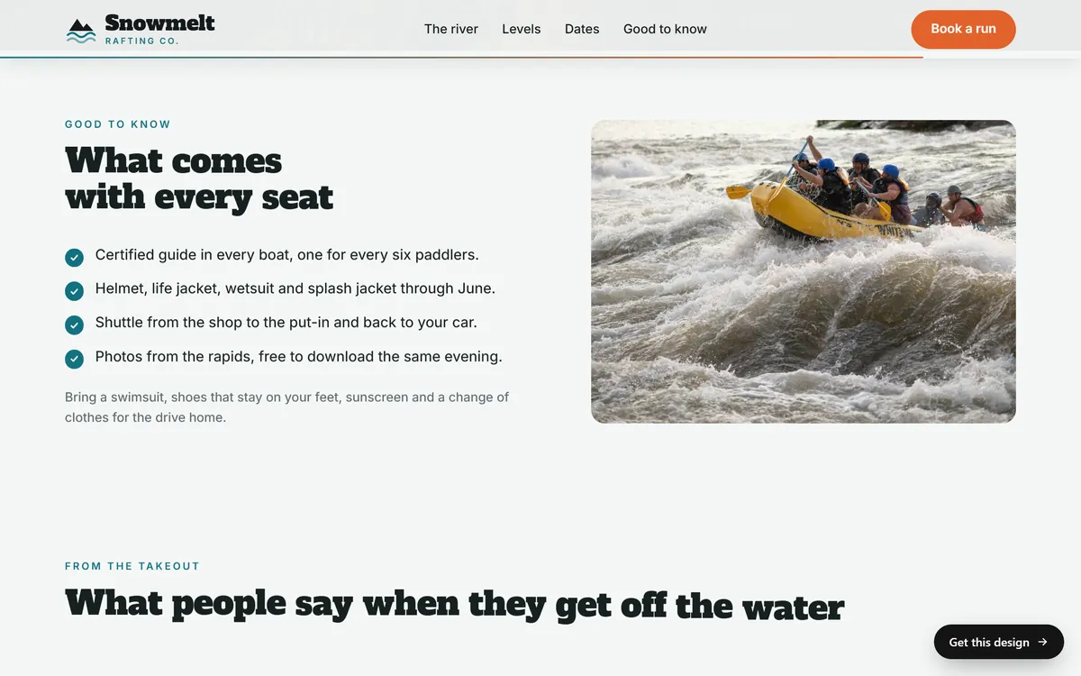
- Use real text. Put hours, prices and addresses in text on the page, not inside a picture. The Snowmelt list below is plain text with short lines, which is easy for a screen reader, a translator tool and a search engine to read.
- Keep type comfortable. Body text of at least 16 pixels, generous line spacing and short lines of about 50 to 75 characters.
- Protect text over pictures. Use a dark layer behind the words or place them on a calm part of the image.
Forms, buttons and links
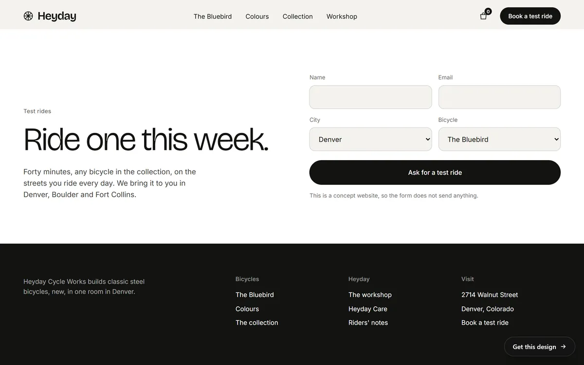
- Label every field with visible text, as in the Heyday form below, and show which fields are required.
- Write clear errors next to the field, in words.
- Name every button for what it does: Ask for a test ride is clear, an arrow with no words is not.
- Write meaningful link text. See our prices makes sense when read alone, and click here does not.
- Make targets large enough to tap, with space between them.
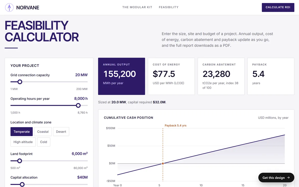
Tools can help people use a page, but the page has to give them the information. In the Norvane calculator below, every control has a name, the current value is written next to it, and the results are text, not only a chart. Someone using a screen reader, or someone who simply cannot judge a slider by eye, can still understand each number.
Keyboard and screen readers
You can run a basic test in three minutes. Put your mouse aside and press the Tab key on your home page. Can you reach every link, button and form field? Can you see where you are? Does the order make sense? Does a menu open with the keyboard? Then try a screen reader. Most devices include one: VoiceOver on Apple devices, TalkBack on Android and Narrator on Windows, and NVDA is a free option for Windows. Listen to the first screen with your eyes closed. If the page makes no sense, a person who uses one cannot understand it either.
Video, audio and motion
- Add captions to videos with speech, and a transcript for audio.
- Do not play sound by itself. WCAG asks for a way to stop or lower audio that plays automatically for more than three seconds.
- Give a way to pause moving content. WCAG asks for a pause, stop or hide control when something moves on its own for more than five seconds beside other content.
- Be gentle with motion. Large animations can bother some people. Keep them small and meaningful.
Be careful with quick-fix promises
Some products promise to make any website accessible, or compliant, with a single line of code. Be careful. Accessibility comes from design, content and code that are built properly. A tool can help find problems, but it cannot replace good work. Ask any provider exactly what they check and fix, and ask a legal professional about compliance.
A one-page accessibility checklist
- Every meaningful picture has a short description
- Each page has a clear title and real headings
- Text has strong contrast and is at least 16 pixels
- Nothing depends on color alone
- Hours, prices and addresses are real text
- Every field has a visible label, and errors are written in words
- Buttons and links say what they do
- Tap targets are big, with space between them
- The whole page works with the Tab key, and you can see where you are
- Videos have captions, and nothing plays sound by itself
- The page works when enlarged
- The language of the page is set
What Good Sites Only can and cannot say
We are a design studio, not a legal service, and we do not certify that a site meets any legal standard. What we can say is how the process works: your texts are written for you, you see a mockup on days 3 and 4, and you can ask for changes at each stage, such as larger text or stronger contrast. Hosting, a mobile version and contact forms are included. If accessibility is important to your business, say so when you answer our first questions. For a formal review or legal guidance, work with an accessibility professional or a lawyer. When you want to begin, start your site.
Questions people ask
What is web accessibility?
It is the practice of building websites that people with different abilities can use, including people who cannot see, hear, use a mouse or process small text. Good accessibility also makes a site easier for everyone.
What is WCAG?
The Web Content Accessibility Guidelines, a set of technical guidelines published by the W3C. They have three levels, A, AA and AAA, and the newest version is WCAG 2.2. Most laws and lawyers refer to level AA.
Does the ADA apply to my website?
The ADA covers businesses open to the public, but it does not list technical rules for websites, and how it applies to a specific site depends on the facts and sometimes the court. Courts and lawyers often use WCAG level AA as the yardstick. Ask a lawyer about your situation.
Is a small business required to have an accessible website?
There is no simple answer that fits every business. Size alone does not settle it, and the rules depend on the facts. Making your site easier to use is good practice for your customers, and a legal professional can tell you what applies to you.
What is the difference between WCAG A, AA and AAA?
They are levels of conformance. A is the basic level, AA includes A and adds more requirements, and AAA includes everything and is the strictest. Level AA is the one most commonly referenced.
How do I check if my website is accessible?
Start with the ten easy checks in this lesson, press Tab through your pages and listen with a screen reader. Automated tools find some problems, but not all of them, so a person should always review the result.
What is alt text?
A short written description of a picture, read aloud by screen readers and shown if the picture does not load. Describe what matters in one sentence, and leave it empty for pure decoration.
What contrast ratio do I need?
At level AA, ordinary text needs a contrast ratio of at least 4.5 to 1 against its background, and large text needs at least 3 to 1. Large means about 24 pixels, or about 19 pixels in bold.
Can I be sued over my website?
Accessibility claims about websites are real, and many come from private individuals and their lawyers. Whether a claim succeeds depends on the facts. For anything legal, talk to a lawyer who knows this area.
What is a screen reader?
A program that reads the text on a screen aloud, or sends it to a braille display. It relies on real text, headings, descriptions of pictures and labels, which is why building those into the page matters.
Want a website that does all of this? Start your site