Landing pages: where your ads should send people
The page your ad opens decides what a click is worth. Learn what a good landing page needs and how to improve yours one step at a time.
A landing page is the page a person reaches after clicking your ad. It has one job: to help that person take one action. A lot of ad money is lost on this page, not in the ad itself. This lesson shows what a good landing page needs, how to match it to your ad and how to test it, with examples from concept websites we designed.
A landing page finishes what the ad started
An ad makes a promise in a few words: "Mobile dog grooming in Tampa. Book your visit." The landing page has to keep that promise in the first second. If the visitor sees something else, they leave, and you paid for the click that brought them.
The page also decides what a click is worth. Two businesses can run the same ad at the same cost per click and end up with very different results, because one page makes the next step easy and the other makes people search for it. Google takes this seriously too: it looks at landing page experience when it rates the quality of an ad.
Home page or landing page
Your home page serves everyone. It has several goals, a full menu and something for every kind of visitor. That is right for a person who typed your name into Google. It is a poor fit for a person who clicked an ad about one thing, because they now have to hunt for it.
A landing page serves one promise and one action. It can be a service page that already lives on your site, or a page built for a single campaign. What matters is focus. If an ad promises a test ride, send people to the page where they can ask for a test ride, not to a home page with fifteen links.
Match the ad
Marketers call this message match. When the ad and the page feel like one thing, people trust the click. Check that these match:
- The words. If the ad says "Book a roof visit," the page should say it too, in the headline or the button.
- The offer. Do not advertise one thing and show another. Any deal, price or condition in the ad must appear on the page, and it must be true.
- The place. If the ad names a city, the page should name it.
- The language. A Spanish ad should open a Spanish page.
- The look. Use the same colors, the same photos and the same logo, so the visitor knows they are in the right place.
Build a strong first screen
The first screen is what a visitor sees without scrolling, and it has about a second to answer four questions: What is this? Is it for me? Can I trust it? What do I do next? A good first screen has a headline that says what you offer, a line of support, one button that stands out and something that builds trust.
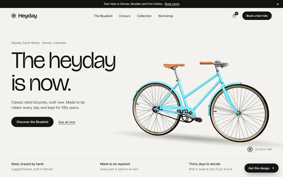
This concept bicycle maker's first screen says who it is and where (Heyday Cycle Works, Denver, Colorado), shows the product and states what it sells in a sentence. A banner at the top mentions test rides in three cities, the menu has a Book a test ride button and three short promises sit under the picture.
One main action
Choose the one thing you want the visitor to do and make that button the most visible thing on the page. A second, quieter link is fine. Five equal buttons are not, because a visitor who has to choose often chooses nothing.
Trust cues
People who do not know you are deciding whether to share their phone number or their money. Help them. Show your business name and place, real photos of your work or products, how to reach you and any honest promise you make, such as a return or repair policy. Show reviews only if they are real and from real customers.
Keep forms short
Every field you add costs you some completions. Ask for what you need to answer the person, which is usually a name and one way to reach them. Add more only when you truly need it. Label every field, use the right keyboard on phones for emails and phone numbers, and say what happens after they press the button.
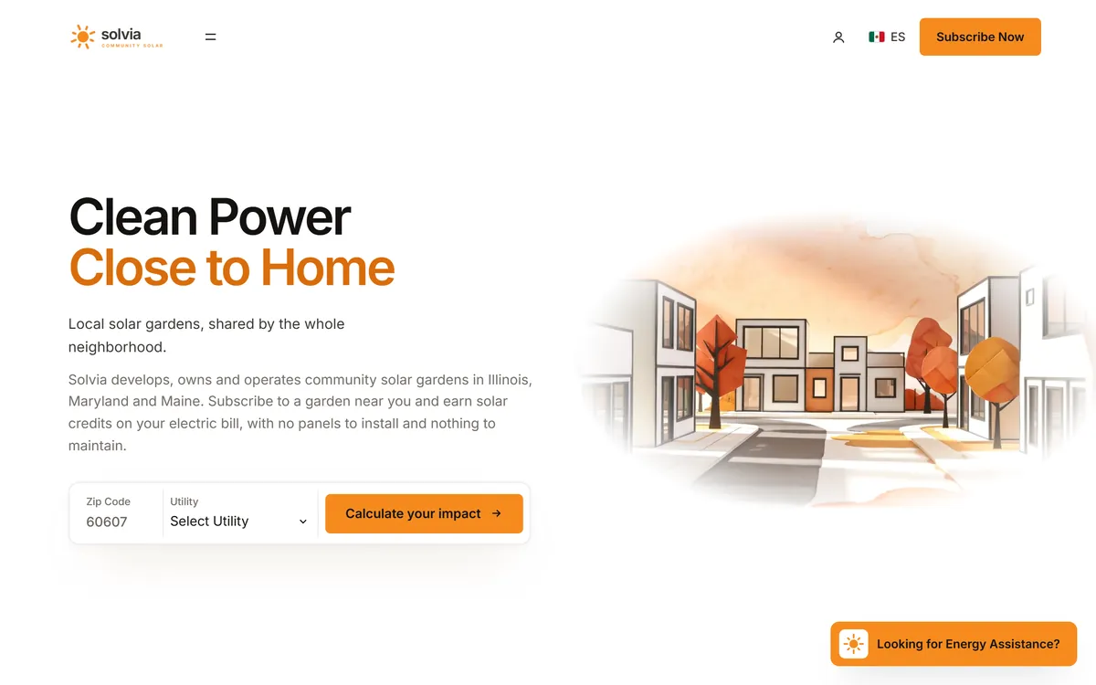
This concept community solar site puts a two-field form in the first screen: a ZIP code and a utility, with a button beside them. The visitor can start in seconds. Notice also the language switch, marked ES, in the header.
Give people a tool or a booking flow
For some businesses, the best landing page does something useful before it asks for anything. A calculator shows what a person might save. A booking flow lets them pick a day. A tool earns attention because it answers the question that was on their mind.
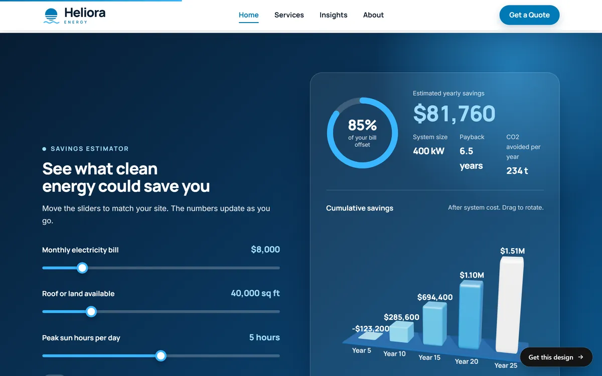
An estimator on a concept energy company's site lets the visitor move three sliders and see a savings estimate and a payback time. The button in the menu offers a quote. Estimates like this must be honest, so label them as estimates.
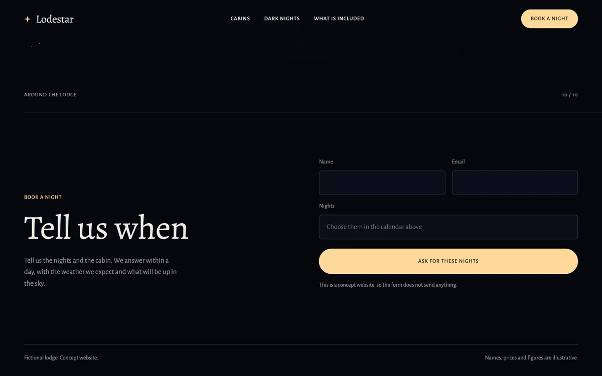
A request form on a concept lodge's site asks for a name, an email and the nights, and tells visitors when to expect an answer. That small sentence, "We answer within a day," lowers the worry of sending a message into the dark. Make sure you can keep any promise you print.
Make it work on a phone
Many people will open your ad on a phone, so judge your page on one. Open it yourself, on mobile data, and try to complete the action with one thumb.
- Buttons are big enough to tap without zooming.
- Text is large enough to read without pinching.
- Your phone number is a tap-to-call link.
- Nothing covers the page when it opens, such as a pop-up or a banner.
- Forms can be filled in with a thumb, without zooming.
Make it fast
A slow page loses people before they read a word. Keep images a reasonable size, do not start with a heavy video, and avoid loading things the visitor does not need yet. Google's free PageSpeed Insights tool tests a page and lists what to fix. Test your landing page, not only your home page.
Leave out what distracts
- A long menu that leads away from the action.
- Links to pages that have nothing to do with the ad.
- Pop-ups that appear before the visitor has read anything.
- Sound or video that plays on its own.
- Vague buttons such as "Submit" or "Click here." Say what happens: "Ask for a test ride."
- Jargon, and long paragraphs where one sentence would do.
One page for each promise
If you run ads for three services, build or choose three pages. An ad for emergency repairs and an ad for yearly maintenance make different promises, and they need different pages. Reuse a page across ads only when the promise is the same. This also makes your results easier to read, because each page has one job and one number.
What your page needs for each goal
The goal you picked at the start decides what belongs on the page.
- Phone calls. Put the number at the top as a tap-to-call link, show your hours and say who answers. If nobody answers at night, say so.
- Bookings and reservations. Show what is available, what is included, the price or a range, and what happens if the visitor needs to change the date.
- Quote requests. Keep the form short, say what you will need to know and tell people when to expect an answer.
- Online purchases. Show clear photos, the price, delivery or pickup details, your return policy and a cart that works without surprises.
Pages in English and in Spanish
If your customers use both languages, build both pages with care. A Spanish ad should open a page written in Spanish, with the same offer, the same button and the same photos as the English one. Write each version on its own, in the words your customers use, instead of running the English through a translator. A language switch in the header, like the one in the solar example above, lets a visitor who landed on the wrong version move to the right one in a tap.
Test one change at a time
You will not get the page right on the first try, and that is normal. Improve it a step at a time. Change the headline, or the button words, or the main photo, or the number of fields, and change only one of them. Then give the new version enough visitors to show a difference. If your traffic is small, wait several weeks, write down what you changed and compare. Running two versions at the same time, which people call a split test, works only when each version gets a fair number of visitors.
A landing page checklist
- The headline matches the ad.
- The first screen says what you offer, for whom and where.
- One button stands out and says what happens next.
- The offer and any price match the ad exactly.
- Photos are real and load fast.
- Contact details are easy to find.
- The form asks only for what you need.
- The page works with one thumb on a phone.
- There is a way to count the result, such as a form message or a call.
- You tested the whole path yourself, from the ad to the confirmation.
Landing pages and your website
Every site we build includes design for your industry, texts written for your business, a mobile version and contact forms, so the pages people reach from an ad are ready for phones and give them a way to get in touch. If you want a page made around one offer, a landing page of the month is a monthly service you can add. When you are ready to start, you can start your site.
Questions people ask
What is a landing page?
It is the page a visitor reaches after clicking an ad, a link or an email. Its job is to help that visitor take one action, such as calling, booking or sending a form.
What is the difference between a landing page and a home page?
A home page serves everyone and has many goals and links. A landing page serves one promise and one action. It can be a page that is part of your site or a page built for a campaign.
Should I send my ads to my home page?
Usually not. A visitor who clicked an ad about one service should land on the page for that service. Send ads to the home page only when the ad is about your business in general, such as a brand name search.
What makes a good landing page?
A headline that matches the ad, a first screen that says what you offer, one clear button, trust cues such as real photos and contact details, a short form and a page that loads fast and works on a phone.
How long should a landing page be?
As long as it needs to be for that decision. A simple request, like booking a visit, can be short. A bigger decision, like a large purchase, may need more explanation. Keep the first screen simple either way.
What is a good conversion rate for a landing page?
It varies widely by industry, offer and the kind of traffic. Instead of chasing a number from somewhere else, record your own rate and try to improve it over time.
Should a landing page have a menu?
Some landing pages remove the full menu so visitors stay on the action. If you keep a menu, keep it short, and keep the main button more visible than any link in it.
Do I need special software to build a landing page?
Not necessarily. A well-made page on your own website can work. What matters is that the page has one clear job, loads fast and works on a phone.
How many fields should a form have?
As few as you can manage. A name and a way to reach the person is often enough to start a conversation. Every extra field costs some completions.
Does page speed matter for ads?
Yes. A slow page loses visitors, and you have already paid for the click. Google also considers landing page experience when it rates ads, so it is worth testing and fixing.
Want a website that does all of this? Start your site