Conversion rate: what it is and how to raise it
Conversion rate shows how many visitors do what you want. Learn to calculate it, read the benchmarks with care and test changes one at a time.
Conversion rate tells you what share of your visitors do what you want them to do. It is the number that connects your website to your business. This lesson shows how to calculate it, what average rates look like in recent industry reports, and ten changes you can test to raise yours.
What a conversion rate is
A conversion is one visitor taking one action that matters to you: sending a form, booking, calling, buying or joining your email list. These are the key events you set up in the earlier lessons of this series. The conversion rate is the share of visitors who did it.
The formula has two parts: divide the number of conversions by the number of visitors, then multiply by 100. If 1,000 people visit your site in a month and 40 send an inquiry, your conversion rate for inquiries is 4 percent. Those figures are invented, and they only show how the math works.
You can use different groups of visitors as the base: all users, all sessions, only the people who landed on one page, or only the people who came from one channel. Choose one base and keep it. A rate calculated in two different ways is not comparable from one month to the next.
Two kinds of conversions
Most sites have a main conversion and several smaller ones. The main one is the action that pays: a purchase, a booking or an inquiry. The smaller ones show interest on the way there: adding something to a cart, opening the booking page, joining the email list or downloading a guide.
Track both, and keep them separate. The small ones have higher rates and give you an early signal. The main one has a lower rate and tells you whether the business is working.
What average rates look like
Two recent reports give a sense of the range. Neither one measures a whole small business website, so read the numbers as a map of the territory, not as a target.
- Unbounce, Conversion Benchmark Report, 2024 edition. It reports a median conversion rate of 6.6 percent across industries for landing pages, based on more than 41,000 landing pages, 464 million visitors and 57 million conversions in the past year it covered. The medians of the nine industries it lists run from 3.8 percent to 12.3 percent.
- LocaliQ, Search Advertising Benchmarks, 2026 edition. It reports an average conversion rate of 8.18 percent for Google Ads across industries, measured as leads divided by clicks, from the campaigns of its own customers.
The same LocaliQ report lists the rate by industry, and the spread is wide. Finance and insurance shows 2.64 percent, real estate 3.70 percent, attorneys and legal services 5.55 percent, home and home improvement 8.05 percent, restaurants and food 8.05 percent, and animals and pets 16.22 percent. Rates vary by industry, and they also vary with the traffic source and with what each company counts as a conversion.
Two cautions come with these figures. First, landing pages and ad clicks are built around one goal, and the visitors arrive with a purpose. Your whole website will probably show a lower rate, because many visitors come only to read or to check your hours. Second, the rate does not say whether the leads were good. Your best benchmark is your own history: the same number, in the same way, month after month.
How to find your own conversion rate
- Pick the action. Use one of the key events from your monthly record.
- Pick the group and the period. For example, all users in the last full month, or only the people who came from search.
- Divide. Conversions divided by visitors, times 100.
Then do it again for each channel. Imagine that 1,000 visitors came from search and 30 of them sent a form, which is 3 percent. Imagine that 400 came from social media and 2 sent a form, which is 0.5 percent. The site is the same, but the groups behave differently. That difference tells you where your best visitors come from.
You can also split the numbers by device. Analytics lets you compare phones with computers in most reports. If the rate on phones is much lower than on computers, the problem is probably in the mobile version of the page, and that is where to look first.
Follow the path, not just the end
A conversion is the last step of a short path. Someone arrives, reads, clicks the button, starts the form and sends it. Each step loses some people. If you only look at the final rate, you do not know where they left.
So count the steps that you can. How many people viewed the page with the button? How many tapped it? How many started the form, and how many sent it? A large drop between two steps shows you the exact spot to fix. A button that few people touch is a problem of words or position. A form that many people start and few send is a problem of length, trust or errors.
Ten changes that can raise your conversion rate
None of these is guaranteed to work on your site. Each one removes a reason for a visitor to hesitate, which is why they are worth testing.
1. Make one main action obvious
Every page should have one clear next step, with the same wording each time. "Book a visit" tells people more than "Submit". Put the button where people see it without scrolling, and repeat it further down.
2. Match the words the visitor already read
If someone clicks a result or an ad about a service, the first heading they see should be about that service. When the page does not match the promise that brought the visitor, people leave.
3. Shorten your forms
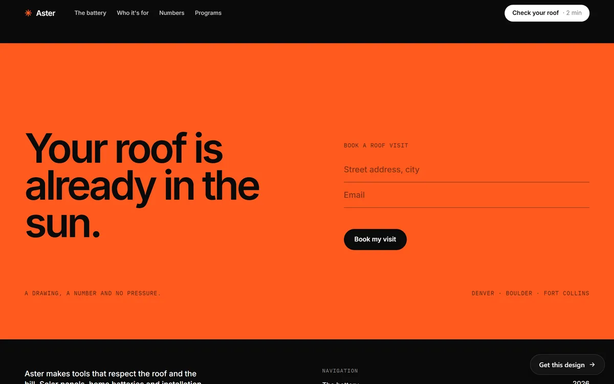
Ask only for what you need to reply. Often that is a name, an email or a phone number and one short message. Each extra field is one more reason to stop. The form below asks for only two things, a street address and an email.
4. Make the page easy on a phone
It is easy to test your site only on a computer. Test it on your phone every month. Buttons should be easy to tap, the phone number should call when touched, and forms should be comfortable to fill with a thumb.
5. Make the page load fast
People leave pages that load slowly. Compress your images, keep heavy video below the first screen and remove scripts you do not use.
6. Show real proof
Real reviews, photos of your work, the years you have been in business and guarantees you truly offer all answer the question "Can I trust them?". Use only what is real. Invented or paid reviews destroy trust and can bring legal trouble.
7. Answer the questions that stop people
List what a hesitant customer would ask: how you charge, how long the work takes, where you work, what happens next. Put short answers near the button.
8. Remove distractions
A page with ten links and three offers asks the visitor to decide too much. On a page that exists to bring a booking, keep the links and the offers that support that one goal.
9. Make it easy to reach you
Put your phone number, your email and your hours where people can find them in a few seconds. Then reply quickly, because a slow answer can lose an inquiry that your site worked hard to bring.
10. Give people a reason to start
A calculator, a quiz or an estimator lets a visitor learn something about their own case before they contact you. Answering a few questions is a smaller step than sending a message, and the result can open the conversation.
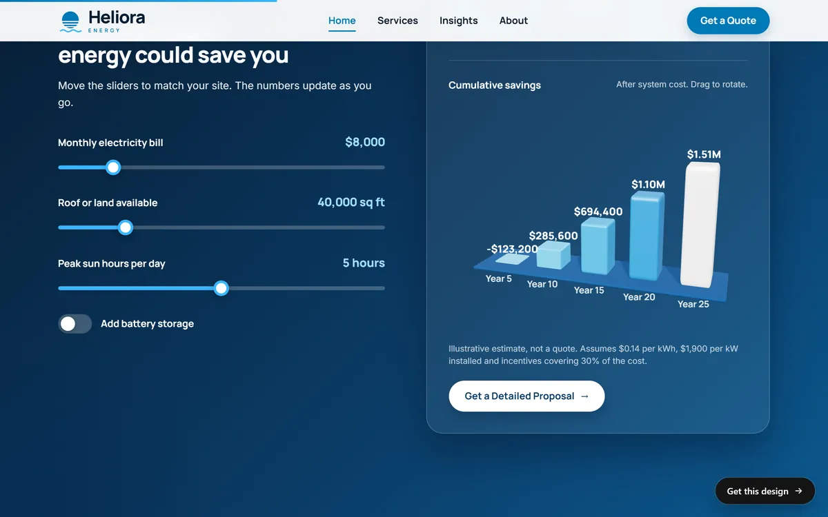
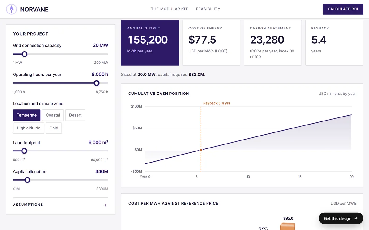
The same idea works for services with more inputs. A feasibility calculator asks for the size, the place and the budget of a project, and shows a result on the same page.
How to test a change without a lab
Large companies run formal tests with thousands of visitors. A small site rarely has that traffic, so use a simpler method.
- Change one thing at a time. If you change the headline, the button and the photo together, you will not know which one mattered.
- Write down the date and the old version. Keep it in your monthly record.
- Wait long enough. Let enough visitors pass through the page. On a small site, that can mean several weeks.
- Compare equal periods. Look at whole weeks or whole months, and think about the season.
- Keep what works, and undo what does not. If the result is unclear, keep the version you prefer.
Here is a first test you can run this month. On your contact page, change the button text from a general word like "Submit" to a specific one like "Send my request". Write down the date, leave everything else alone and compare the next full month with the last one. It is small, it costs nothing and it teaches you how a change shows up in your own numbers.
When the rate is not the real problem
A low rate does not always mean a weak page. Check these before you rebuild anything.
- Tracking. Send a test form yourself and check that the key event appears in Analytics.
- The audience. Visitors who were never looking for what you sell will not convert on any page.
- The offer. If the service, the area or the terms do not fit the visitor, no wording will fix it.
- The follow-up. If inquiries arrive and few become customers, look at how you answer them.
Conversion rate and your website
No design can promise a conversion rate, because it depends on your offer, your market and your visitors. What a site can do is give you good building blocks. Every site we build includes contact forms and a mobile version, with a design made for your industry and texts written for you. You can see forms, calculators and booking panels on real pages in our designs. A landing page of the month is one of the monthly services you can add.
Questions people ask
What is a conversion rate?
It is the share of visitors who take an action you want, such as sending a form, booking or buying. You calculate it by dividing the conversions by the visitors and multiplying by 100.
How do you calculate conversion rate?
Divide the number of conversions by the number of visitors in the same period, then multiply by 100. If 40 of 1,000 visitors send a form, the rate is 4 percent. Choose one base, such as users or sessions, and keep it.
What is a good conversion rate for a website?
There is no single answer, because it varies by industry, traffic source and what you count. Recent reports show a wide range: Unbounce's 2024 landing page report puts the median at 6.6 percent across industries, and LocaliQ's 2026 report puts the average for Google Ads at 8.18 percent. The best comparison is your own rate in earlier months.
What is the average conversion rate for small business websites?
The reports that publish averages measure landing pages and advertising clicks, not whole small business websites. Use them as a rough range, and track your own numbers from month to month.
What is the difference between conversion rate and bounce rate?
Conversion rate is the share of visitors who took the action you wanted. Bounce rate, in Google Analytics, is the share of sessions that were not engaged. A page can have a high bounce rate and still convert well, for example a contact page.
How long should I wait before judging a change?
Wait until enough visitors have passed through the page and you have compared equal periods. On a small site that can take several weeks. Judging after a few days mostly measures chance.
Does traffic or conversion rate matter more?
Both matter. More visitors help only if the page can turn some of them into customers, so it makes sense to look at the page before you pay for more traffic.
Can I track conversions without Google Analytics?
Yes. Privacy-friendly tools offer goals or events, and you can also count form entries and phone calls yourself. What matters is that you count the same thing in the same way every month.
Why is my conversion rate low?
Common reasons are an unclear next step, a slow or hard-to-use mobile page, a long form, weak proof, visitors who do not match your offer, or tracking that is not working. Check them one at a time.
How many form fields should I use?
Only the ones you need to reply. A name, an email or a phone number and a short message is often enough. Each extra field adds friction.
Want a website that does all of this? Start your site